BePlus
Turning personal passions into a gateway for learning
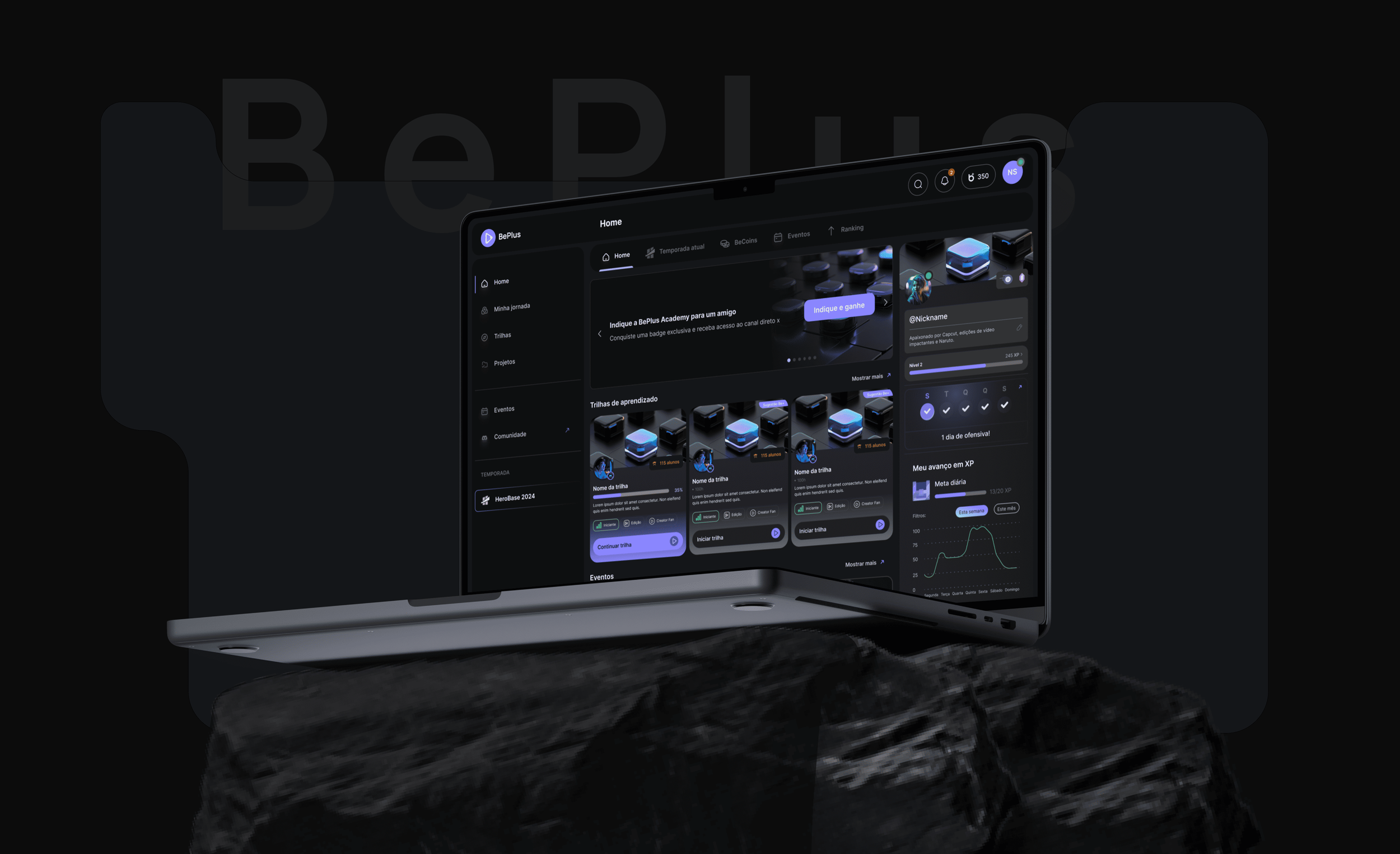
A connected learning experience for the creator economy.
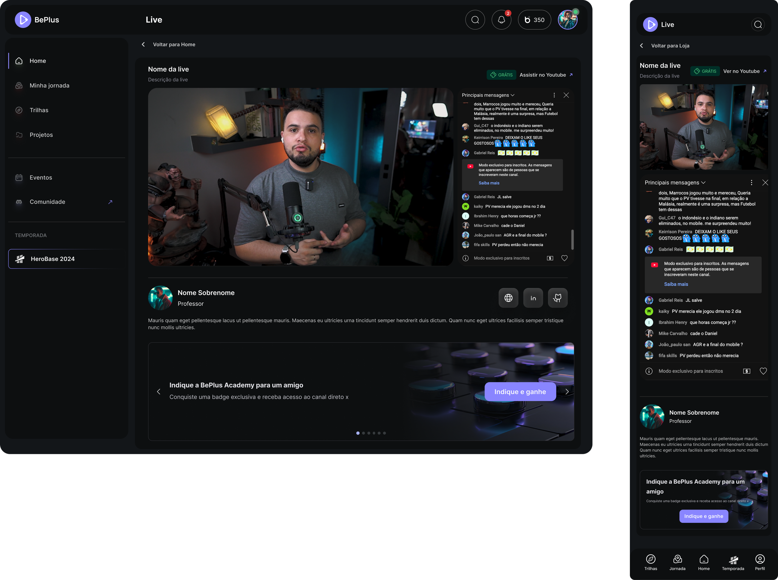
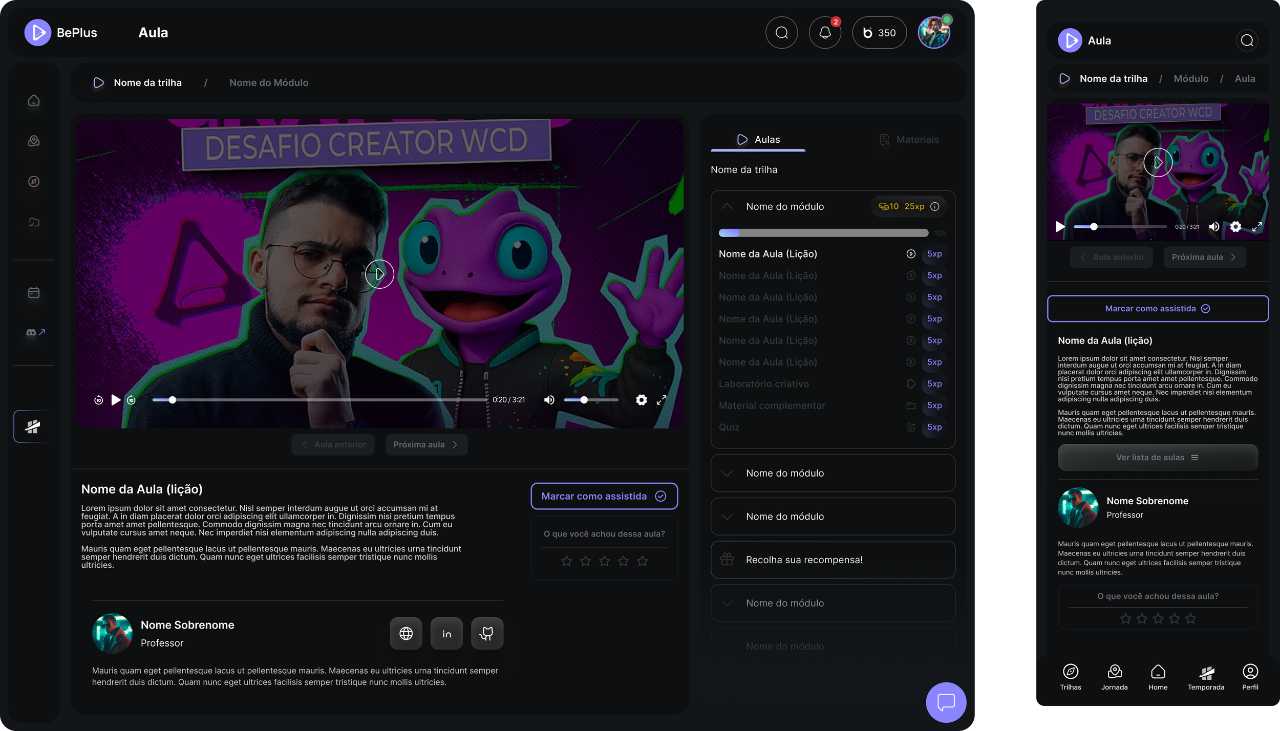
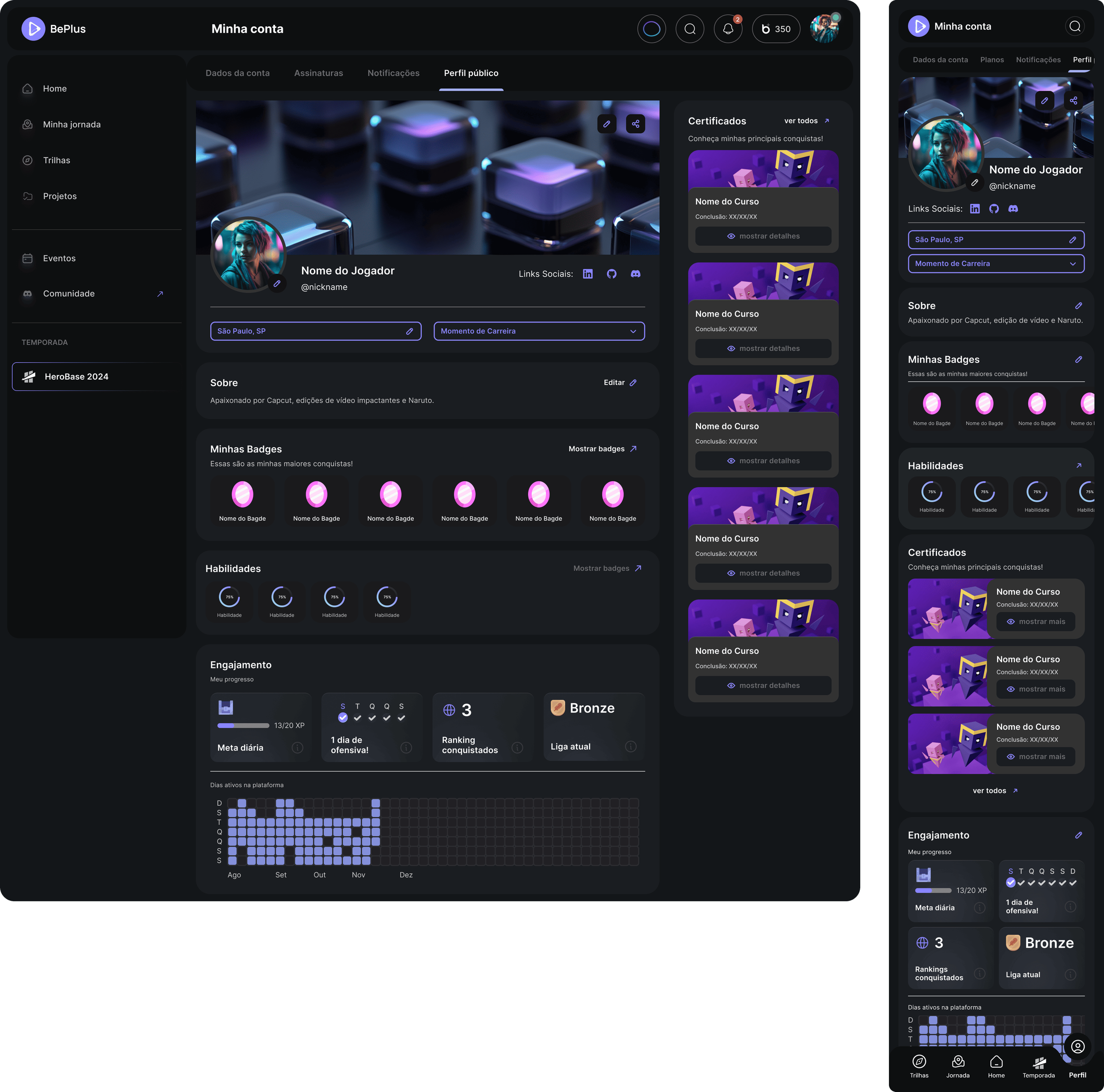
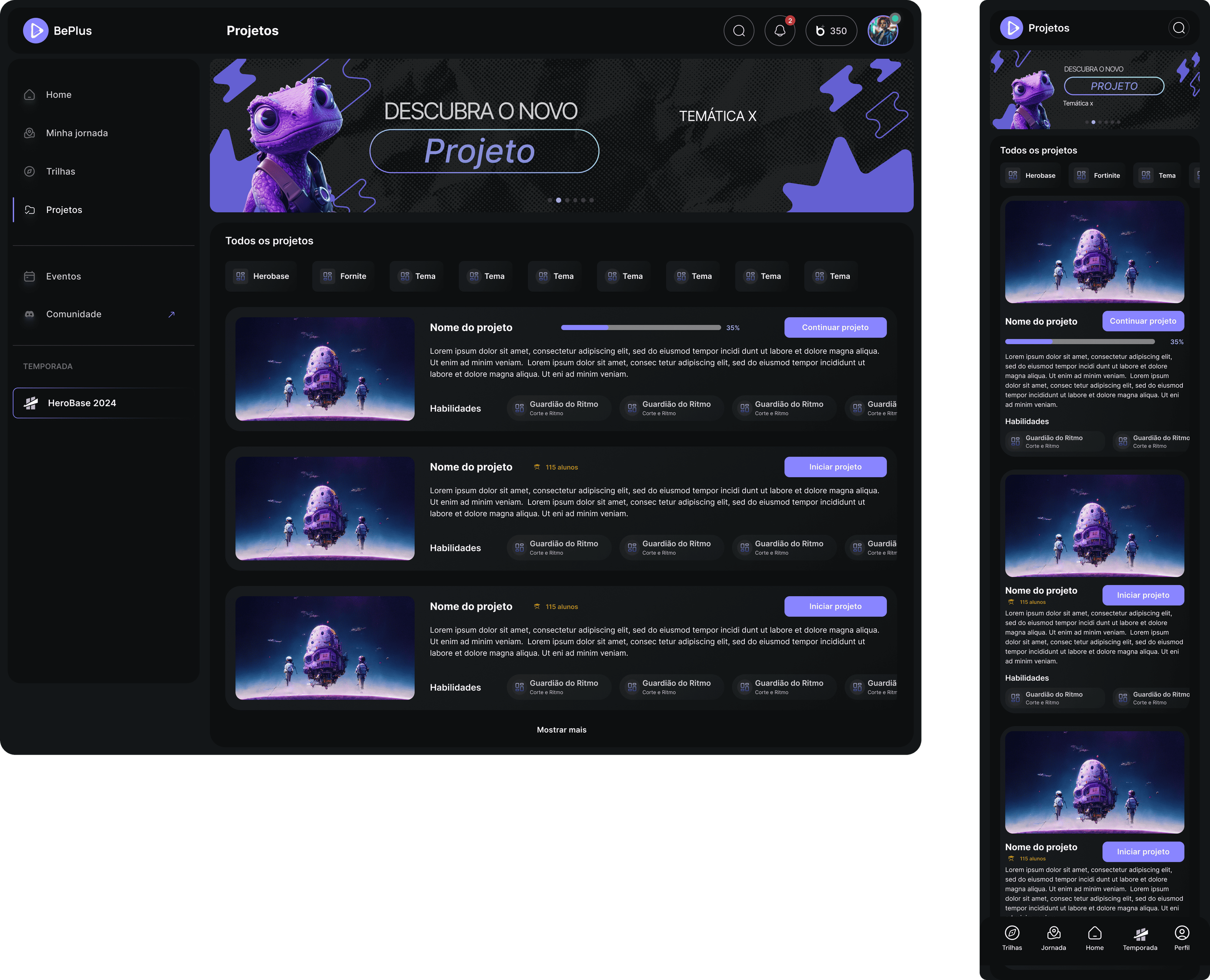
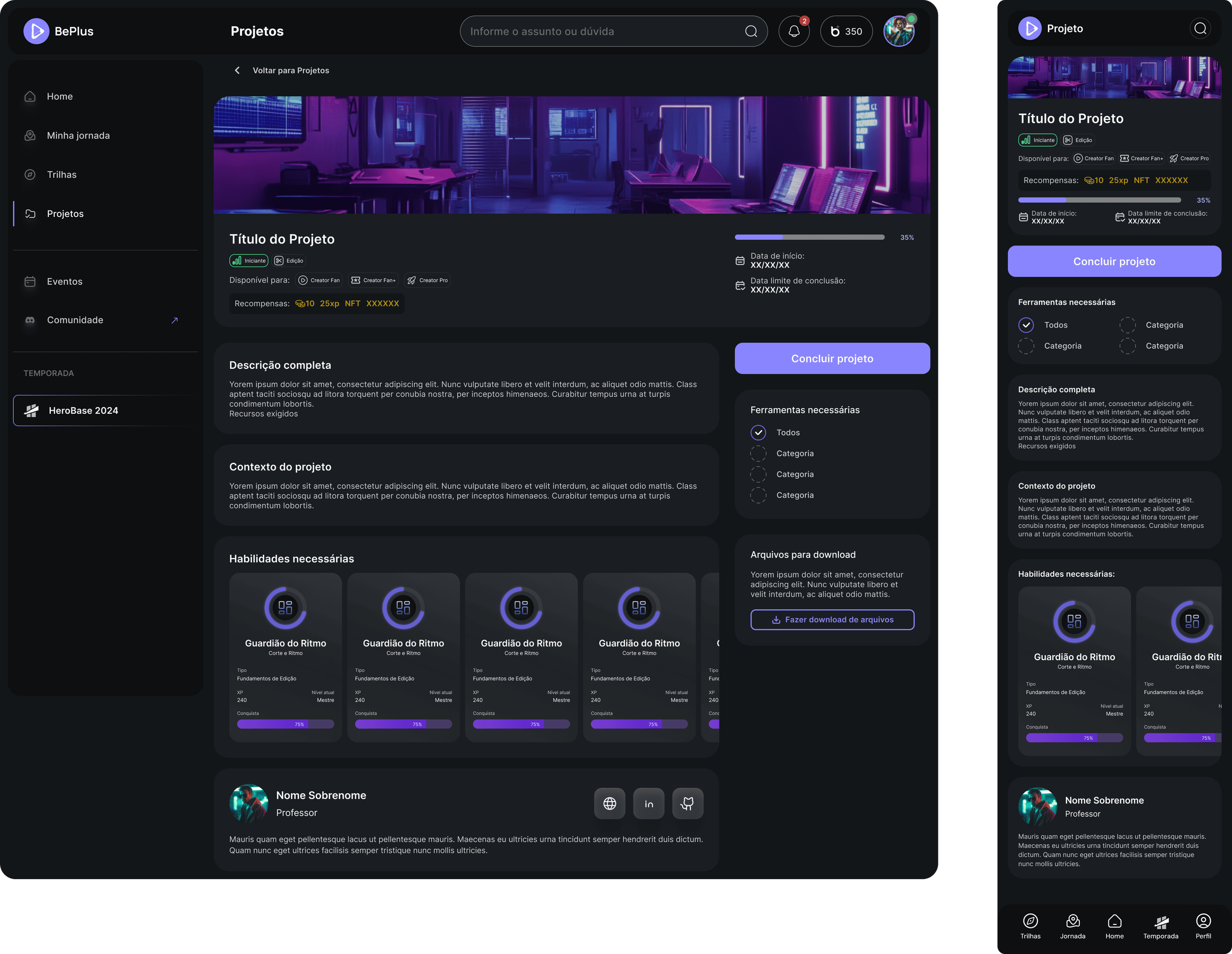
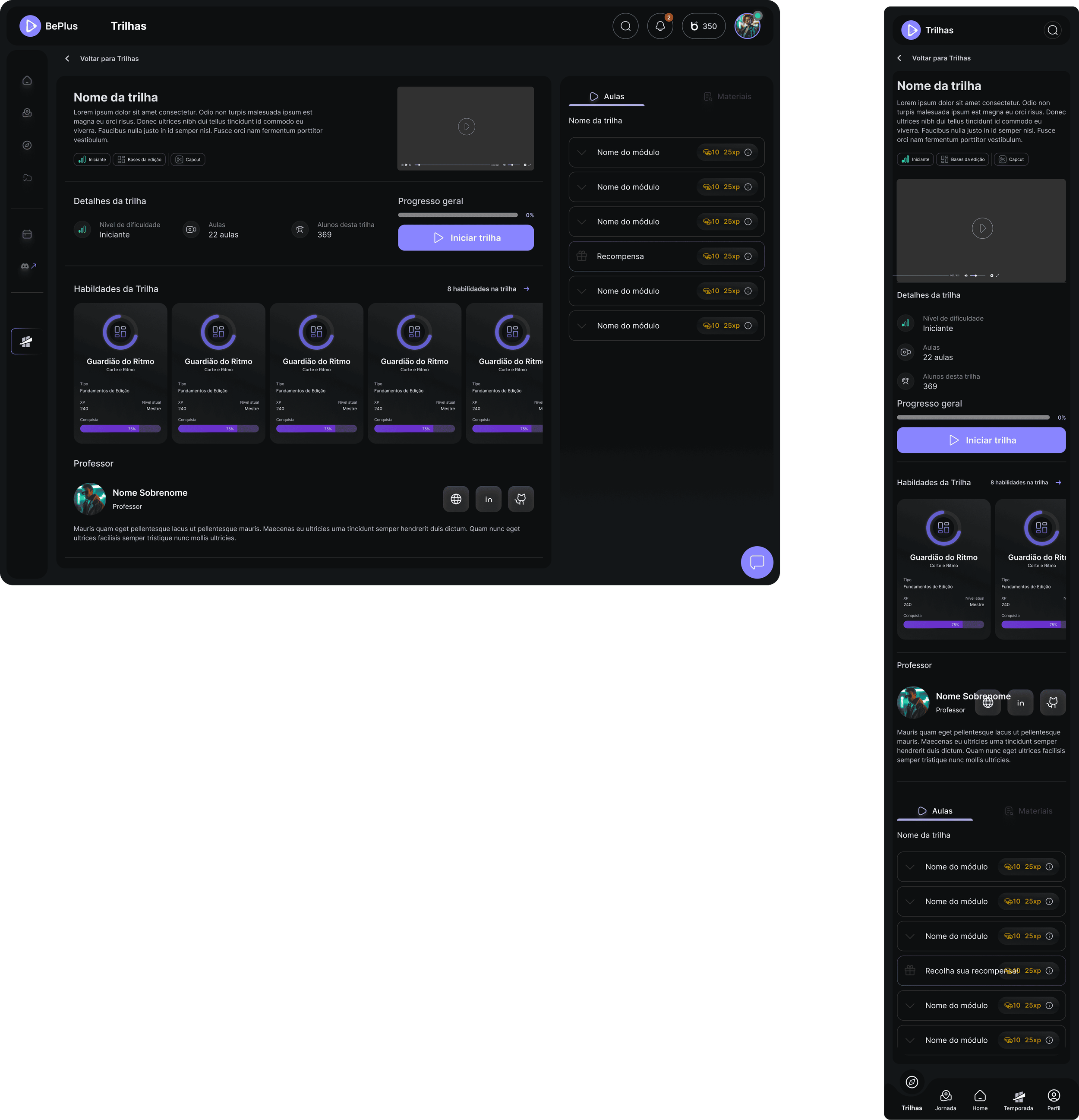
BePlus combines learning tracks, projects, events and skill development into a single product ecosystem.
Multiple learning experiences needed to feel like parts of the same product.
Learning tracks, practical projects, events and skill progression had to connect clearly without making the experience feel complex.
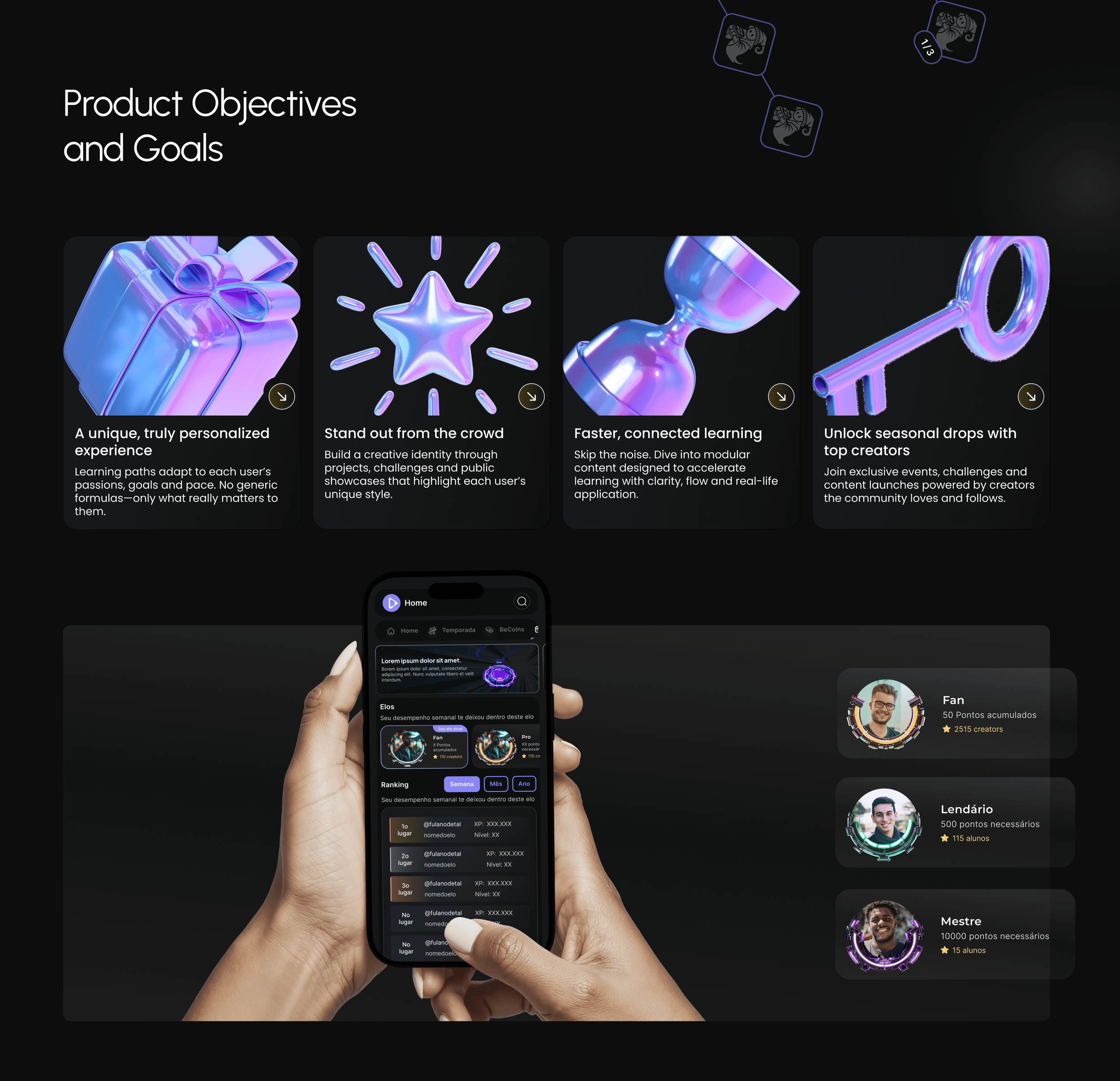
Four promises the interface had to keep.
A unique, truly personalised experience
Learning paths adapt to each user's passions, goals and pace. No generic formulas — only what really matters to them.
Stand out from the crowd
Build a creative identity through projects, challenges and public showcases that highlight each user's style.
Faster, connected learning
Skip the noise. Modular content designed to accelerate learning with clarity, flow and real-life application.
Unlock seasonal drops with top creators
Exclusive events, challenges and content launches powered by the creators the community already follows.
Difficulty engaging users
New users feel lost during their first interaction with the platform, lacking clear guidance or personalised entry points that match their interests.
Interactive and personalised onboarding
An onboarding flow that adapts to each user's passions — asking smart questions and suggesting creative paths that match their goals from the start.
Low completion rates in learning tracks
Users start courses and drop out before finishing, from content overload, lack of motivation, or not seeing immediate progress or value.
Gamified system with clear milestones
Visual progress maps, short missions, and reward systems — BeCoins, badges, seasonal drops — that keep users focused on completion.
Market saturation and AI fatigue
The market is flooded with platforms promising personalisation through AI, and most of them deliver something overwhelming and disconnected.
Human-centred personalisation with a creative focus
A guided, interest-driven experience that uses AI in service of creativity. Simple, visual and emotionally engaging — learning that feels like play, not pressure.
For the player, personalisation is what the platform does for them. For the affiliate, it is what they do to the platform.
The brief said personalisation. What that word meant depended entirely on which of the two users you asked, and the two answers were incompatible. Four things had to hold at once.
- Give the platform a brand identity of its own, when what we inherited was a provider template shared with every competitor in the market.
- Serve entertainment and work software from one design system, without either one feeling like a compromise made for the other.
- Give affiliates real control — profile, campaigns, signals, community, analytics — without turning the dashboard into a control panel only an expert could operate.
- Keep it all coherent across four products, two modes and fifteen designers.
The challenge
The brief said personalisation. What that word meant depended entirely on which of the two users you asked, and the two answers were incompatible.
For the player, personalisation is what the platform does for them. For the affiliate, it is what they do to the platform.
Four things had to hold at once:
- Give the platform a brand identity of its own, when what we inherited was a provider template shared with every competitor in the market.
- Serve entertainment and work software from one design system, without either one feeling like a compromise made for the other.
- Give affiliates real control — profile, campaigns, signals, community, analytics — without turning the dashboard into a control panel only an expert could operate.
- Keep it all coherent across four products, two modes and fifteen designers.
Every idea was once a dream of the project's creator. My job as a lead is to make those ideas tangible.
The main challenge in BePlus was turning a complex idea into a functional, engaging user experience. The focus was on aligning business goals, technology and design into one cohesive product.
That meant leading the creation of personalised learning flows, gamified systems and community features that worked with AI-driven content — designing clear navigation, reducing friction, and building an interface that could grow with the platform.
Business ideas into business requirements
Translating ideas into the team's scope — transforming them from the intangible into project documents.
Design and business alignment
- Pricing format
- MVP planning
- Gamification mechanisms
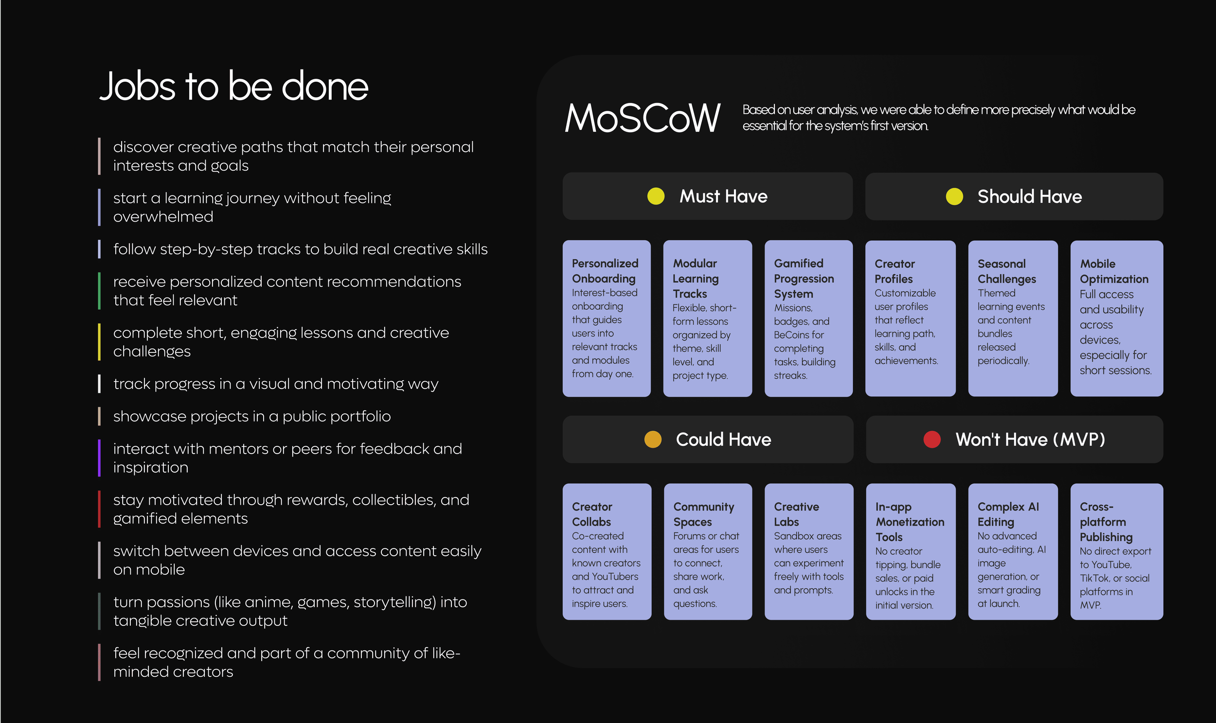
- Jobs to be done
- Team growing
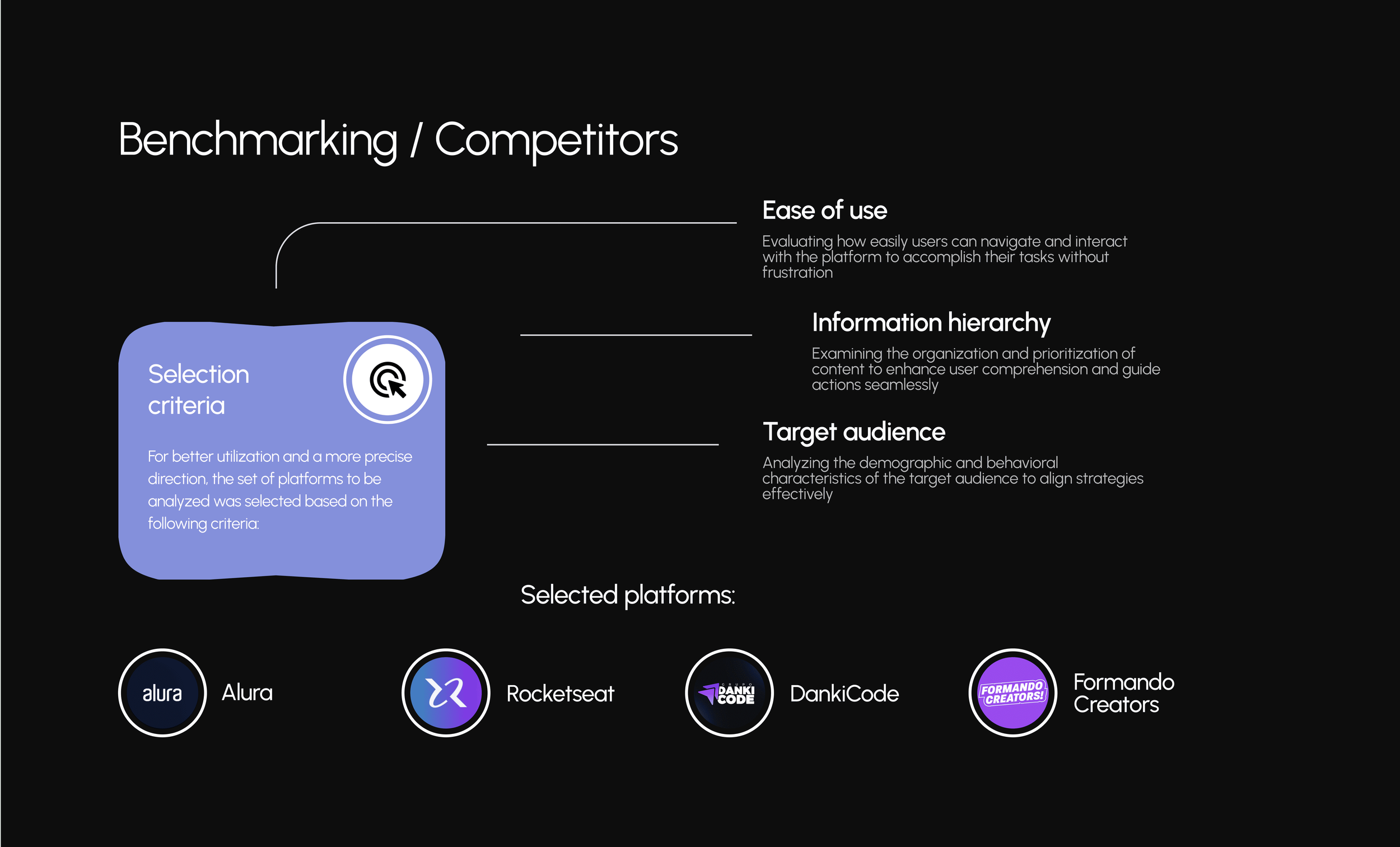
- Competitor comparison
- Tactical planning
- Persona detailing
- RACI matrix
- AI interface
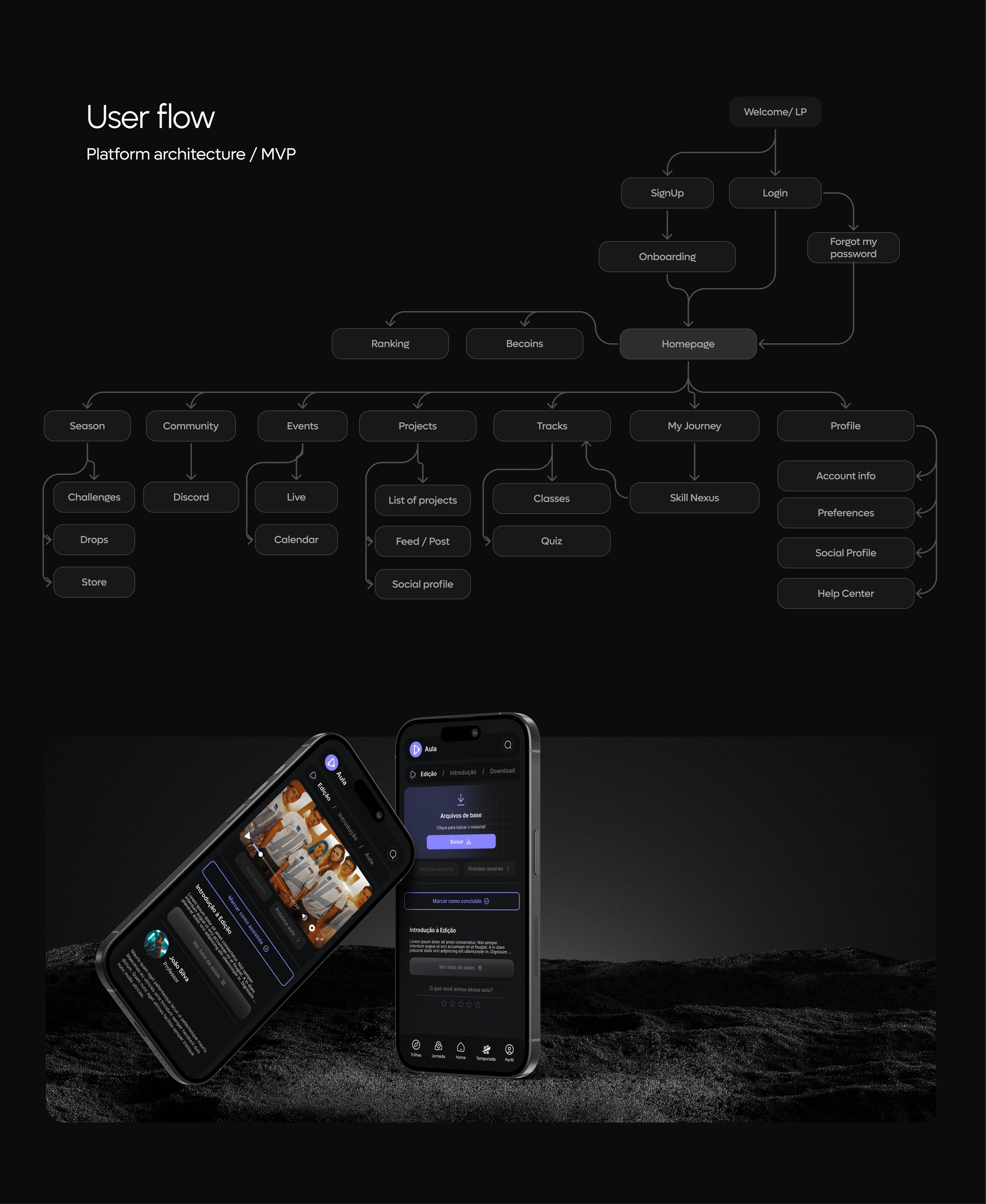
- Sitemap
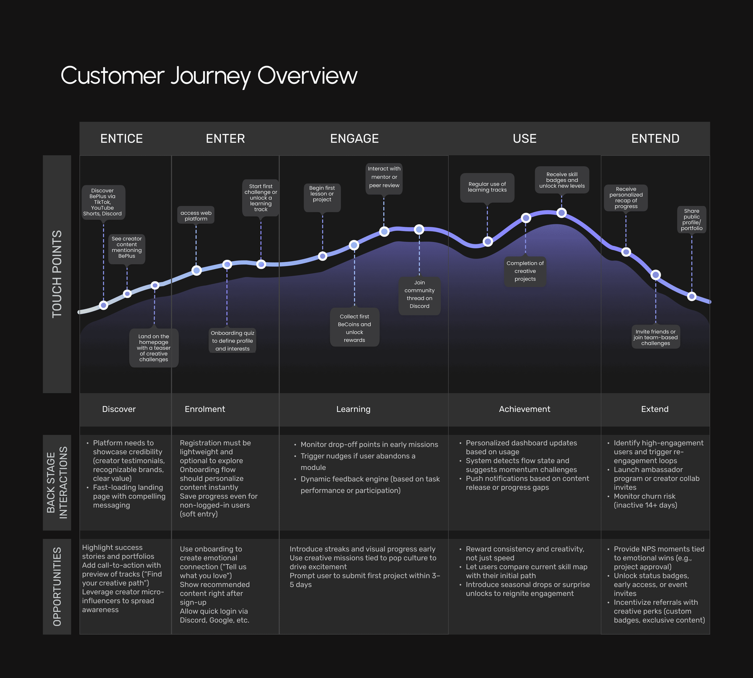
- Journey mapping
- Versioning control
- Creator relations
Service blueprint
Flow prioritisation, backlog and roadmap planning
The team's ceremonies
Kickoff, weekly, daily, approval rituals, retros, design QA, development QA.
Design system
Metrics, in three layers
Business — engagement and acquisition, retention and conversion, DAU/WAU, churn and churn reason codes, time to first value, CAC, conversion per funnel step, session duration, feature adoption, D1/D7/D30 cohort retention, reactivation, LTV per segment and track, referral.
Design — task time, task success rate, drop-off per step, navigation path length, rage and dead clicks, CSAT/SUS/UMUX-Lite/SEQ, heuristic violation count, track completion rate, seasonal drops redemption, AI recommendation acceptance rate.
Internal design — cycle time, time to market, velocity and capacity per designer, on-time task completion, rework rate post handoff, design system coverage, design QA bug rate.
Research, design, test, improve
The loop the other seven exist to feed.
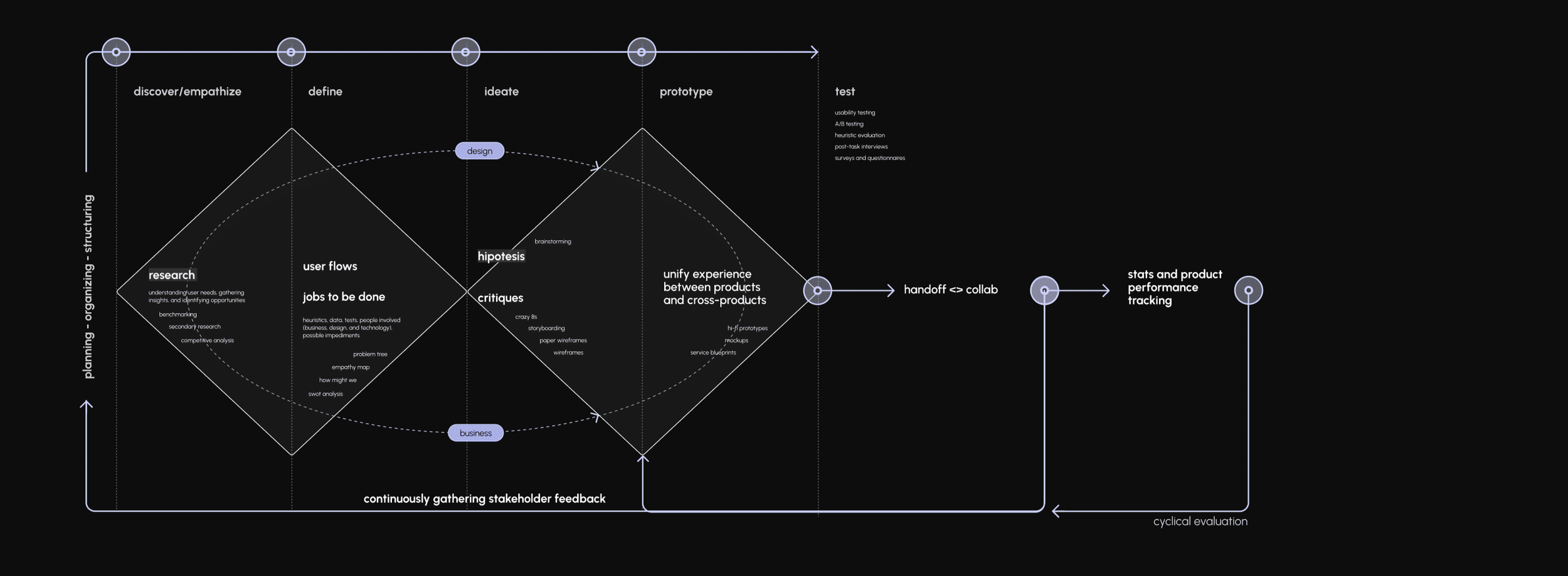
Nine steps, and the last one is the one teams skip.
- Discover — finding the problem and defining the parameters of success
- Business analysis — how can we solve it and make it a business?
- Ideate — solution hypothesis and brainstorming
- Solution evaluation — breaking down the complicated into simple
- Prototype and testing — corridor and usability tests
- Final design — team review
- Development — quality control and answers to questions
- Release — watching how users behave
- Metrics analysis — checking to see if the hypothesis worked
Stakeholder feedback gathered continuously, across every phase — not at the end.
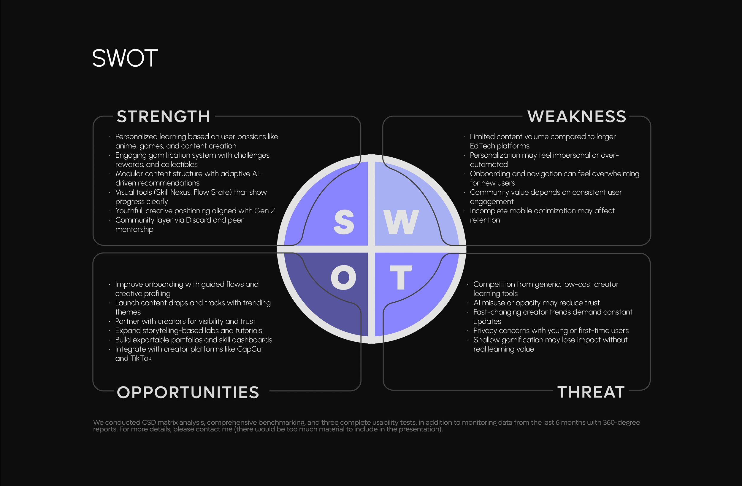
Discover and empathize · define · ideate · prototype · test. Research, benchmarking and competitive analysis on the way in; user flows, jobs to be done and SWOT at the narrow point; Crazy 8s, storyboarding and wireframes on the way back out.
Handoff and collaboration with development, then stats and product performance tracking.
Cyclical evaluation sends the whole thing back to discovery.
Data whispers, but insights shout.
We started with secondary research, using what the marketing and business teams already had: user demographics, engagement metrics from social platforms, behavioural analytics from landing pages, and feedback collected through support channels and surveys. That gave us the audience segments and the first hypotheses about motivations and pain points.
Then exploratory research — persona field analysis built on qualitative insights, competitive benchmarking, and contextual inquiry. We studied content consumption habits, learning preferences and creative aspirations by analysing adjacent platforms in EdTech, creator tools and entertainment-driven education.
And finally validation: user interviews and card sorting, to understand mental models, learning goals and engagement triggers. Alongside it ran a CSD matrix, three complete usability tests, and six months of monitored data with 360-degree reports.
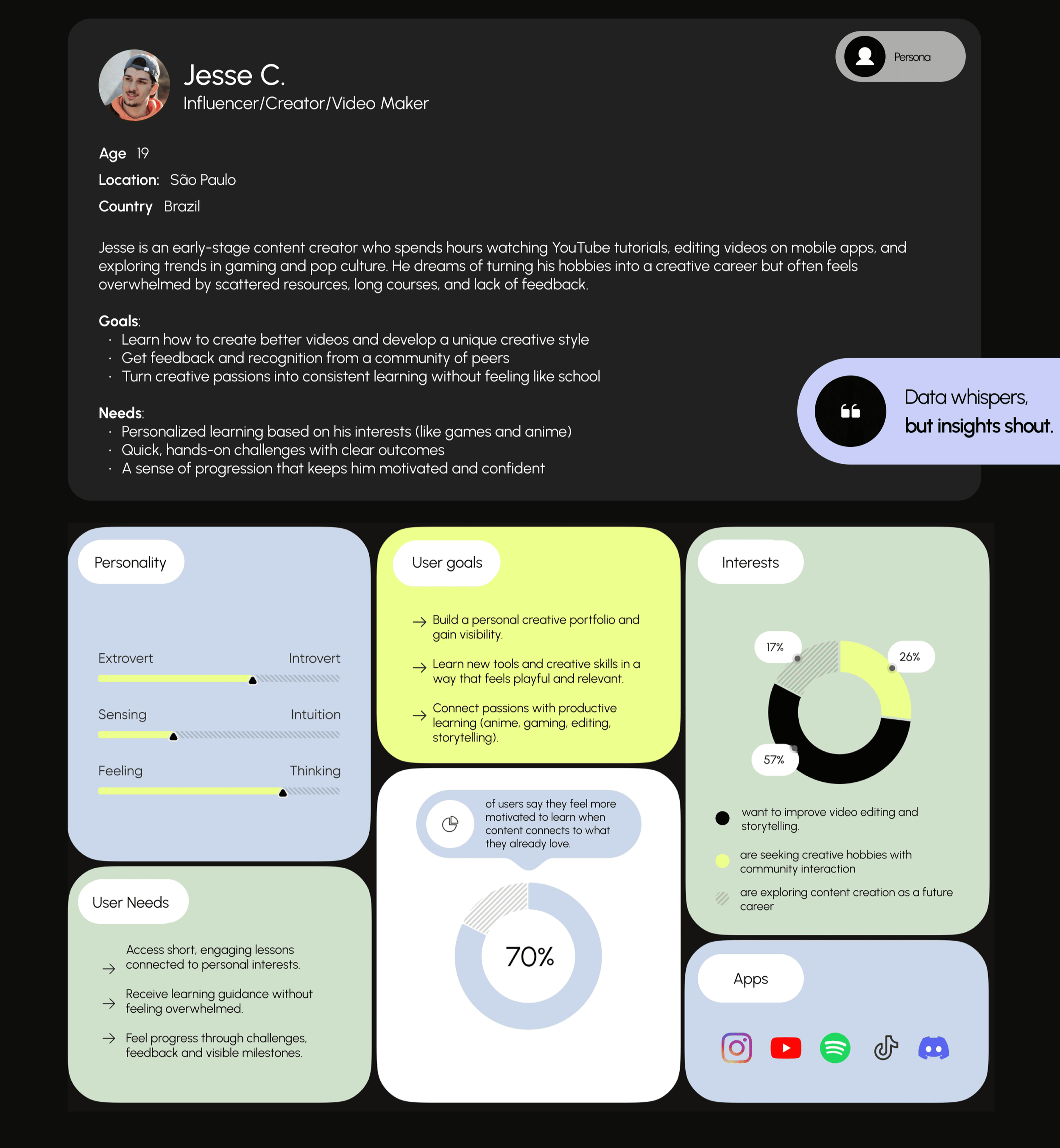
An early-stage creator who spends hours on YouTube tutorials and edits video on his phone.
He dreams of turning his hobbies into a creative career, and he is overwhelmed by scattered resources, long courses and a total absence of feedback.
- Goals — make better videos and develop a style of his own; get feedback and recognition from peers; turn creative passions into consistent learning without it feeling like school
- Needs — personalised learning based on what he actually likes; quick hands-on challenges with clear outcomes; a sense of progression that keeps him confident
- Where he already is — Instagram, YouTube, Spotify, TikTok, Discord
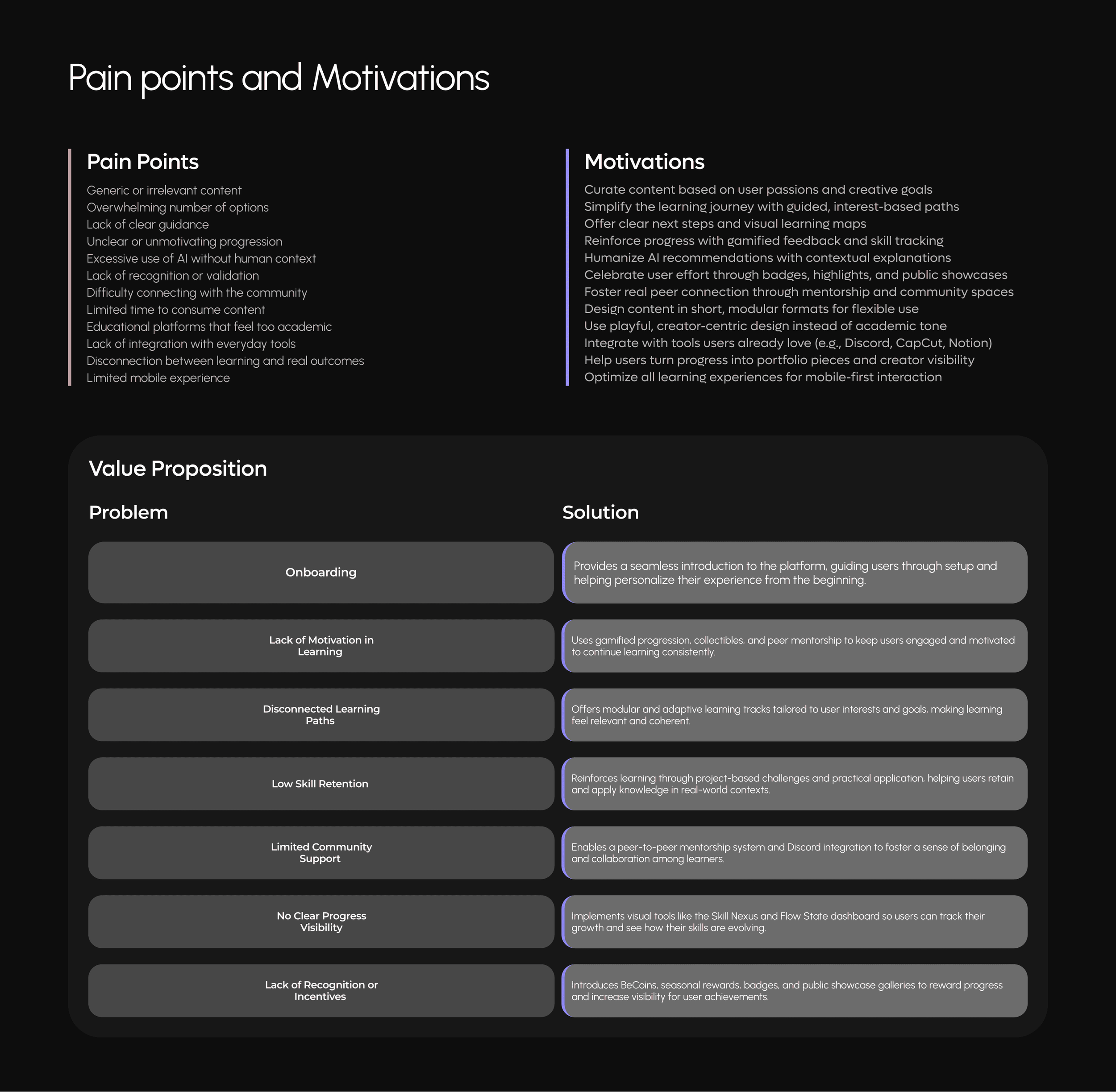
- Generic or irrelevant content
- Overwhelming number of options
- Lack of clear guidance
- Unclear or unmotivating progression
- Excessive use of AI without human context
- Lack of recognition or validation
- Difficulty connecting with the community
- Limited time to consume content
- Educational platforms that feel too academic
- Lack of integration with everyday tools
- Disconnection between learning and real outcomes
- Limited mobile experience
- Curate content based on user passions and creative goals
- Simplify the journey with guided, interest-based paths
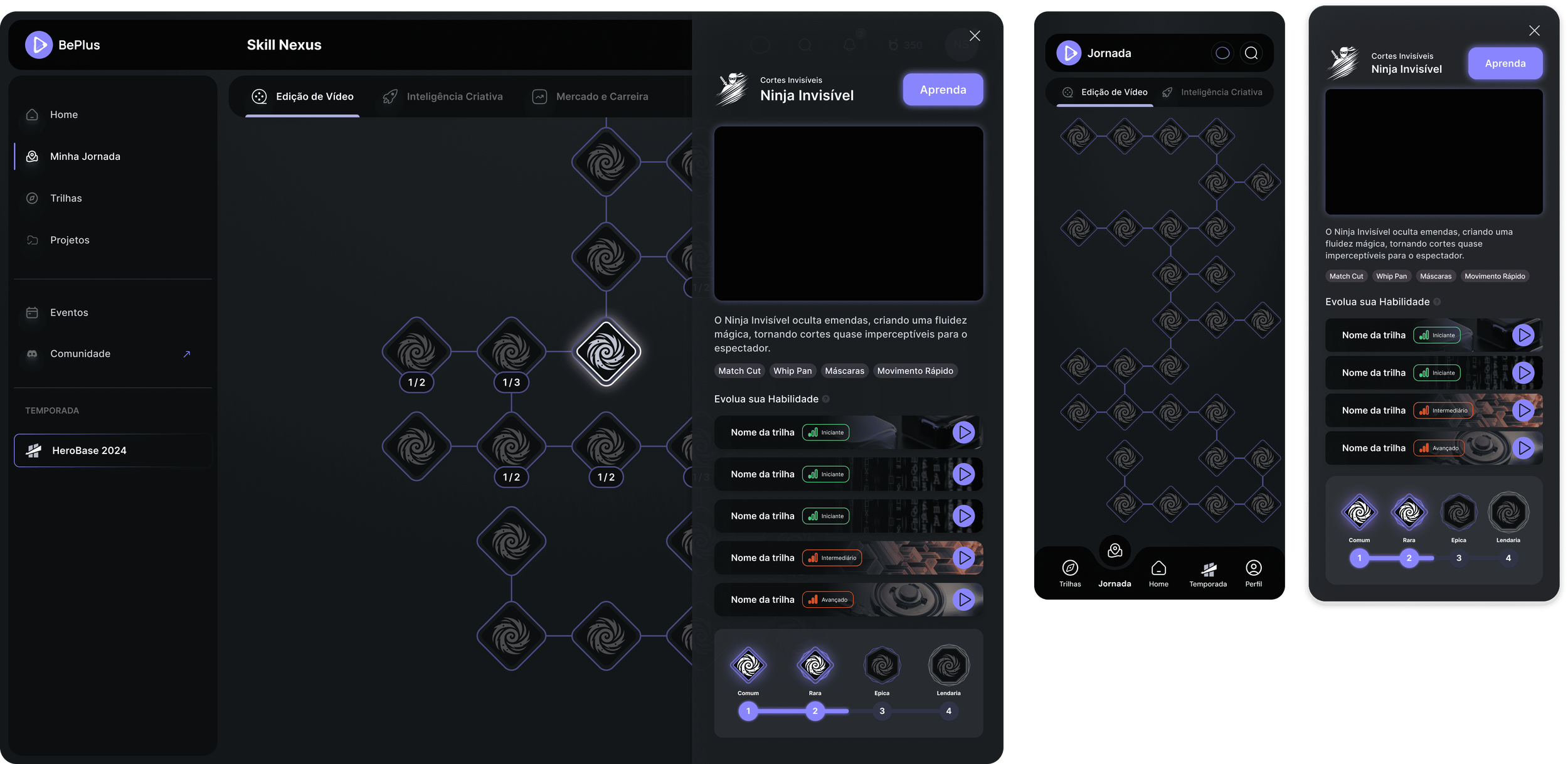
- Offer clear next steps and visual learning maps
- Reinforce progress with gamified feedback and skill tracking
- Humanise AI recommendations with contextual explanations
- Celebrate effort through badges, highlights and public showcases
- Foster real peer connection through mentorship and community spaces
- Design content in short, modular formats
- Use playful, creator-centric design instead of an academic tone
- Integrate with tools users already love — Discord, CapCut, Notion
- Help users turn progress into portfolio pieces and visibility
- Optimise every learning experience for mobile-first interaction
Seven problems, and what the product does about each one.
A seamless introduction to the platform, guiding users through setup and helping personalise the experience from the beginning.
Gamified progression, collectibles and peer mentorship keep users engaged enough to continue consistently.
Modular and adaptive learning tracks tailored to interests and goals, so learning feels relevant and coherent.
Project-based challenges and practical application, so knowledge survives the lesson.
Peer-to-peer mentorship and Discord integration, to build belonging rather than a forum.
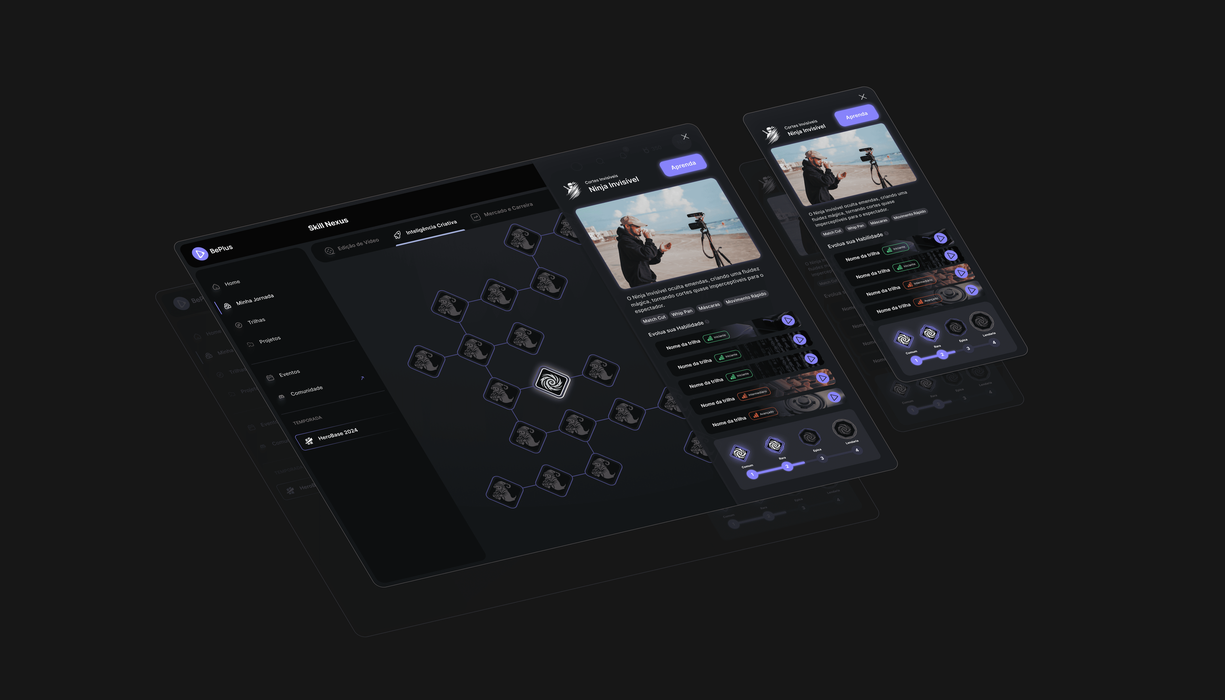
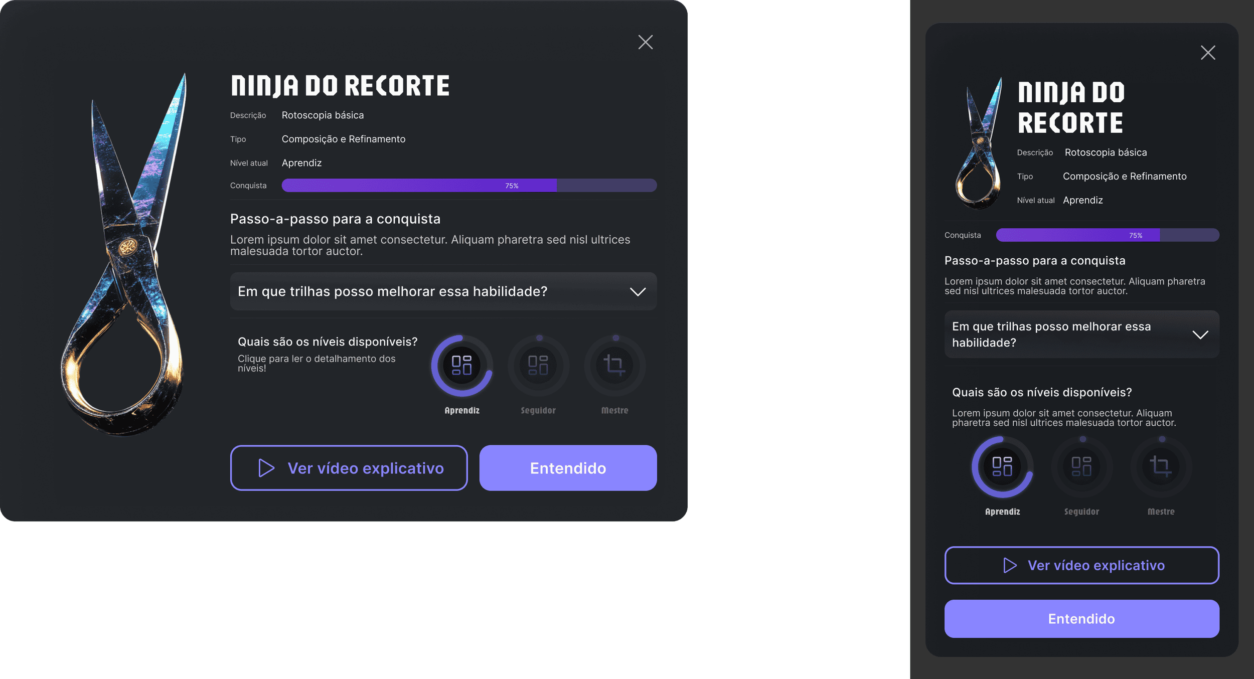
Skill Nexus and the Flow State dashboard, so users can see how their skills are evolving.
BeCoins, seasonal rewards, badges and public showcase galleries.
A system built to survive a platform that adds a feature every sprint.
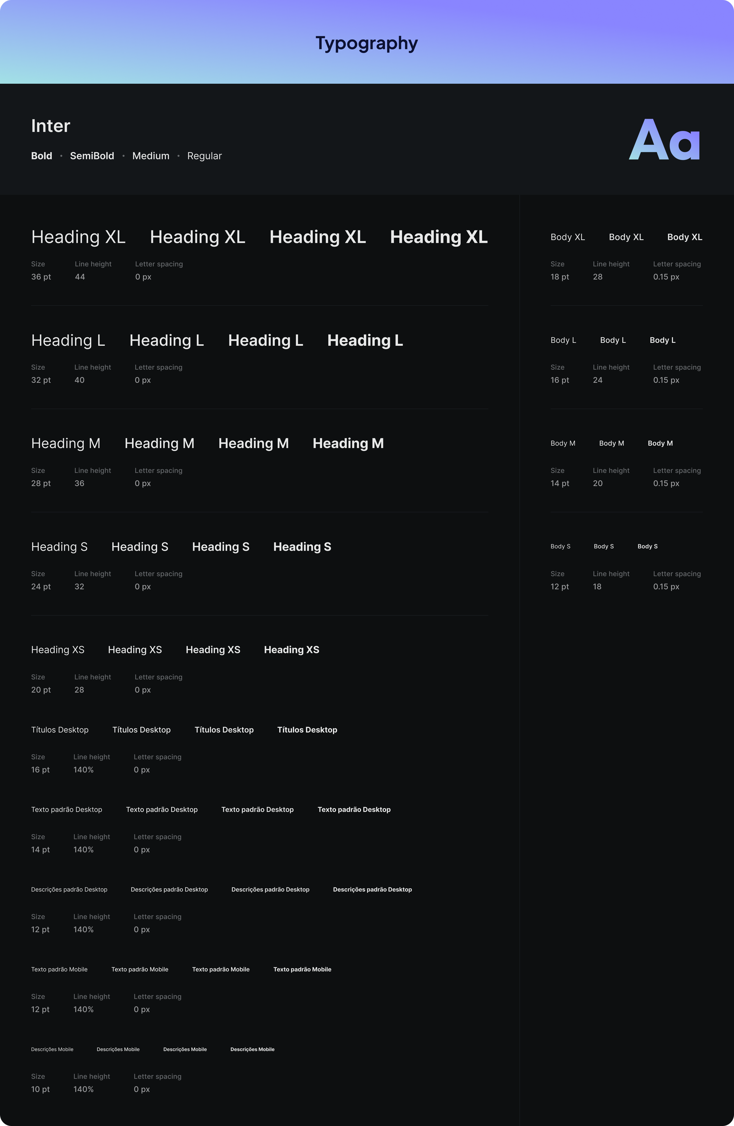
Inter
One family, carrying an interface that has to hold dense dashboards and short mobile sessions without changing register.
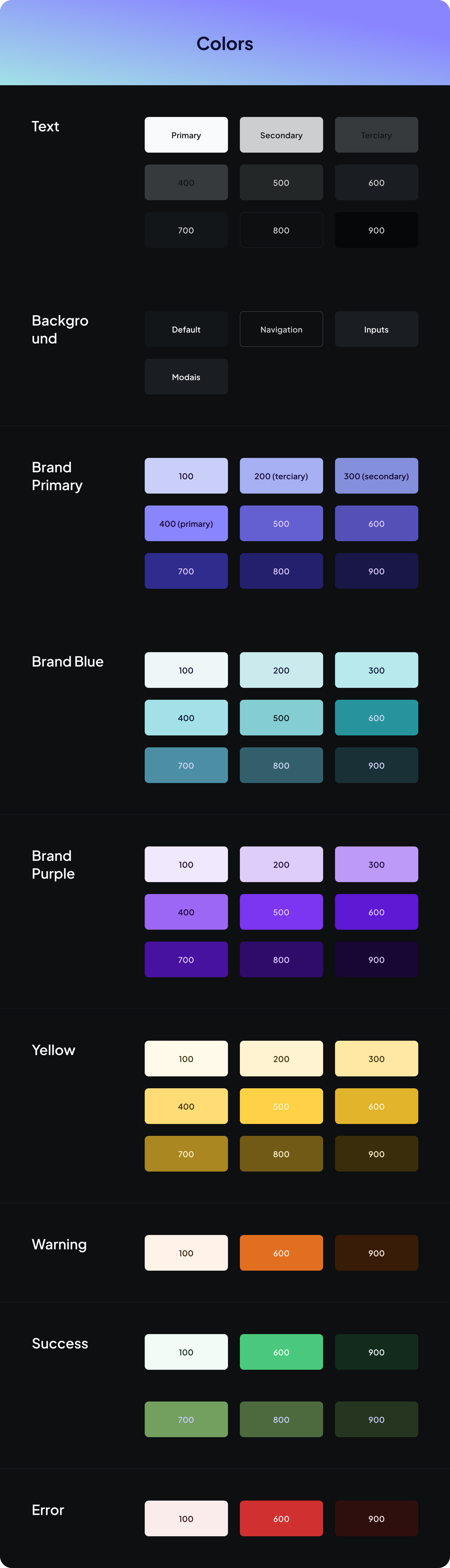
One purple, three grounds
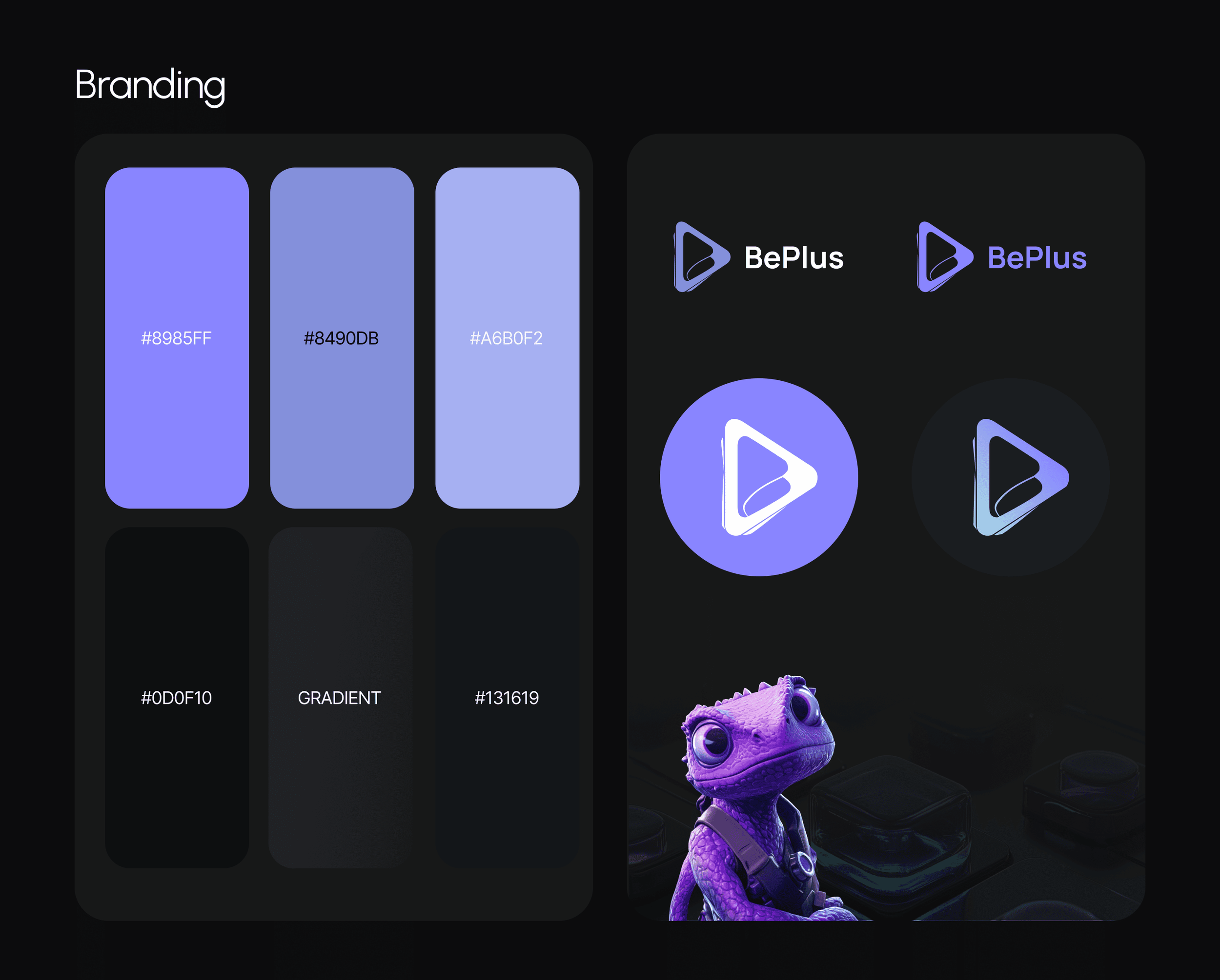
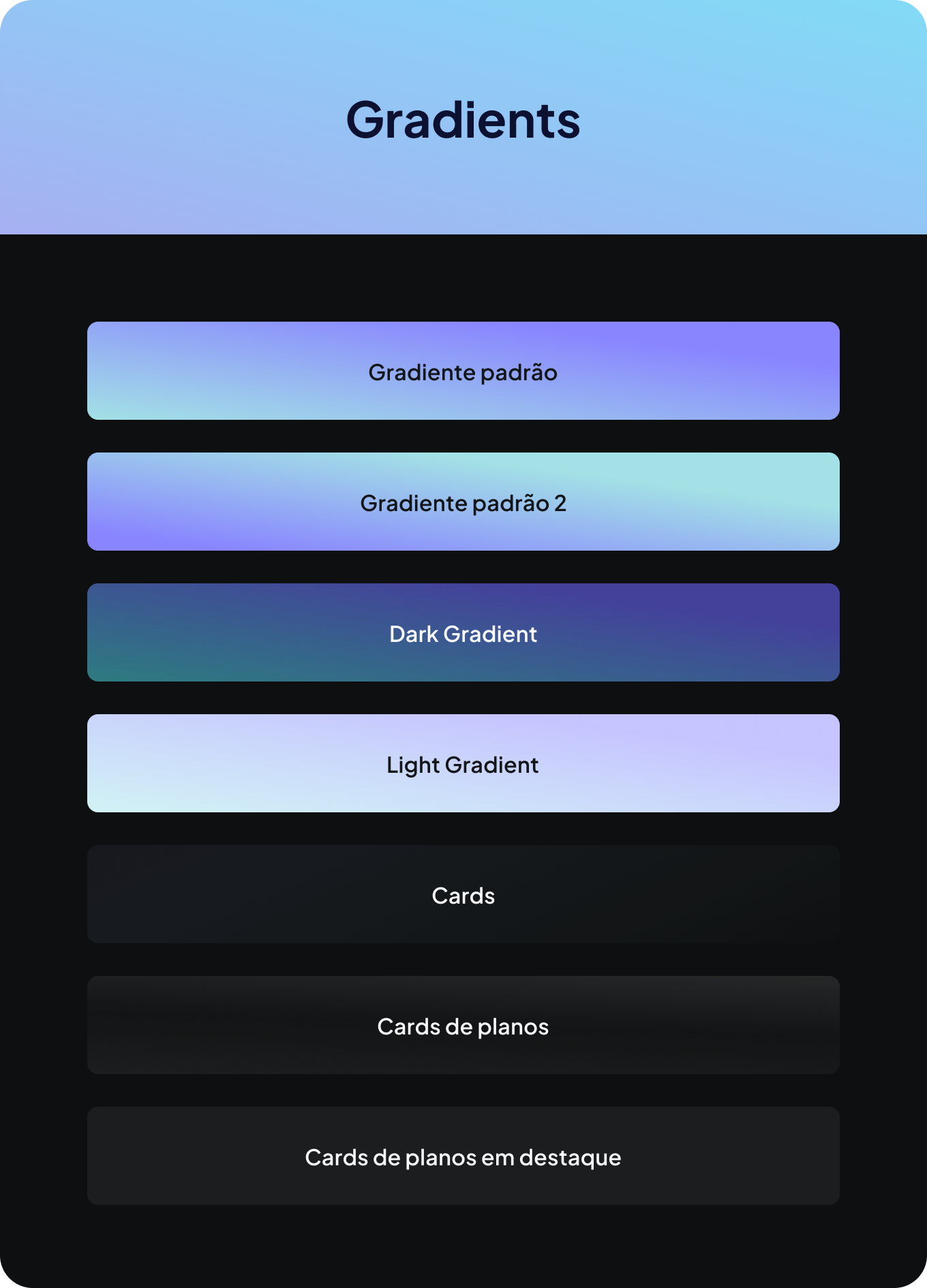
A primary ramp of #8985FF, #8490DB and #A6B0F2 against #0D0F10 and #131619, plus a gradient. The product lives in dark because its audience does — editing at night, on a phone, next to a game.
A play button and a mascot
The mark is a play triangle with a fold in it, working in full colour, in a circle, and as a flat monochrome icon. The mascot carries the tone the interface cannot — the part of the brand that says this is not school.
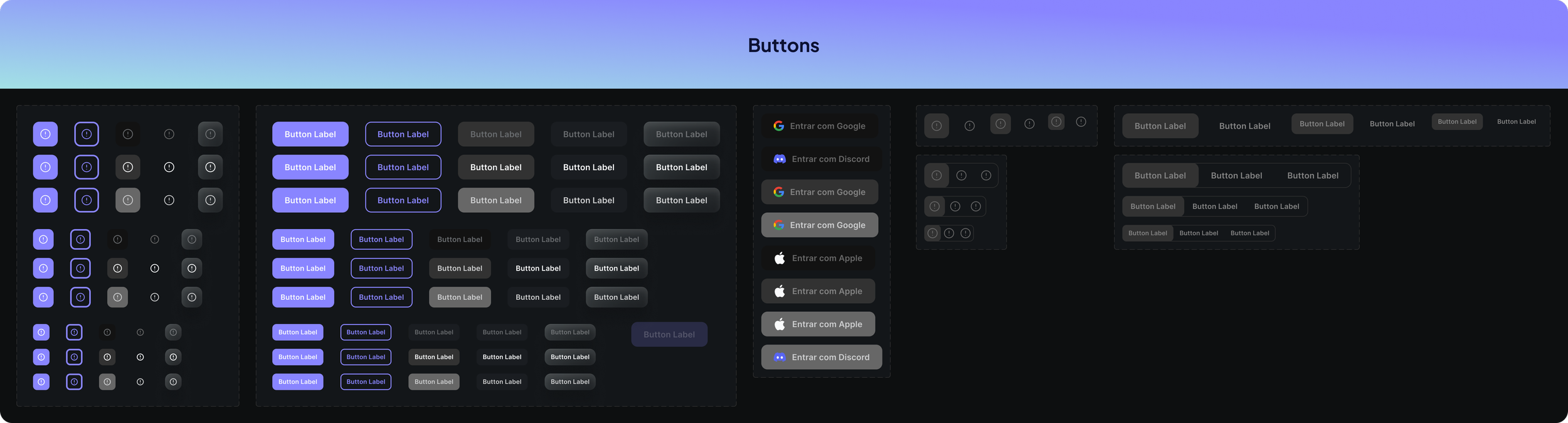
Built for four states before three screens
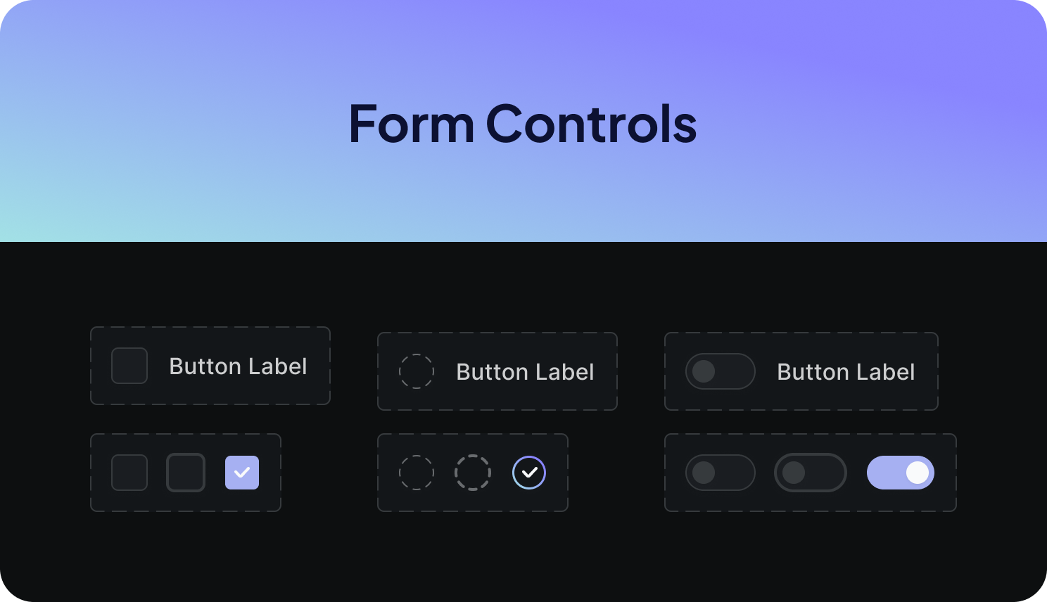
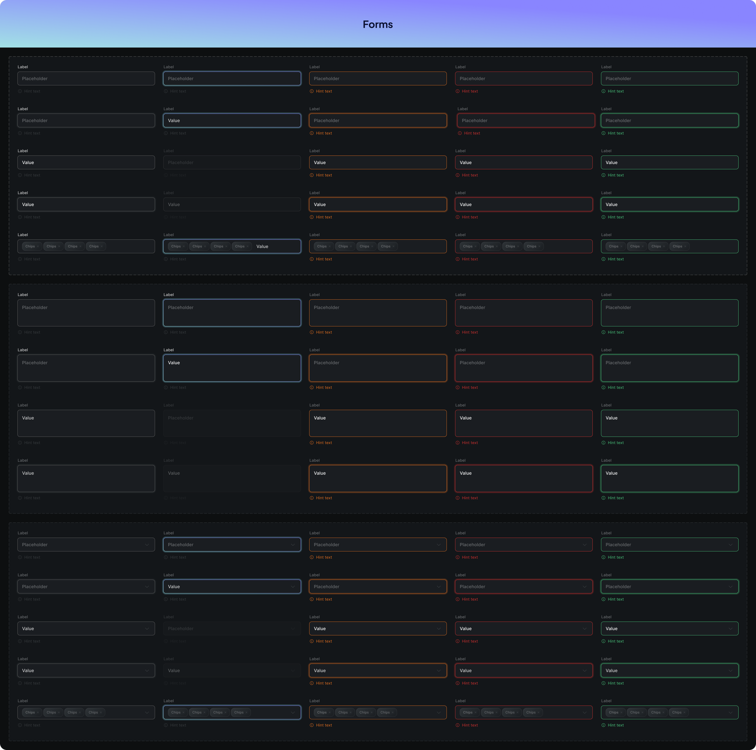
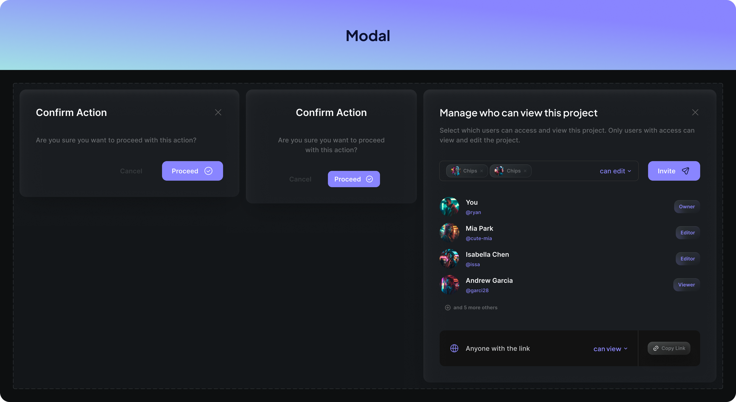
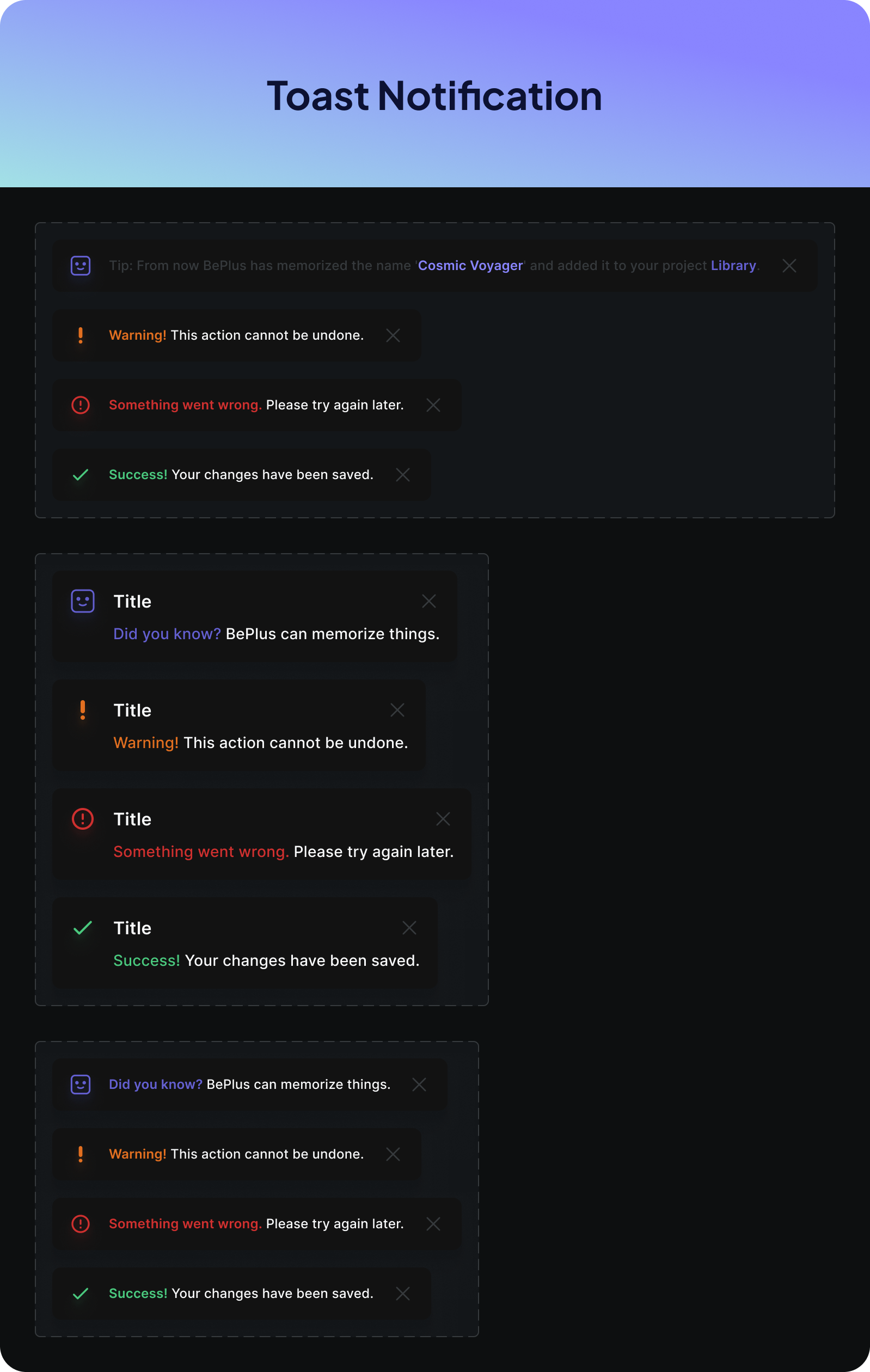
Icons and buttons drawn across default, hover, active, disabled and focus from the start — because a platform shipping weekly cannot stop to retrofit states.
The graphic set of presentation file lives on Behance.
For graphic visualization, this project is also published in the Behance gallery.
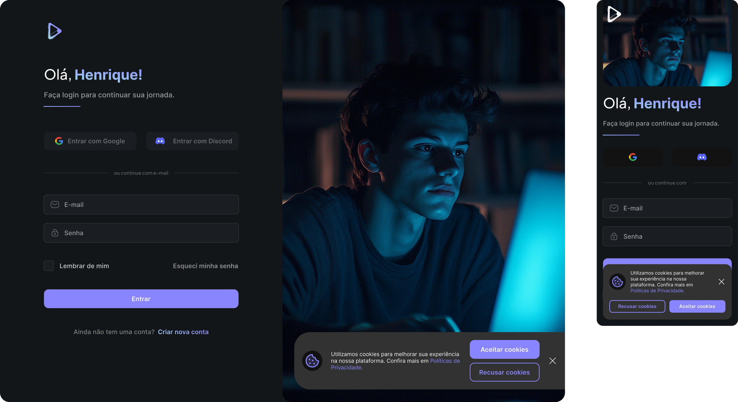
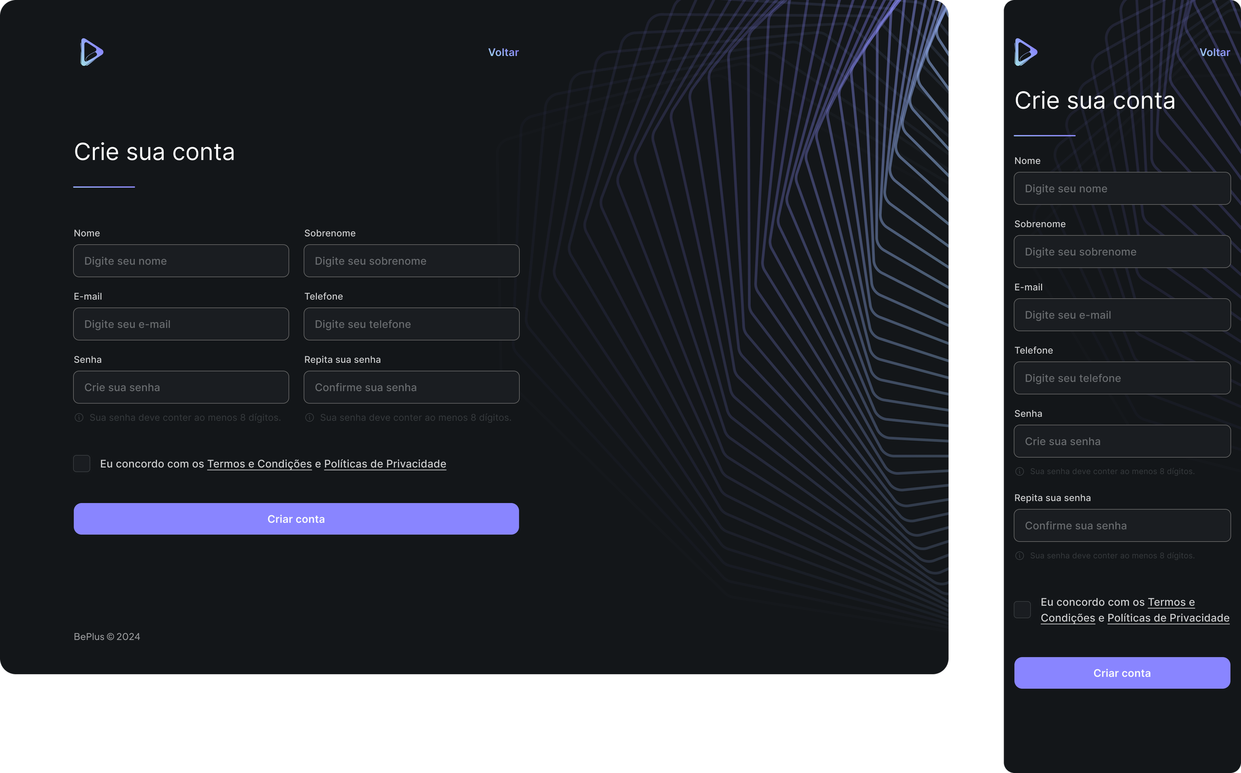
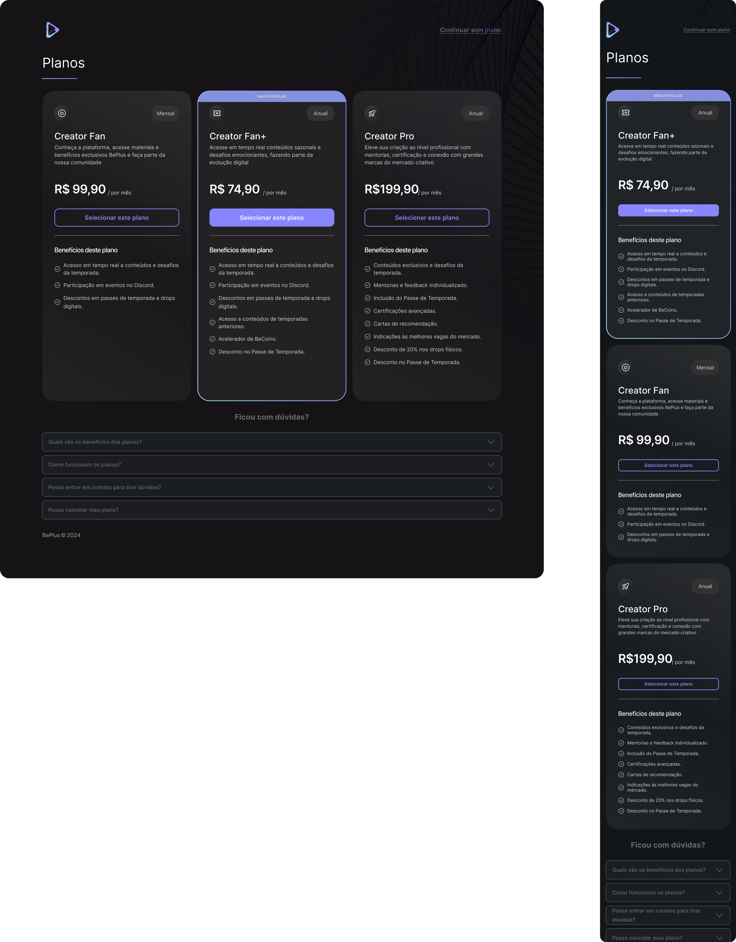
View the full project on Behance ›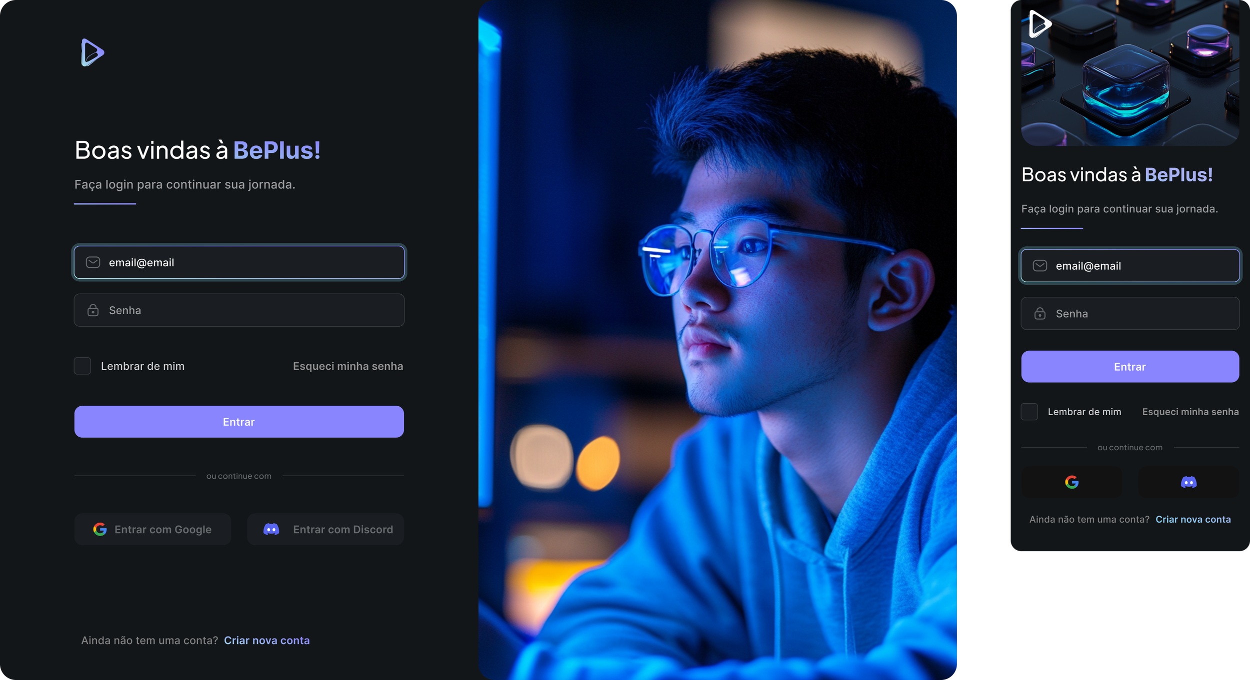
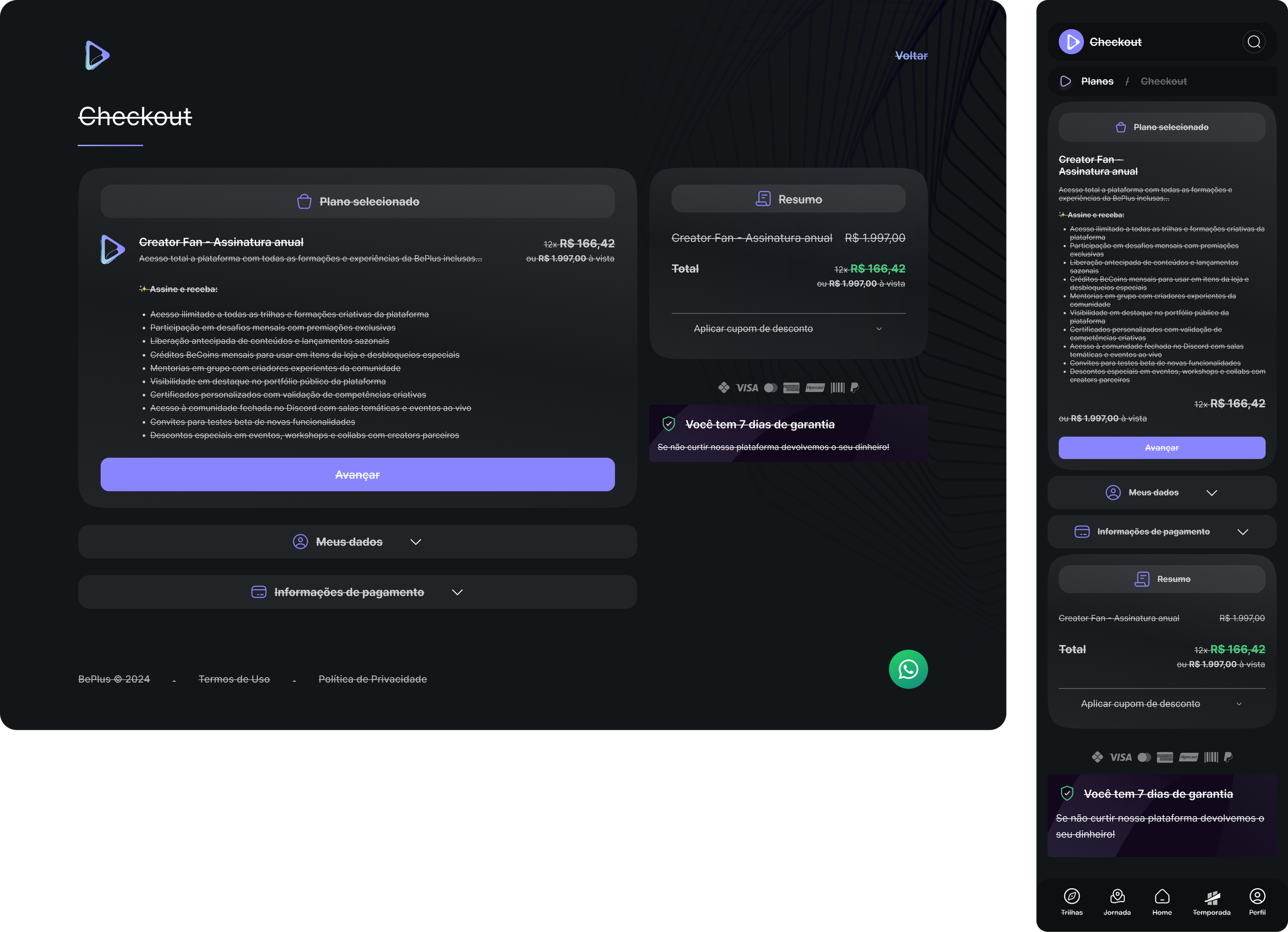
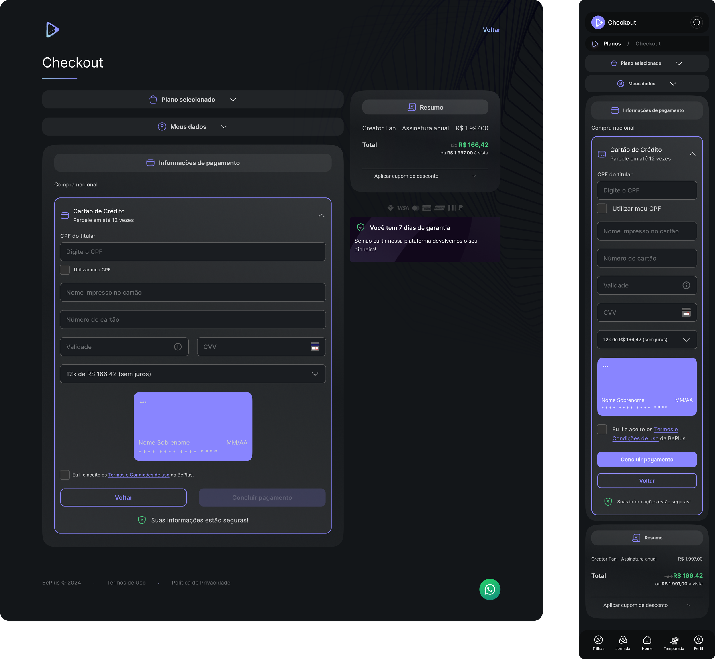
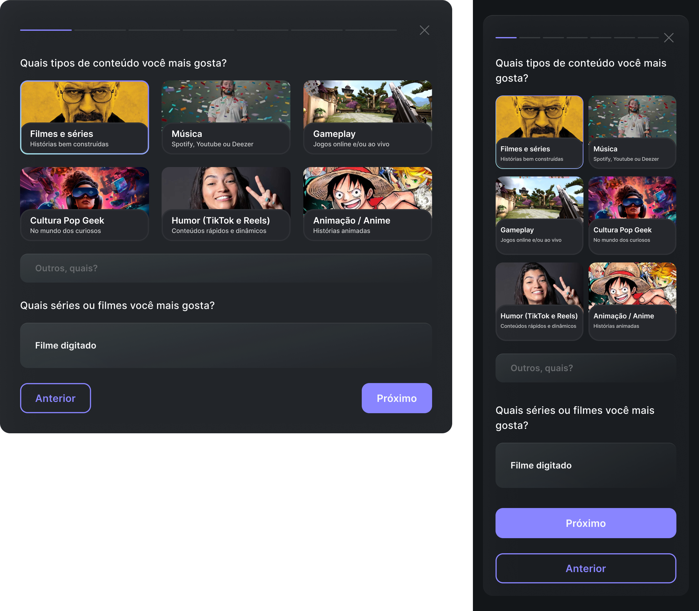
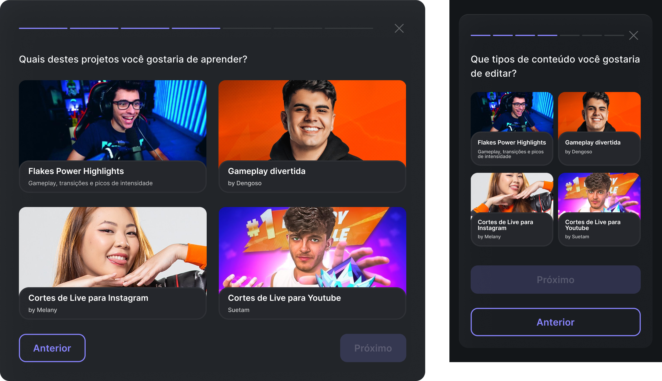
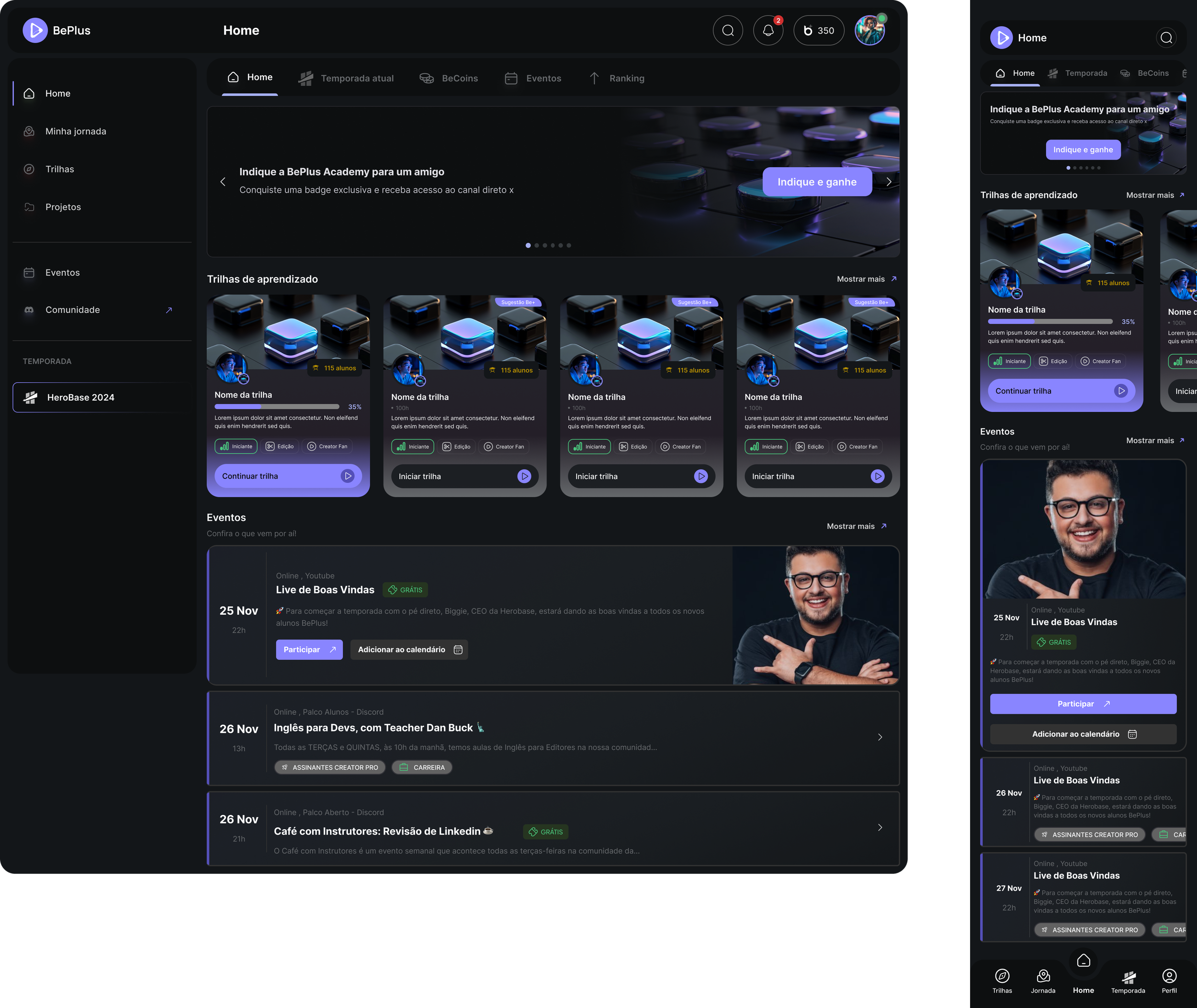
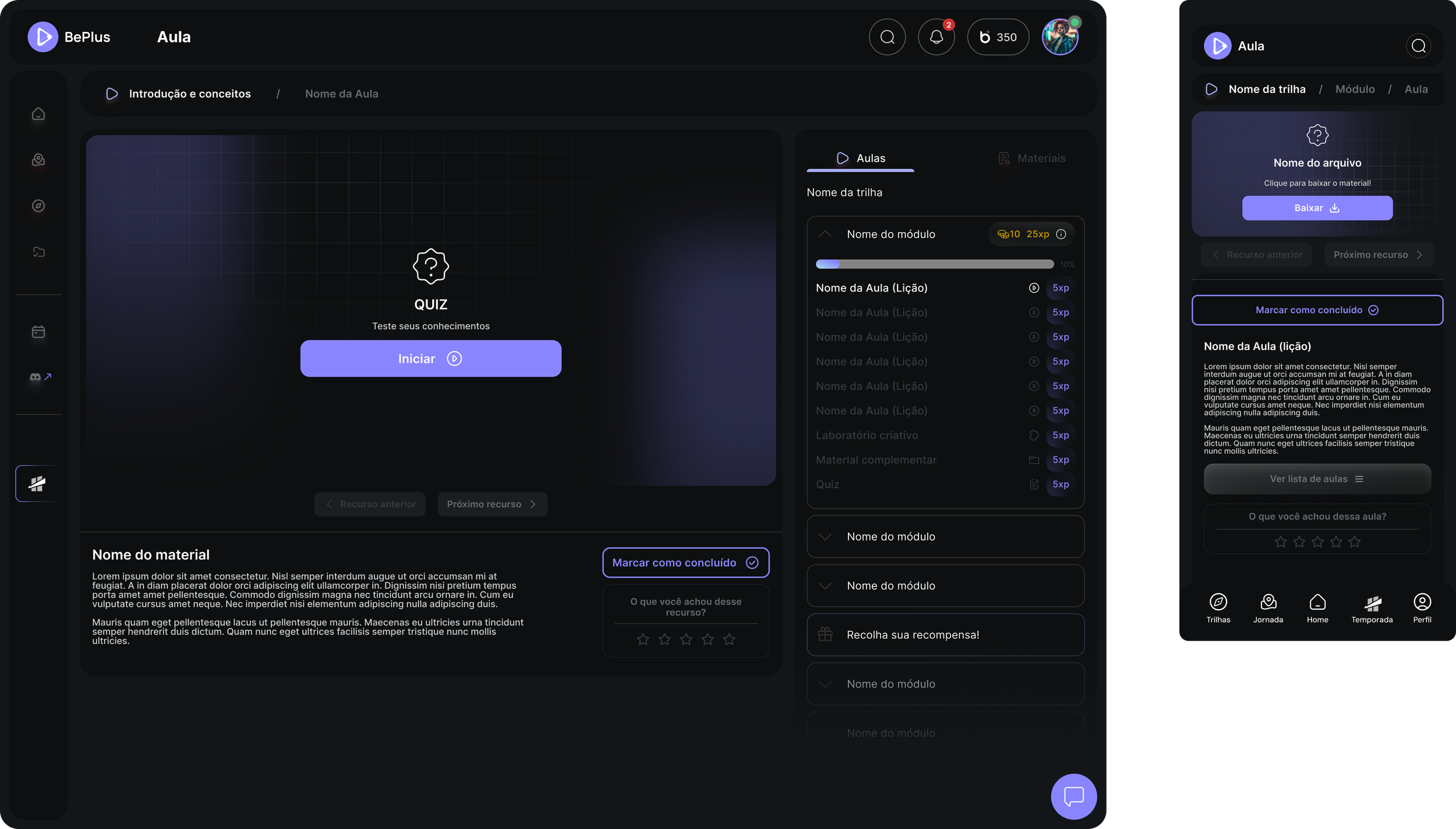
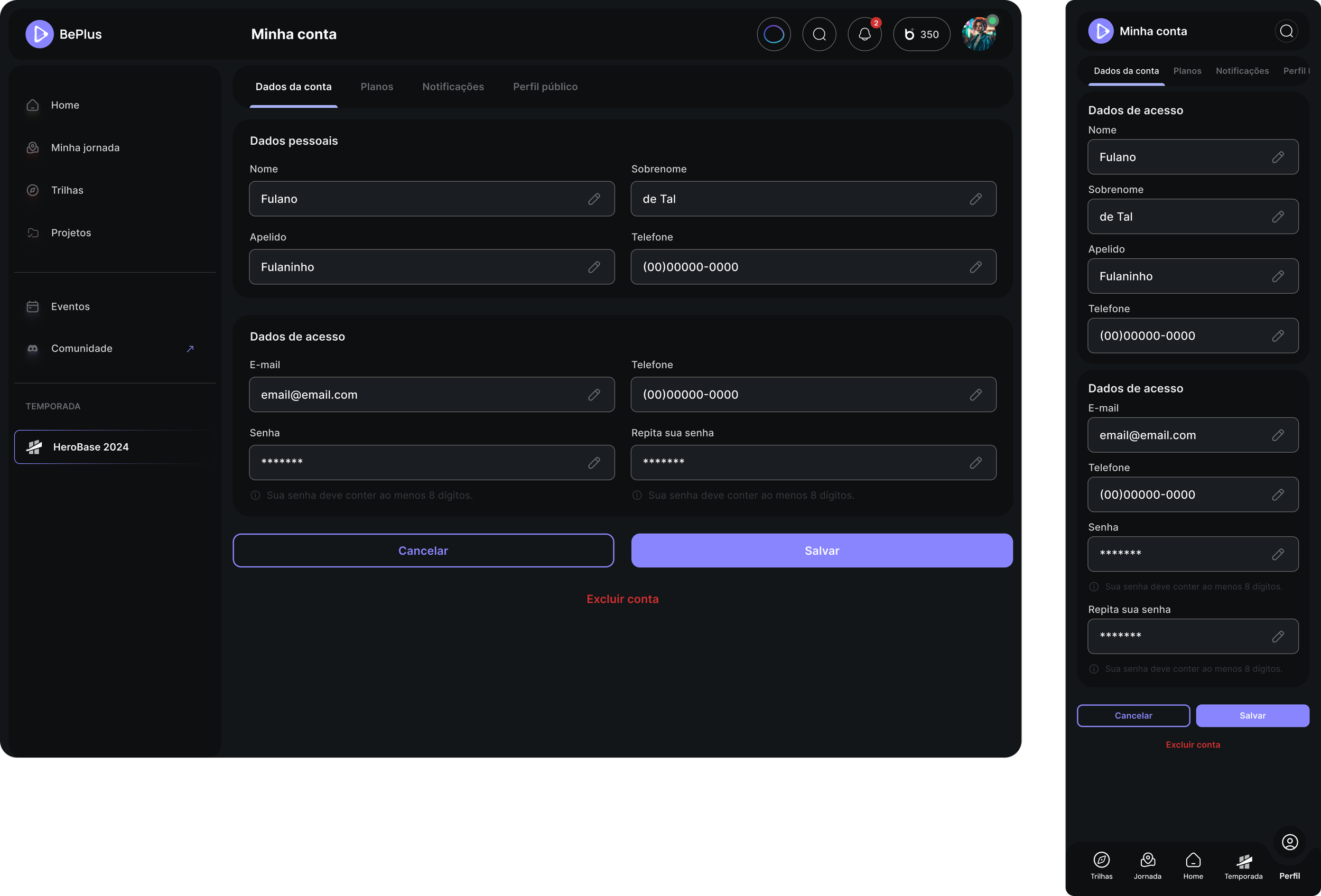
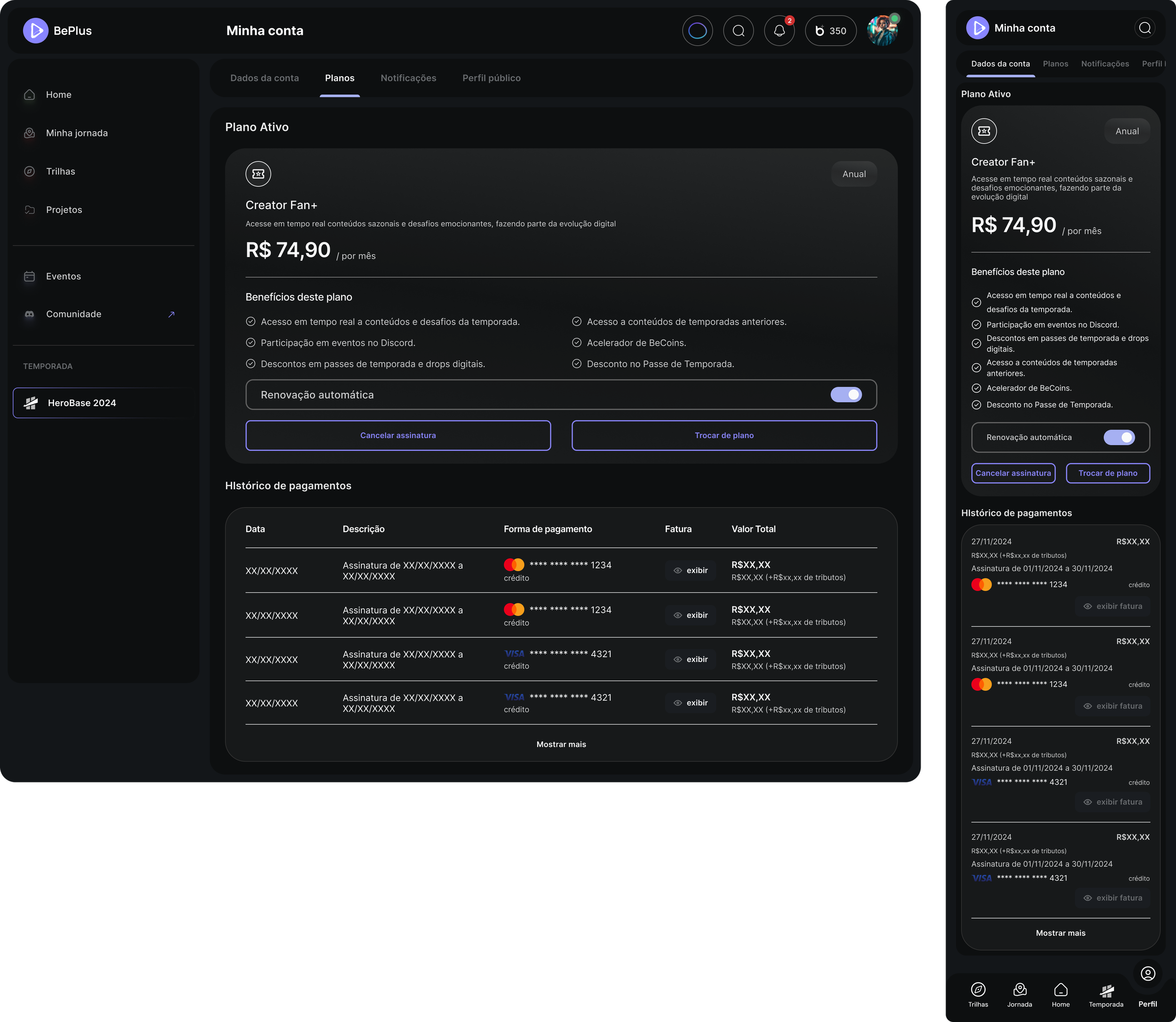
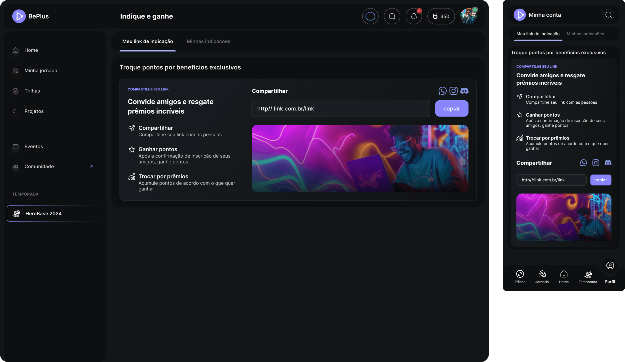
Let's check some projections
The product's performance data is under NDA. Downloads, CAC, profit, daily platform usage and referral acquisition were all tracked — and none of them are mine to publish.
What I can show is the shape of the delivery and the targets the design team set. The OKRs below were a forecast produced by design to be proposed to the business team. They are not official company data and they do not reflect internal practice.
Successful launch and initial user activation
Key result: 1,000 users completing onboarding in the first 30 days.
Strategy: a personalised onboarding flow with interest mapping, track suggestions and guided missions that lower cognitive load from day one.
Measured by: new users completing onboarding · first mission or lesson started · time to first interaction.
Validate the learning experience through project submission
Key result: 300 users completing and submitting their first creative project within the first month.
Strategy: a modular track with a clear start and end, visual progress indicators, nudges, and easy project upload.
Measured by: project submission rate · lesson completion rate · average track progression in the first 7 days.
Establish community and reward loops
Key result: 500 interactions in the community layer in the first 30 days.
Strategy: themed missions with discussion prompts, activated mentors, and early rewards through BeCoins and seasonal drops.
Measured by: active users in community channels · peer reviews submitted · BeCoins earned and redeemed.
Insights
Navigation complexity
User flows presented friction from overloaded menus and unclear hierarchy. Streamlining the interface and prioritising content visibility is what first-time users need most.
Mobile responsiveness
Delayed load times and layout instability on mobile — on a product whose audience lives there.
Gamification scalability
Well received, limited in variety. More challenge types and reward loops would reduce short-term drop-off.
Personalisation overload
Users appreciated personalised content, and the number of options plus the lack of clarity in AI suggestions produced decision fatigue. The platform built against AI fatigue reproduced a version of it. Contextual guidance is the answer, not fewer recommendations.
Metrics and feedback loops
Dashboards should carry project-based metrics, peer feedback and visual skill mapping.
Real-time support gaps
Delays in support and no visible help inside the platform reduce user confidence. Embedded chat and contextual help are a priority.
Improve season mechanics
Refine the structure of seasonal challenges and rewards to align better with actual user behaviour, increasing consistency across learning cycles.
Integrate features and expand gamification
More frequent usability tests, to identify and address user pain points rather than infer them.
Monthly data collection and iteration planning
Monthly performance data collection to understand user behaviour and platform performance properly.