Chuki
A pocket sized nutritionist
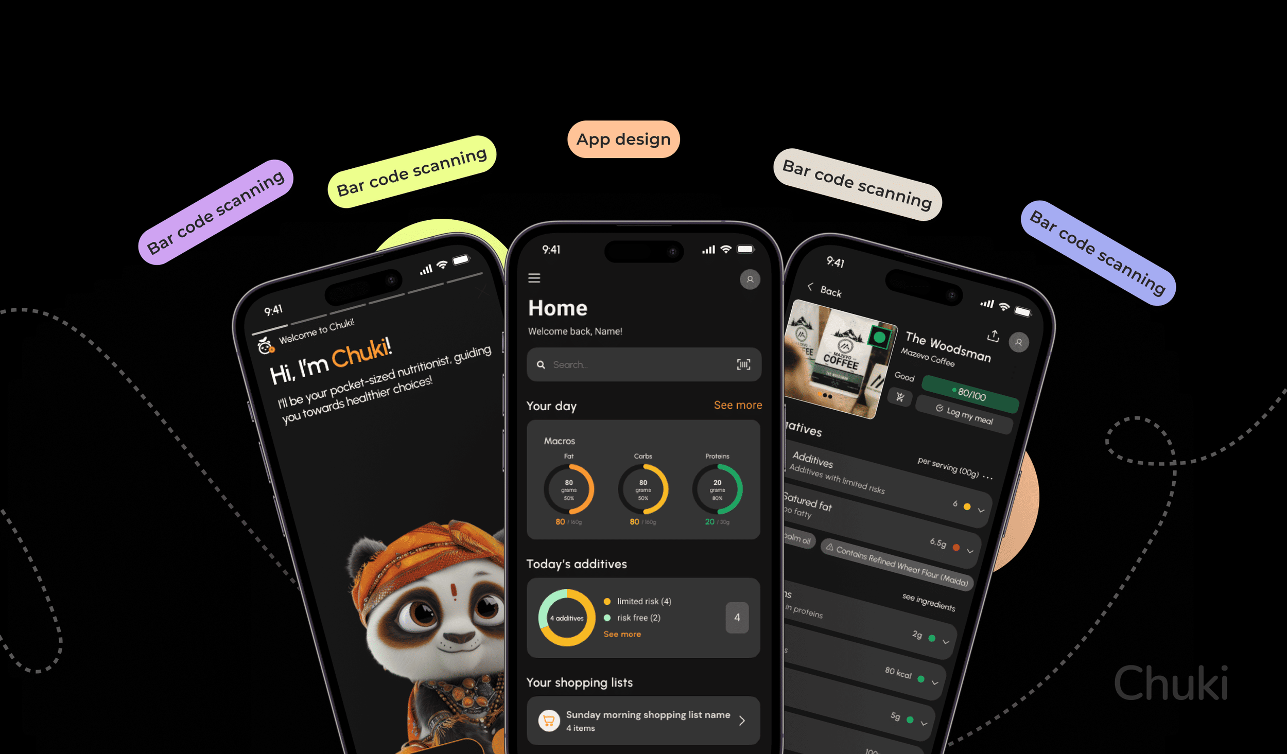
A clearer way to understand what is really inside everyday products.
Chuki turns barcode scanning, nutritional analysis and ingredient intelligence into a simple experience that helps people make more informed choices.
Empower your choice. Chuki demystifies what is in your food with a single scan.
Chuki is a pocket sized nutritionist. It reads the components of a product, identifies potentially harmful additives, and points the person towards cleaner eating habits, with a comprehensive analysis of what is genuinely beneficial and what is best avoided.
The core mission is knowledge and confidence in a dietary decision. It sits as a guardian of well-being: with Chuki you are not just choosing food, you are choosing clarity about it.
I led the product design end to end, from the discovery brief with the client through research, architecture, prototyping, UI, the design system and the metrics plan.
screens designed across light and dark modes
200+ light · 300+ darkAn app that reads the label for you.
The research changed who the product was for. It turned out the app could benefit not only people already following a diet, but also attract people who simply want to improve their health and have never tracked anything in their lives.
That widened the audience and narrowed the design problem at the same time: the first scan has to make sense to someone with no nutritional vocabulary at all.
The label is written in a language the buyer does not speak.
The global rise in processed food consumption, together with a lack of transparency in food labelling, has produced a measurable public health problem. Harmful additives sit behind complex labels that the average consumer finds difficult to read.
Most existing apps answer this with generic nutritional advice that accounts for no individual dietary need, and none of them decode a label in real time. The reluctance to engage with nutritional information is not indifference, it is a vocabulary gap.
- 1.9bn adults overweight worldwide, of whom 650 million are obese
- 3x obesity rates have nearly tripled since 1975
- 11m deaths a year to which dietary risks contribute
- 422m people living with diabetes
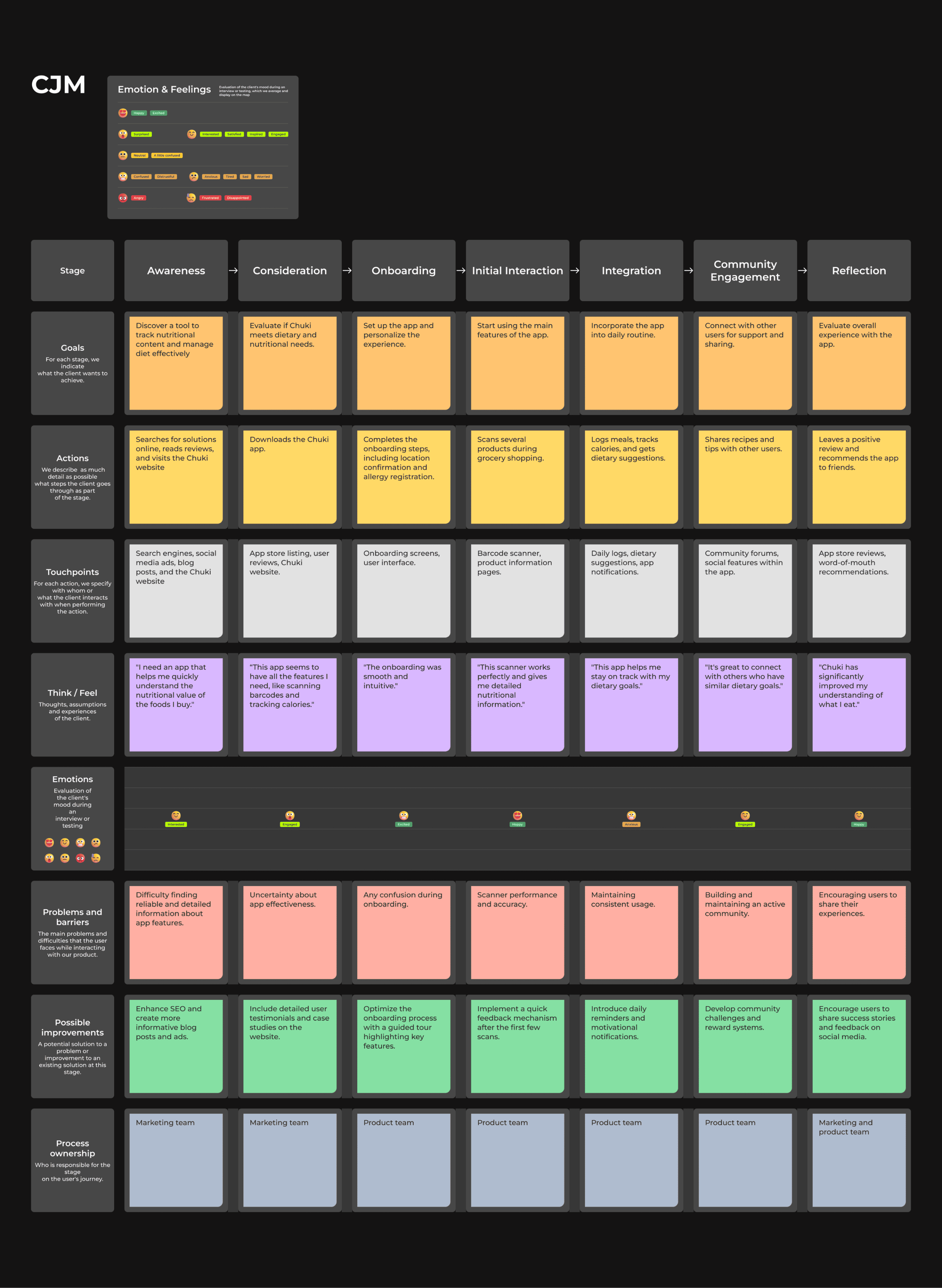
Seven stages, three months.
Discovery
The brief for the app design. Discover the problem and solve it in the best way together with the client.
Research
Interviews, how might we, job statement, MoSCoW, jobs to be done, competitors, user stories, persona, blueprint, benchmarking, sitemap, journey map.
User flow and CJM
Wireframes, prototypes, testing, versioning
High fidelity UI and testing
Design system
Metrics
A survey tells you how many. An interview tells you why.
25 questions on dietary habits, current use of nutrition apps, challenges in understanding food labels and desired features. Distributed by email and social media to health conscious individuals and fit communities, analysed with statistical software.
Semi structured, 45 to 60 minutes each, over video, recorded and transcribed. Purposive sampling for a mix of dietary needs and tech savviness, analysed thematically.
Industry reports, academic papers and whitepapers. Market trends, competitive analysis, user patterns and the state of barcode scanning technology.
Existing studies and databases on nutrition, health trends, dietary restrictions, food allergy prevalence, and what people already value in a health app.
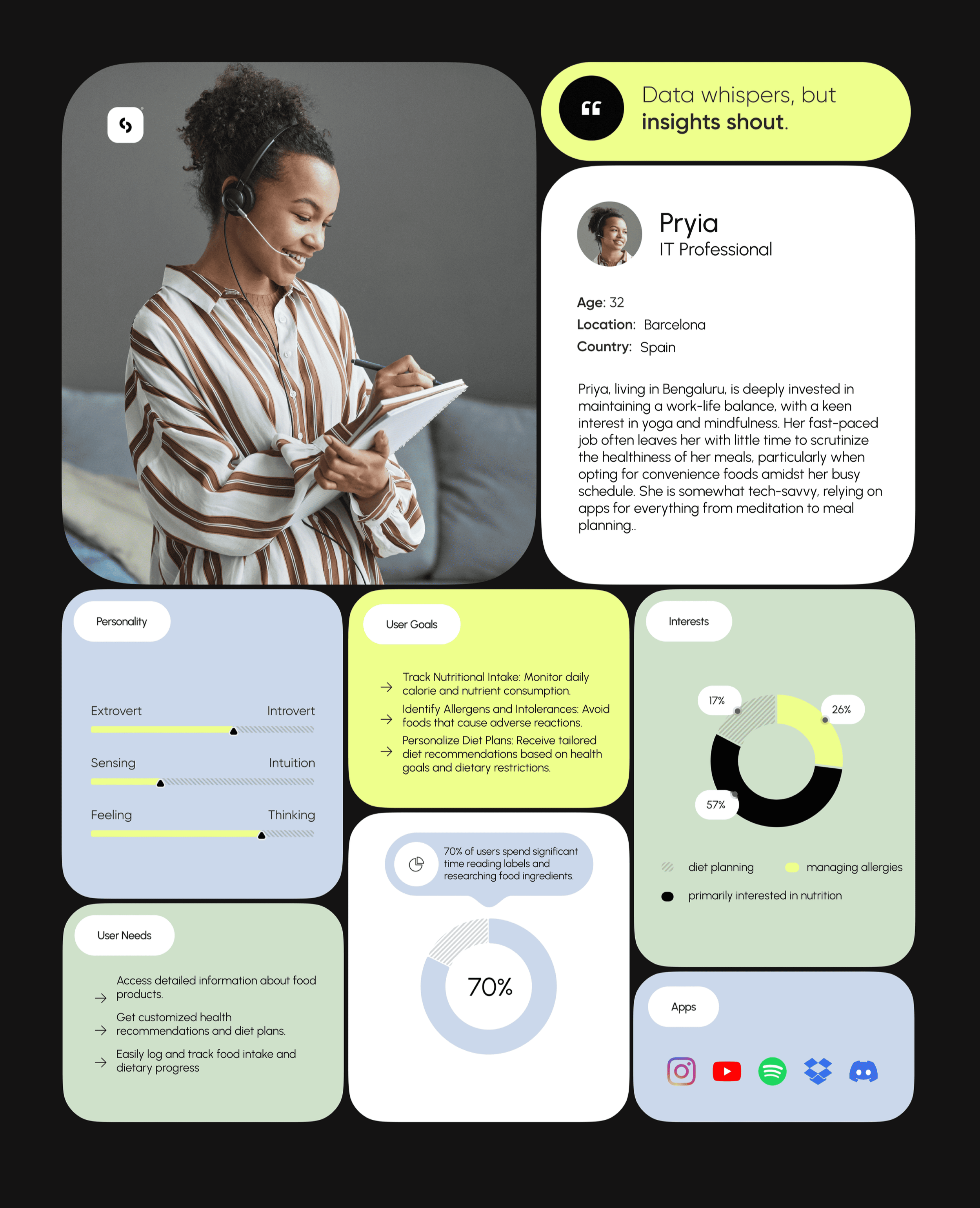
Three personas, and none of them is on a diet.
Nobody in the research was tracking macros. They were busy, they were feeding other people, or they were advising other people, and all three wanted the same thing: to know what is actually in the packet.
Priya26 · IT professional · Bengaluru +
Deeply invested in maintaining a work life balance, with a keen interest in yoga and mindfulness. Her fast paced job leaves her little time to scrutinise the healthiness of her meals, particularly when she opts for convenience food.
- Somewhat tech savvy, relying on apps for everything from meditation to meal planning
- Drawn to the promise of simplifying food labels, especially hidden sugars and fats in packaged food
- Wants a community that shares her interest in healthy living, to exchange recipes and clean eating tips
Arjun40 · Small business owner · Mumbai +
A father of two, striving to instil healthy eating habits in his children. With a business to run, he finds it hard to tell which snacks are genuinely healthy and which are marketing. He is the reason the Truth Detector exists.
- Comfortable using technology to improve his family's lifestyle
- Wants to assess snack options quickly, and values the flagging of harmful additives
- Sees the community as a place to find child friendly recipes that children will actually eat
Neha32 · Freelance nutritionist · Pune +
Combines professional expertise with a personal interest in holistic wellness. She meets clients who are confused by the range of food options and health claims on the market. The only persona who is an expert, and the one who turns the product into a recommendation engine for other people.
- Highly tech savvy, always looking for tools to recommend to clients
- Wants to curate a list of recommended products for different dietary needs
- Values the community as a support network for sharing expert advice
Beyond the threeEleven groups +
What unites the wider audience is not diet, it is time.
- Young professionals, 23 to 35
- Parents with young children or teenagers
- Students
- People in high stress jobs
- People going through major life transitions
- Remote workers
- Entrepreneurs and startup founders
- People managing mental health challenges
- Expatriates and immigrants
- The LGBTQ+ community
- Caregivers
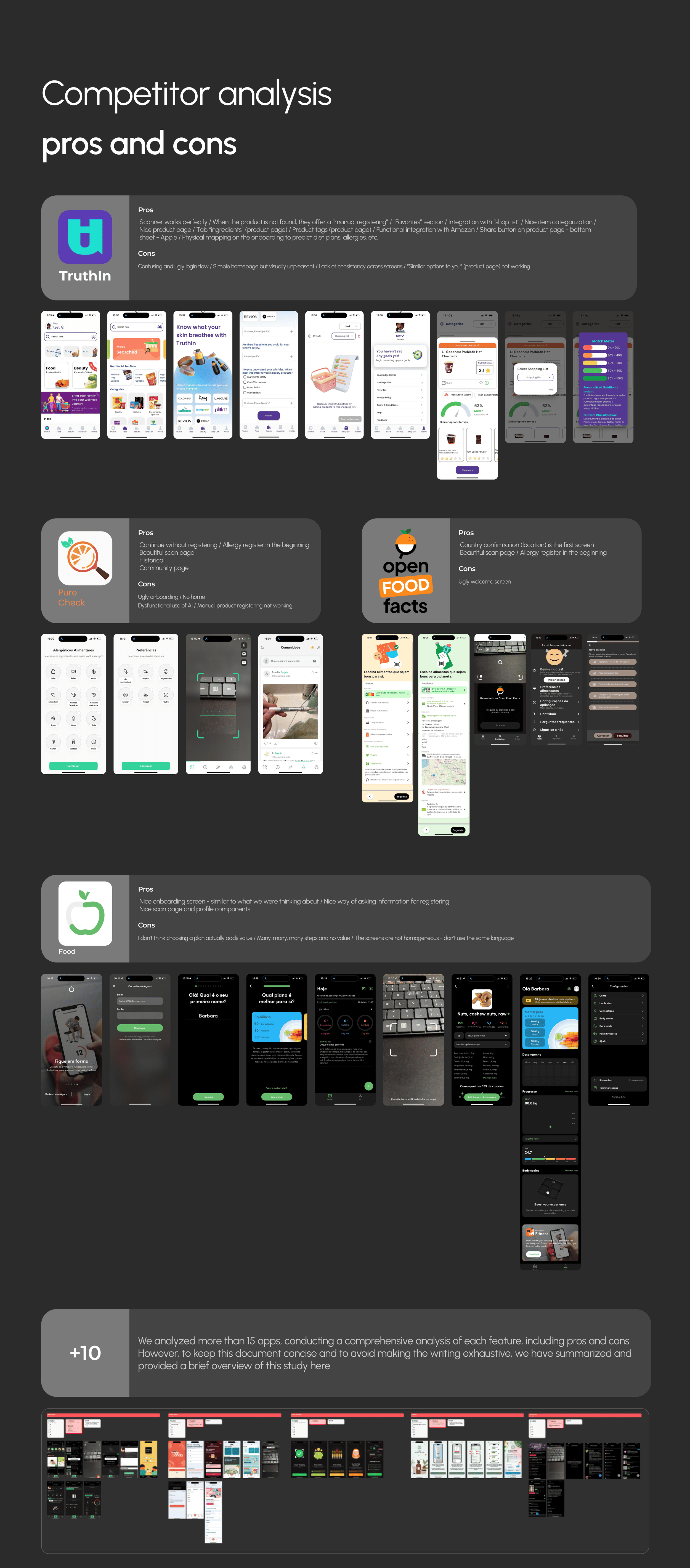
Everyone got the scan right and the first five minutes wrong.
More than fifteen apps, feature by feature, with pros and cons for each. Four carried most of the useful lessons.
Truthin · Purecheck · Open Food Facts
Yuka · EWG · Trash Panda · Spoonful · Fooducate
Think Dirty · INCI Beauty
TruthinThe most complete +
- The scanner works perfectly, and when the product is not found it offers manual registering
- A favourites section and integration with a shopping list
- Good categorisation, a good product page, an ingredients tab and product tags
- Functional Amazon integration and a share button on the product page
- Physical mapping in the onboarding, to predict diet plans and allergies
- A confusing and unattractive login flow
- A simple homepage that is visually unpleasant
- A lack of consistency across screens
- The similar options for you block does not work
PurecheckThe best scan page +
- Continue without registering
- Allergy registration at the very beginning
- A beautiful scan page
- History and a community page
- An unattractive onboarding, and no home
- Dysfunctional use of AI
- Manual product registering does not work
Open Food FactsThe database +
- Country confirmation is the first screen, which sets the product database correctly from the start
- A beautiful scan page
- Allergy registration at the beginning
- An unattractive welcome screen
FoodThe onboarding +
- A good onboarding screen, close to what we were already thinking about
- A good way of asking for information at registration
- A good scan page and good profile components
- Choosing a plan does not seem to add value
- Many, many steps and no payoff
- The screens are not homogeneous, they do not use the same language
What the first version is, and what it deliberately is not.
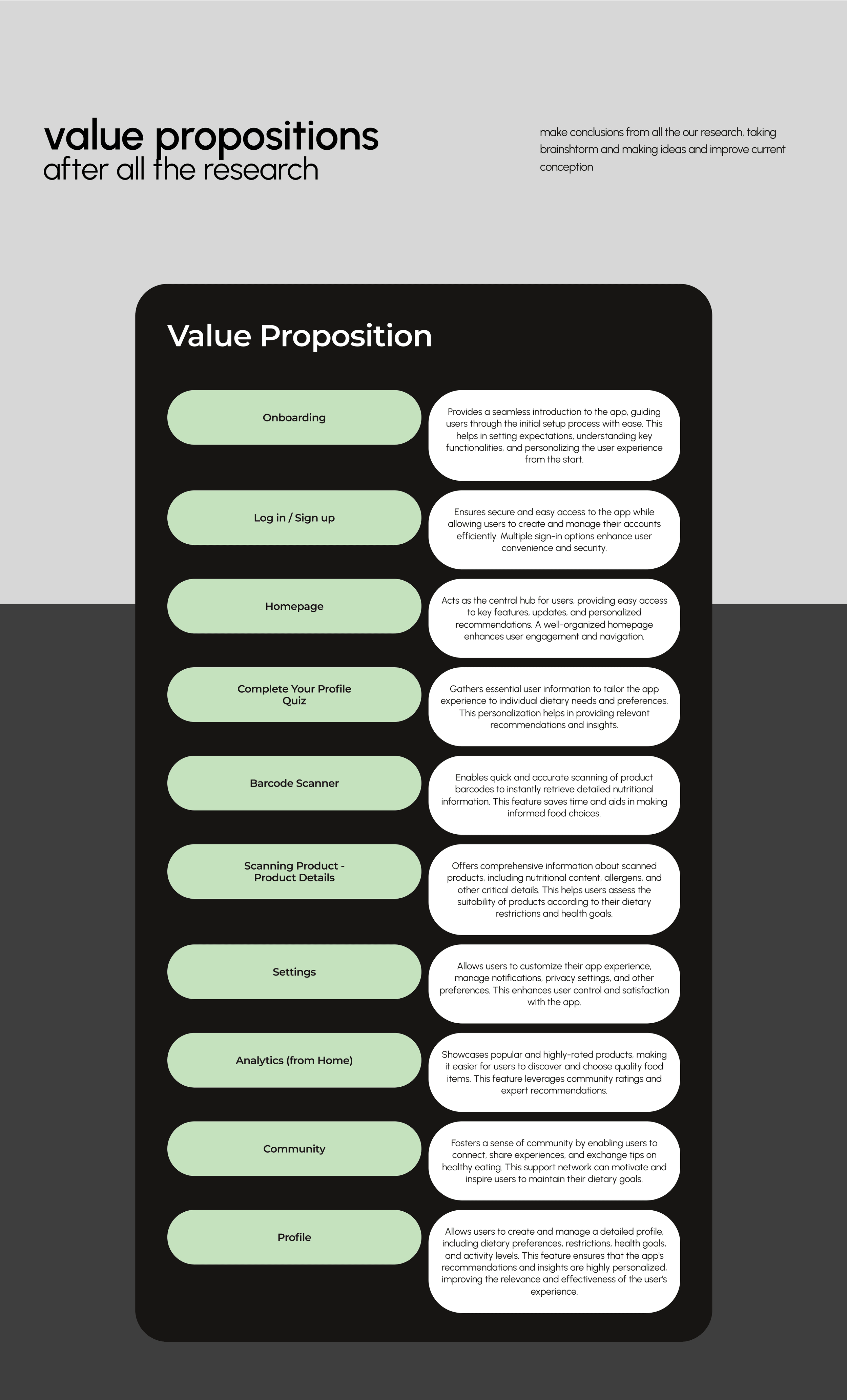
- Barcode scanner accurate and quick scanning, with manual product registration for items not found in the database
- User profile a comprehensive setup including dietary preferences, allergies and intolerances, with the option to continue without registering and still use the core features
- Nutritional information a detailed breakdown of a scanned product, identifying hidden sugars, fats and other dietary concerns
- Personalised recommendations driven by profile and past interactions, with alternative products that match dietary needs
- Integration with shopping lists and with Amazon for direct purchases
- Analytics and tracking, with historical data of scanned products and personalised trends
- Community engagement, a page for sharing tips, recipes and healthy eating habits
- Social sharing of scanned products and dietary insights
- An expanded database with regular updates and user contributions
- Diet and meal planning tools, and integration with fitness apps
- In app purchases through an internal store
- Affiliate links, because they would compromise the user experience with external promotions
The last line is a product decision, not a scoping one. An app whose whole promise is impartial analysis of what you are about to eat cannot also be paid to recommend it.
Seven features waiting behind the MVP.
Marketing gimmick and shady packaging analysis
All natural and filled with artificial additives. Low fat and compensating with sugar. It evaluates terms like natural, organic and low fat against the actual ingredient list, and reports the gap. The only feature in the set that does not describe a food, it describes the person selling it.
Nuts, lactose, palm oil, maida and anything else the person adds, flagged at the moment of the scan rather than after the research.
The same scan applied to the bathroom shelf and the cupboard under the sink, against a database of chemical substances.
Sugar and carbohydrate content assessed for a diabetic diet, with the risk named rather than implied.
The safety standards for the two groups in a household who cannot read the label themselves.
Images, reviews and thoughts, with moderation designed in rather than added after the first problem.
Buying a recommended product through a retail integration, so a decision does not have to survive the walk to a different app.
Four ways to make money, three of which can eat the product.
Premium subscription, in app purchases for expert led community groups, affiliate marketing and sponsored content. All four are in the business plan, and all four were on the table for the first release.
The design side kept affiliate links out of the MVP, on the grounds that an app whose entire promise is impartial analysis of what you are about to eat cannot also be paid to recommend it on day one. Trust first, monetisation once the trust is established: that is a sequencing decision, not a refusal.
High fidelity UI
Where this case sits.
MVP launch
Testing, feedback, improve.
Post MVP features
Talk to as many customers as possible.
Community, baby and pet
The two that widen the household.
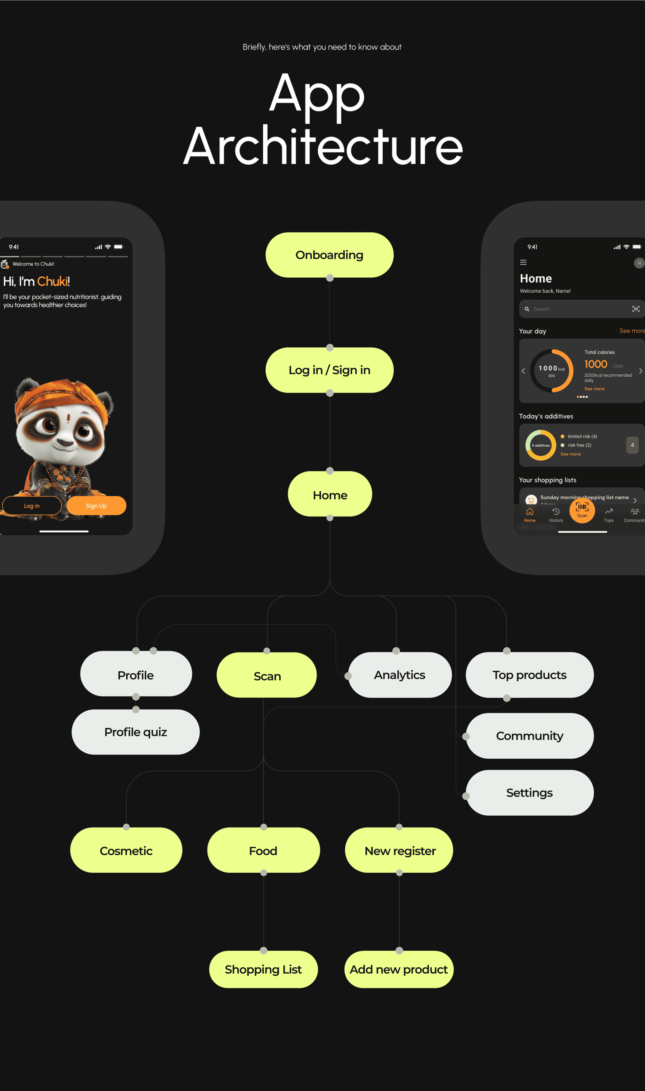
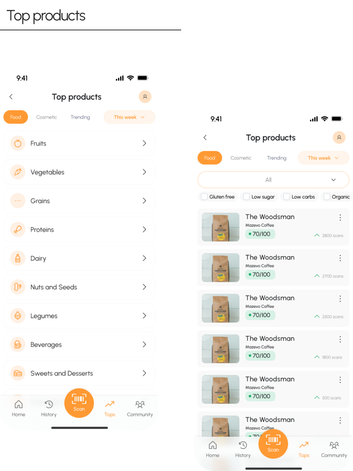
The scan is one tap, and it is the centre of the navigation
The bottom bar carries home, history, scan, tops and community, with scan raised and coloured as the only accented control on screen. Everything else in the product is a way of getting back to that gesture or reading what it produced.
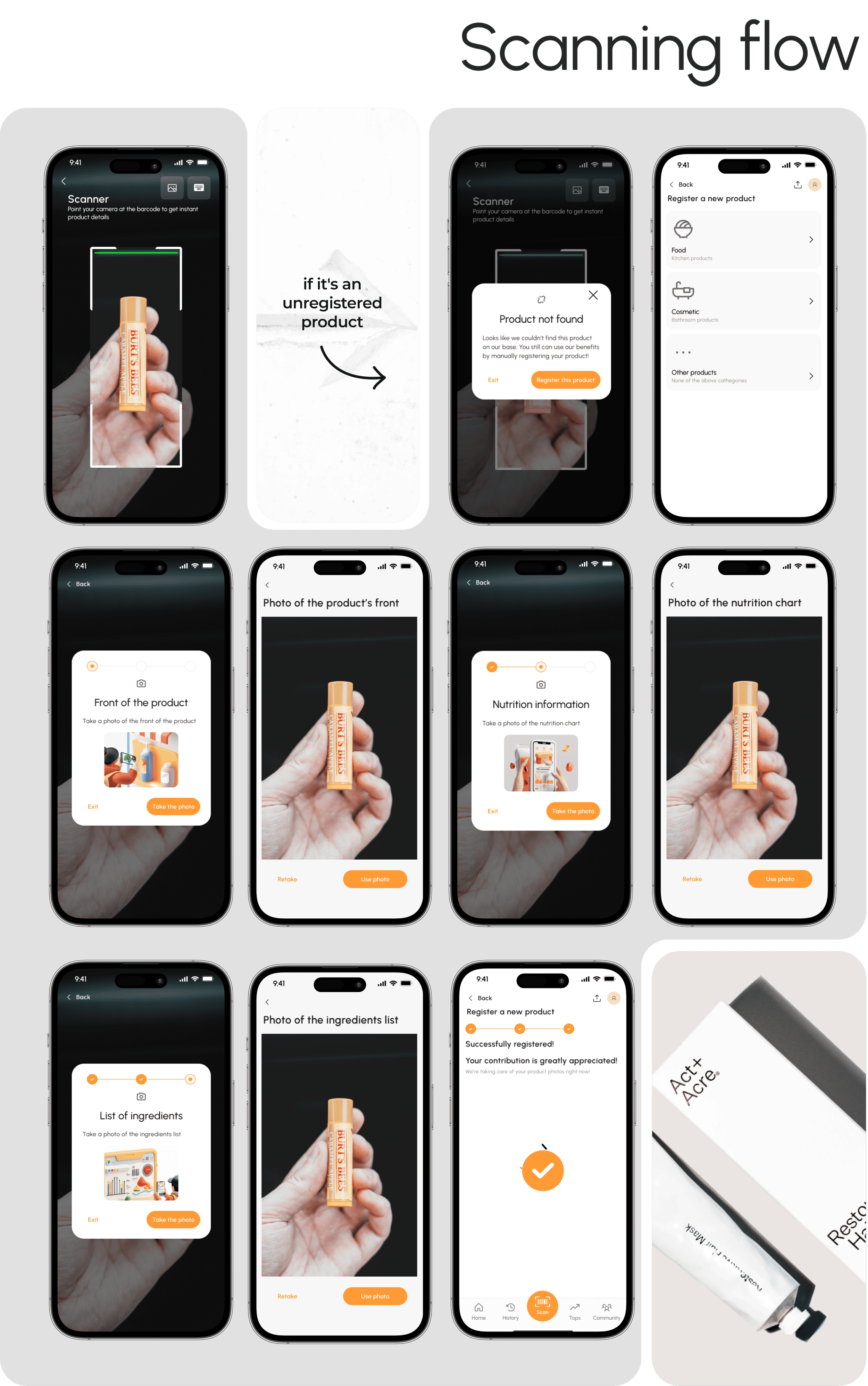
A product that is not in the database becomes a contribution, not a dead end
When the scan finds nothing, the person is offered manual registration: category, then a photo of the front, a photo of the nutrition chart, a photo of the ingredients list, and a confirmation that the contribution is appreciated. The failure state is where the database grows, which is the only sustainable way to get past 400,000 products.
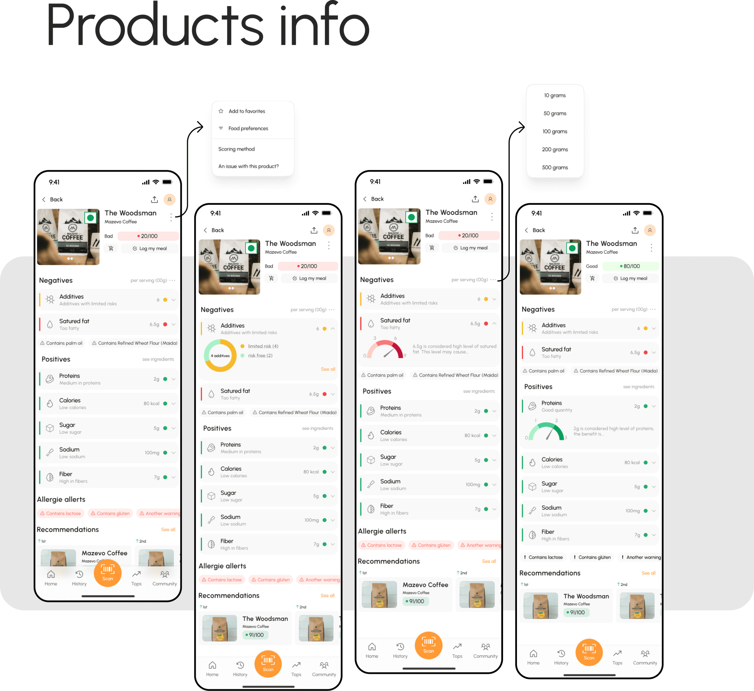
A score, then the reason for the score
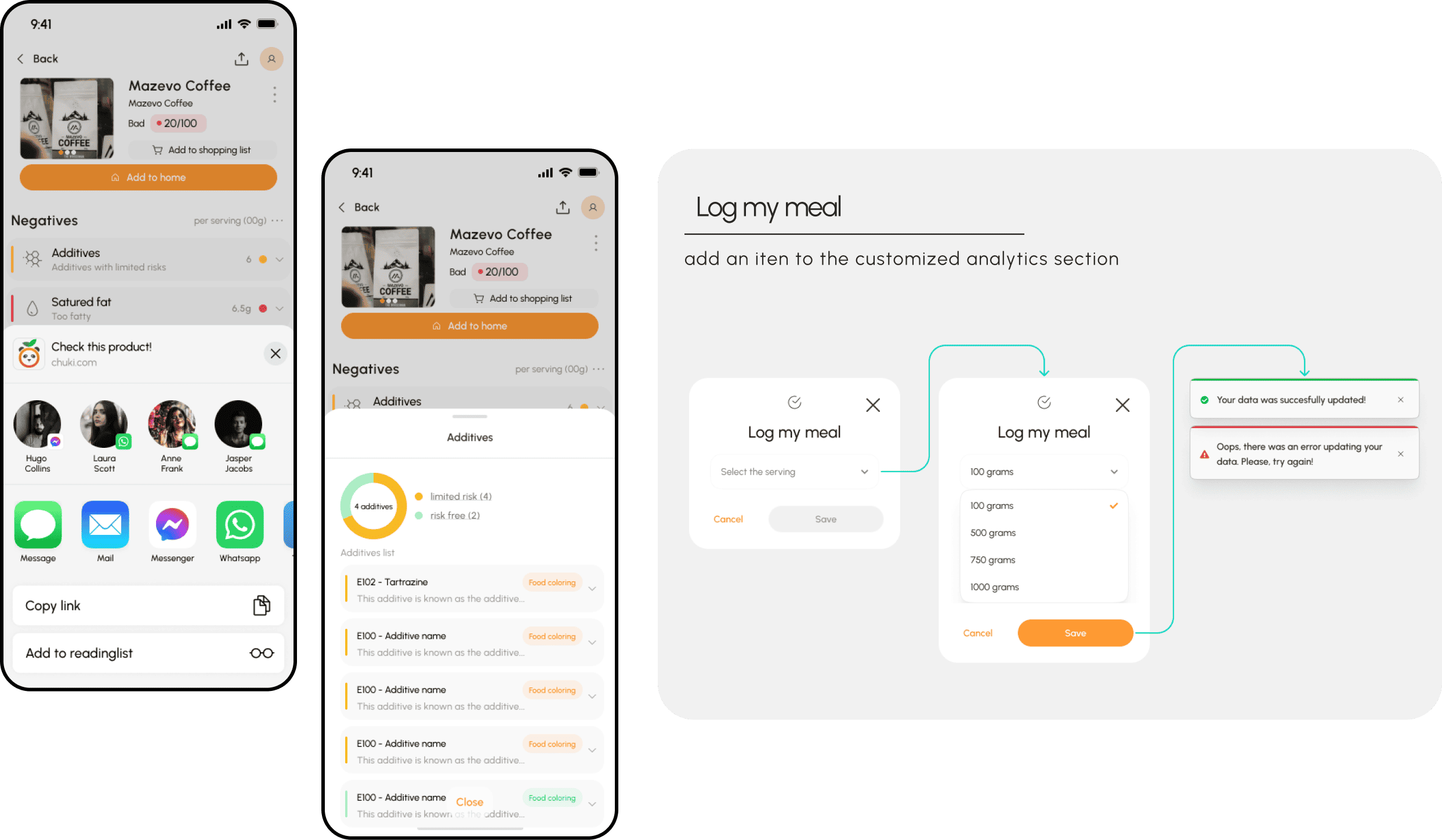
Each product opens with a rating out of 100 and a flag, from bad through medium and good to awesome, then splits into negatives and positives: additives, saturated fat, proteins, calories, sugar, sodium, fibre. Allergy alerts sit between them, and every row expands into the explanation. The person gets a verdict fast and can audit it afterwards.
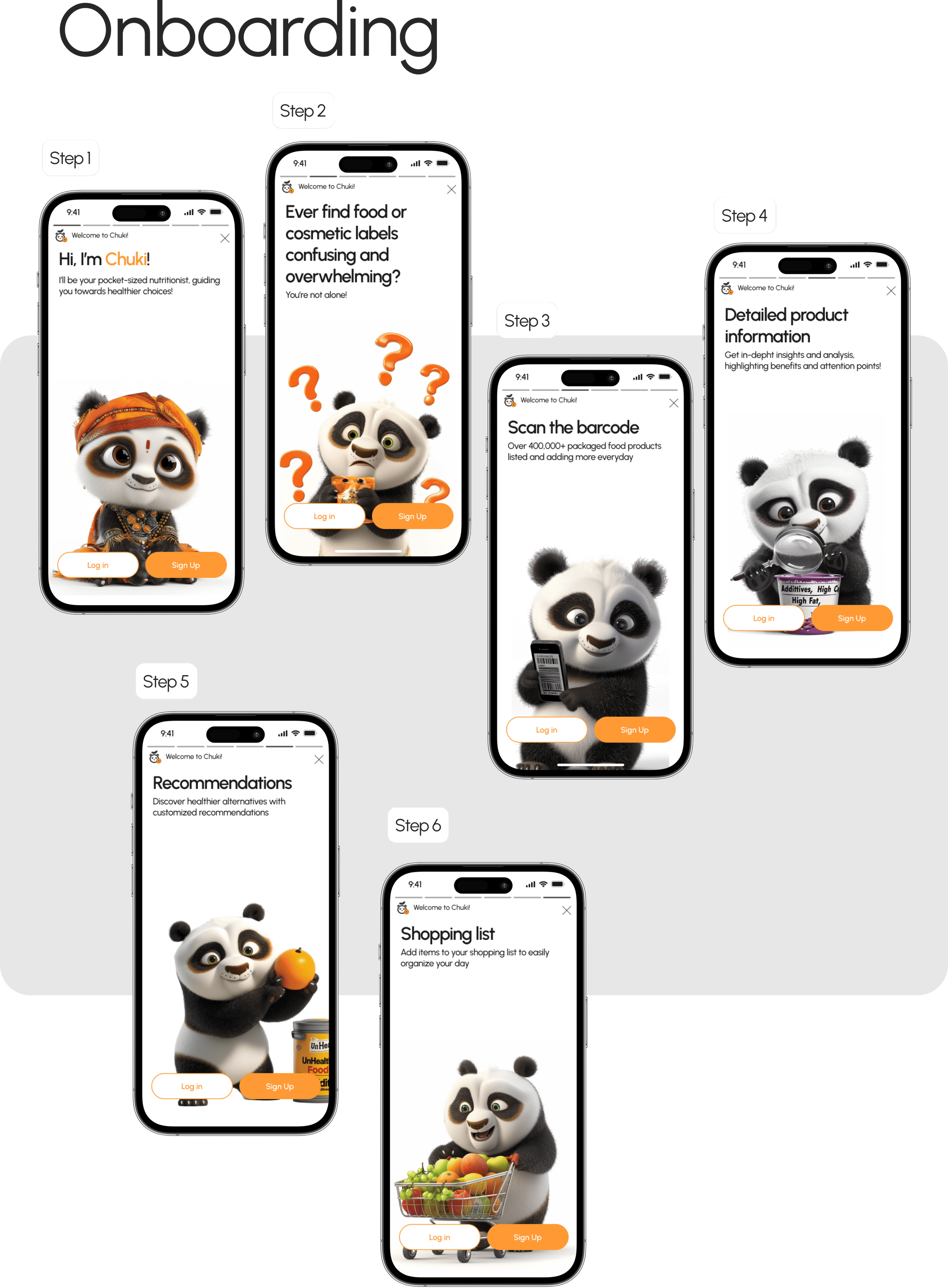
An onboarding carried by a character rather than by copy
Six steps, each with the mascot doing the thing the screen describes: confused by labels, holding a barcode, inspecting a product with a magnifying glass, carrying a shopping basket. For an audience that includes people who have never tracked a nutrient in their lives, a character explaining the product is a lower barrier than a paragraph that does.
Dark mode as half the product, not as a setting
More than 300 of the 500 screens are dark. Designing both modes in parallel rather than retrofitting one is what let a four person team ship a surface this wide in three months.
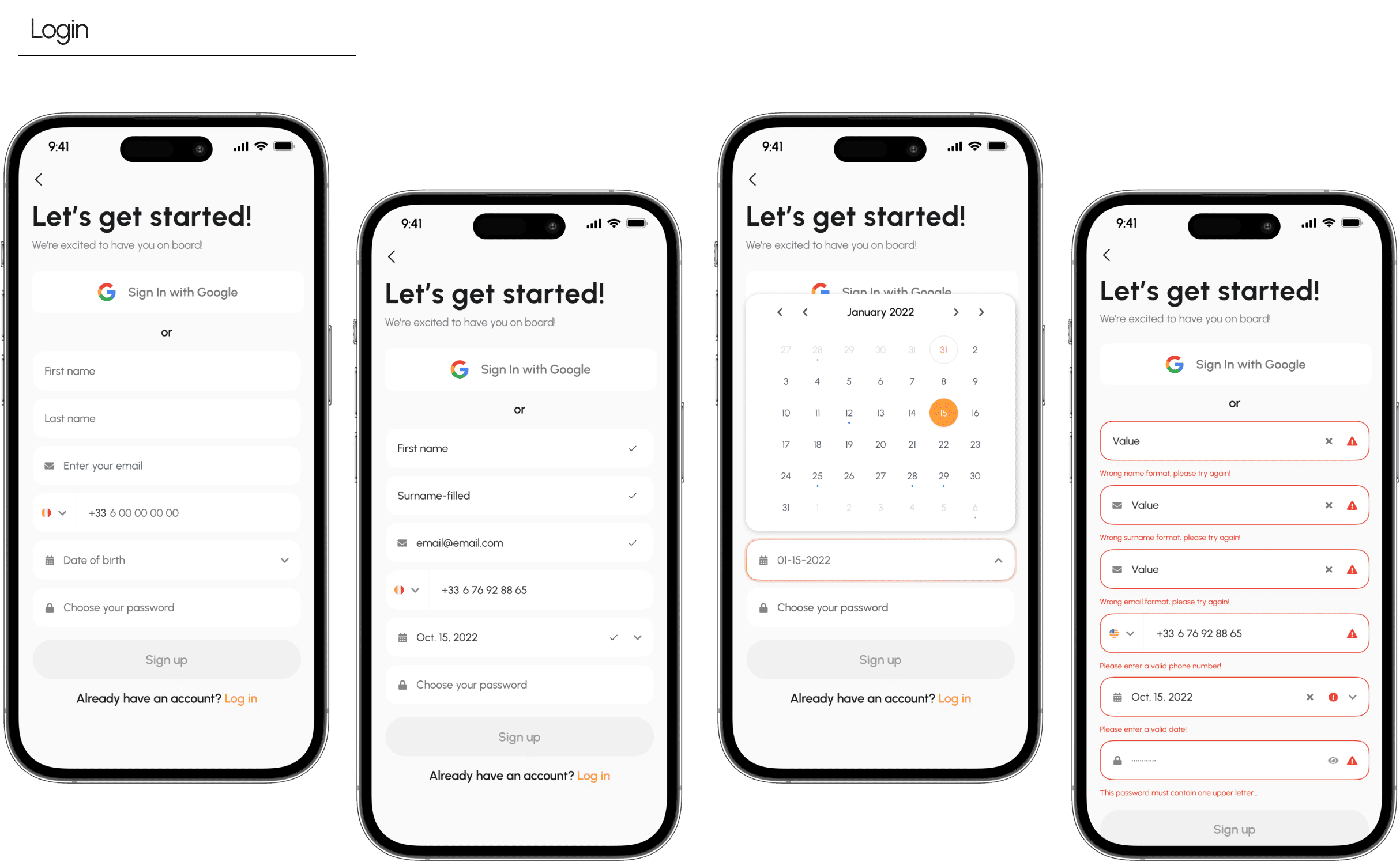
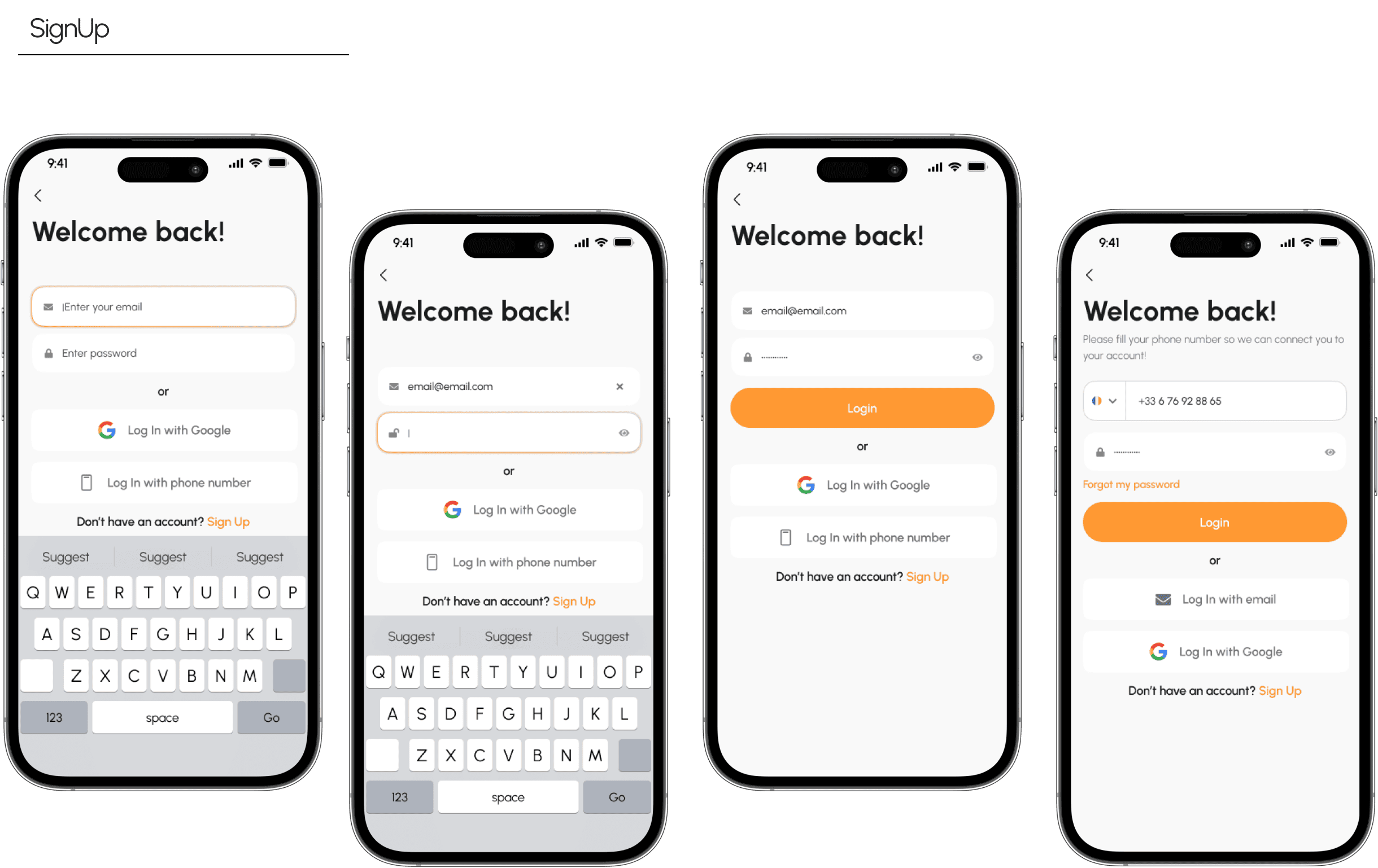
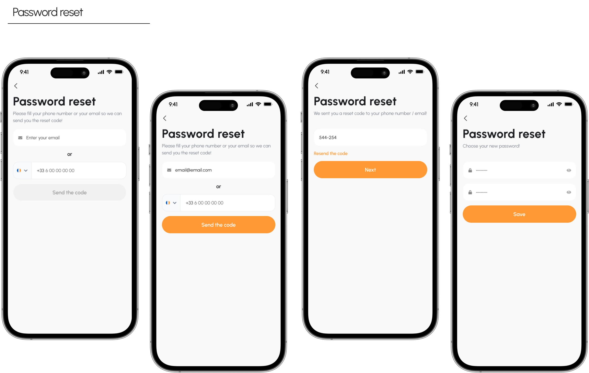
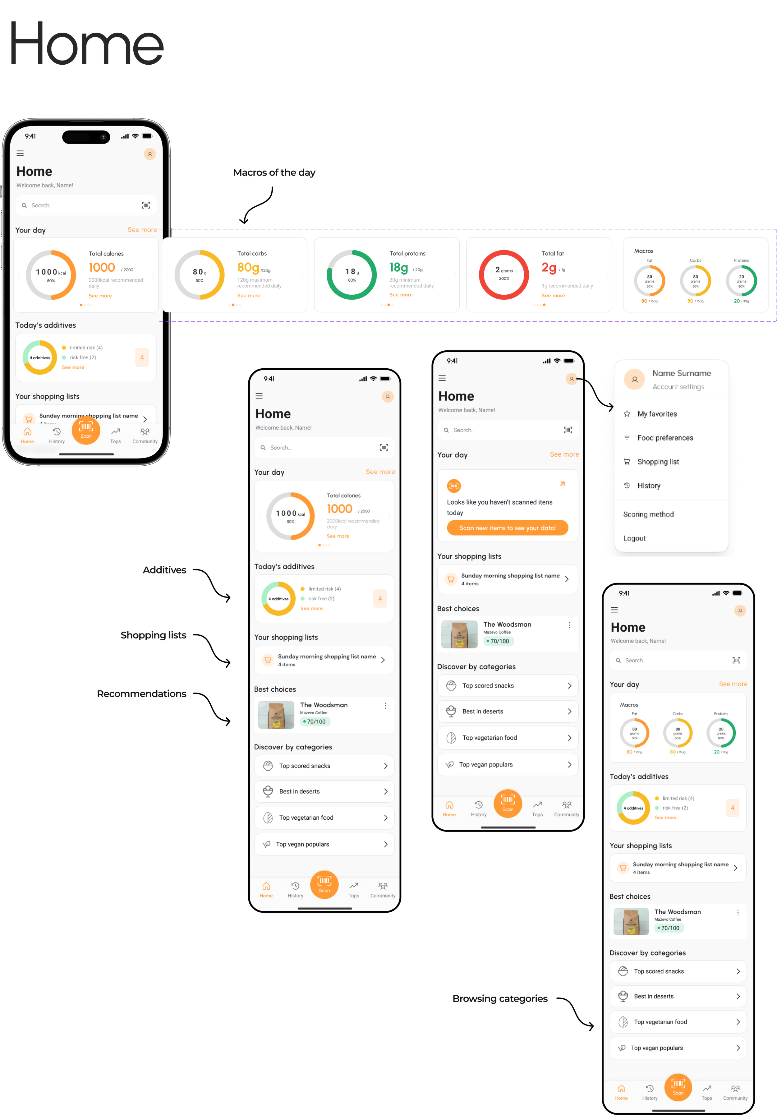
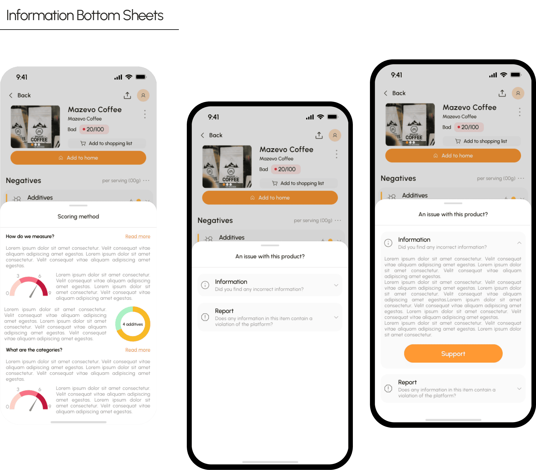
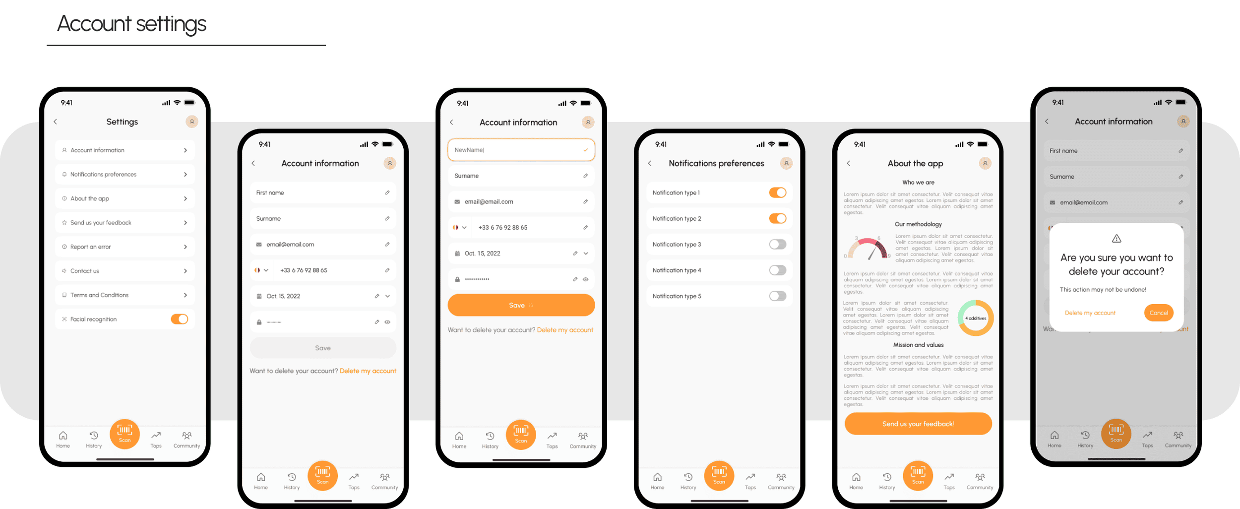
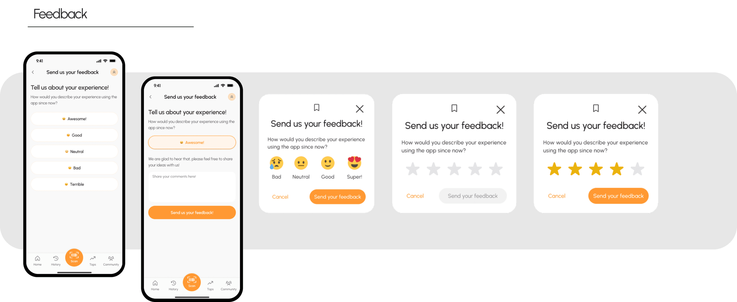
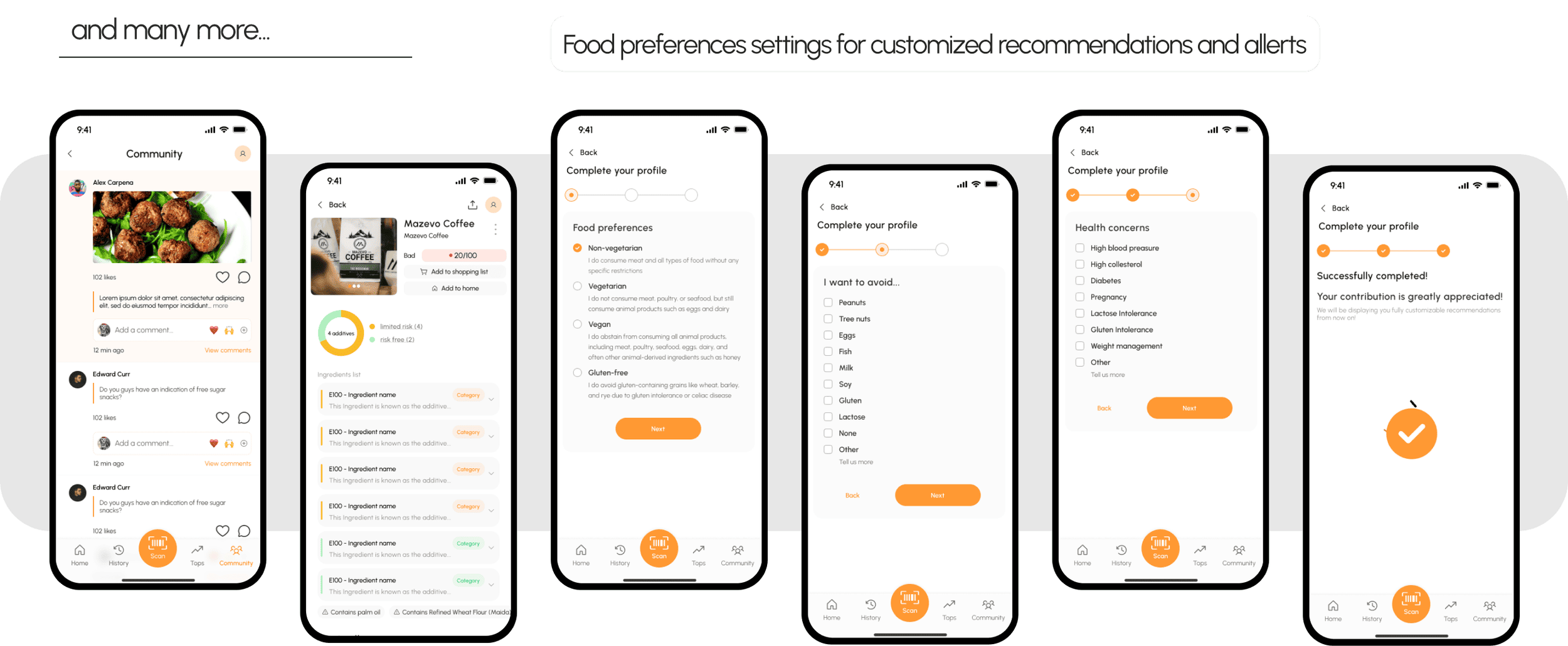
The same project, told visually.
This page is the full case: the research, the decisions, the reasoning and what came out of it. The Behance gallery is the other half of the story, a visual presentation of the same project, built for looking rather than reading.
Worth opening if you want the screens large, the flows laid out end to end, and the design system sheets at full size.
See the visual presentation on Behance ›Five things the product taught us about where it goes next.
The database is the product
Four hundred thousand products sounds like a lot until someone scans the one thing they buy every week and it is missing. Manual registration is the growth mechanism, and it deserves the same care as the scan itself.
The first five minutes
Every competitor got the scan right and the entry wrong. That is where the opportunity was, and it stays the thing to keep measuring.
Explaining the score
A rating is only trusted once. The expandable reasoning behind each row is what makes it trusted the second time.
The audience is wider than the brief
The research showed the app reaches people who are not on a diet at all, and simply want to eat better. Writing for that person, rather than for someone fluent in macros, is the highest leverage content decision available.
Community needs a reason
A feed exists in the MVP. Giving people something specific to post about is what turns it into a place.
Cosmetics, from day one
The scanner handles bathroom products as well as food, which doubles the reasons to open the app in a week.
Instrument the first scan
Time to first scan, scan success rate and the proportion of scans that end in a not found. The three numbers that describe whether the product works.
Grow the database through contribution
Make manual registration faster and reward it, so the gap closes from inside the product.
Bring the should haves forward
Personalised recommendations, shopping list integration and analytics were scoped as the second release. They are what turn a scanner into a habit.