Mulher em Forma
A fitness training app and community for women
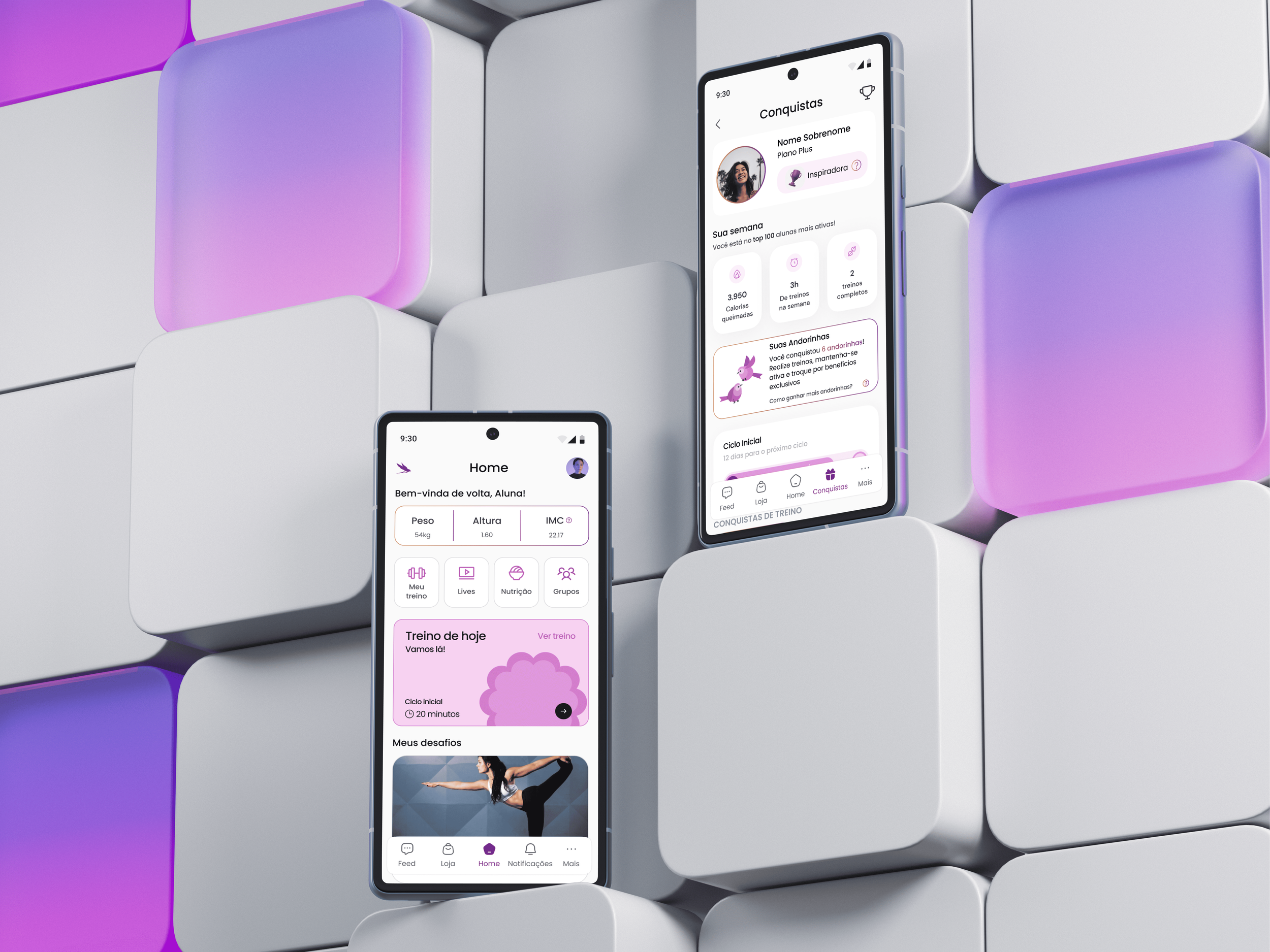
A complete health and wellness experience built around women's journeys.
Mulher em Forma brings workouts, health programmes, personalised guidance and specialist support into one mobile experience.
The existing platform could not support the experience Mulher em Forma wanted to offer.
The previous solution had been purchased rather than built, which limited customisation and made it difficult to respond to users' evolving needs. The redesign focused on engagement, real-time insights and more personalised experiences while keeping the product simple and secure.
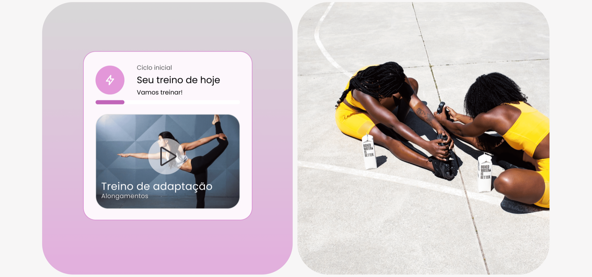
Two surfaces, two jobs. One brings people in, the other keeps them.
The promise, before anyone has paid for it
The page that has to make a woman who has already been disappointed by fitness products believe this one is different.
The proof, every day after that
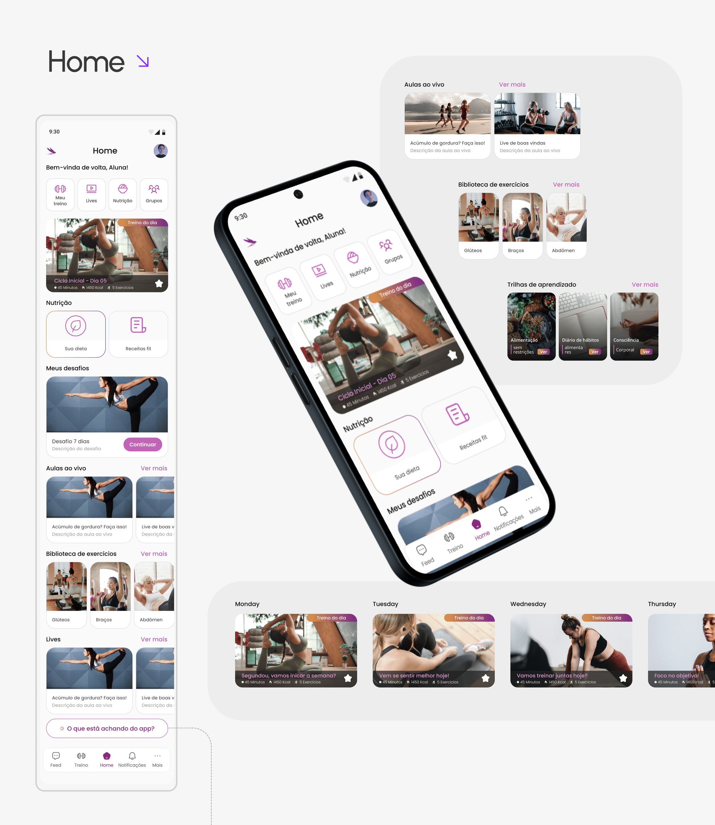
Workouts, nutrition, community, progress, all of it in a product used in short sessions on a phone, in the middle of a day that is already full.
- Enhance user engagement
- Provide real time insights
- Offer personalised experiences
- Keep it easy to use
- Keep it secure

Before

After
Five problems the old platform could not solve, and what replaced each one.
Difficulty tracking progress and goals
Users struggle to monitor their fitness progress, manage personal health goals, and receive tailored feedback efficiently.
Real time progress dashboard
A dashboard that lets users track their fitness journey, set goals, and receive ongoing feedback on their performance.
Limited personalisation for workouts and nutrition
Participants have limited options to customise their workout routines and meal plans according to their specific needs.
Personalised workout and nutrition plans
Customisable workout and meal plans tailored to individual needs, built from what the user tells the product about her body and her goals.
Lack of engagement and motivation
Many users find it challenging to stay engaged and motivated enough to keep a fitness routine and healthy habits going.
Gamified challenges and rewards
Challenges, rewards and progress tracking that sustain engagement across weeks rather than across one good afternoon.
Challenges in building a supportive community
Users face difficulties creating a strong, supportive community to foster collaboration, encouragement, and accountability.
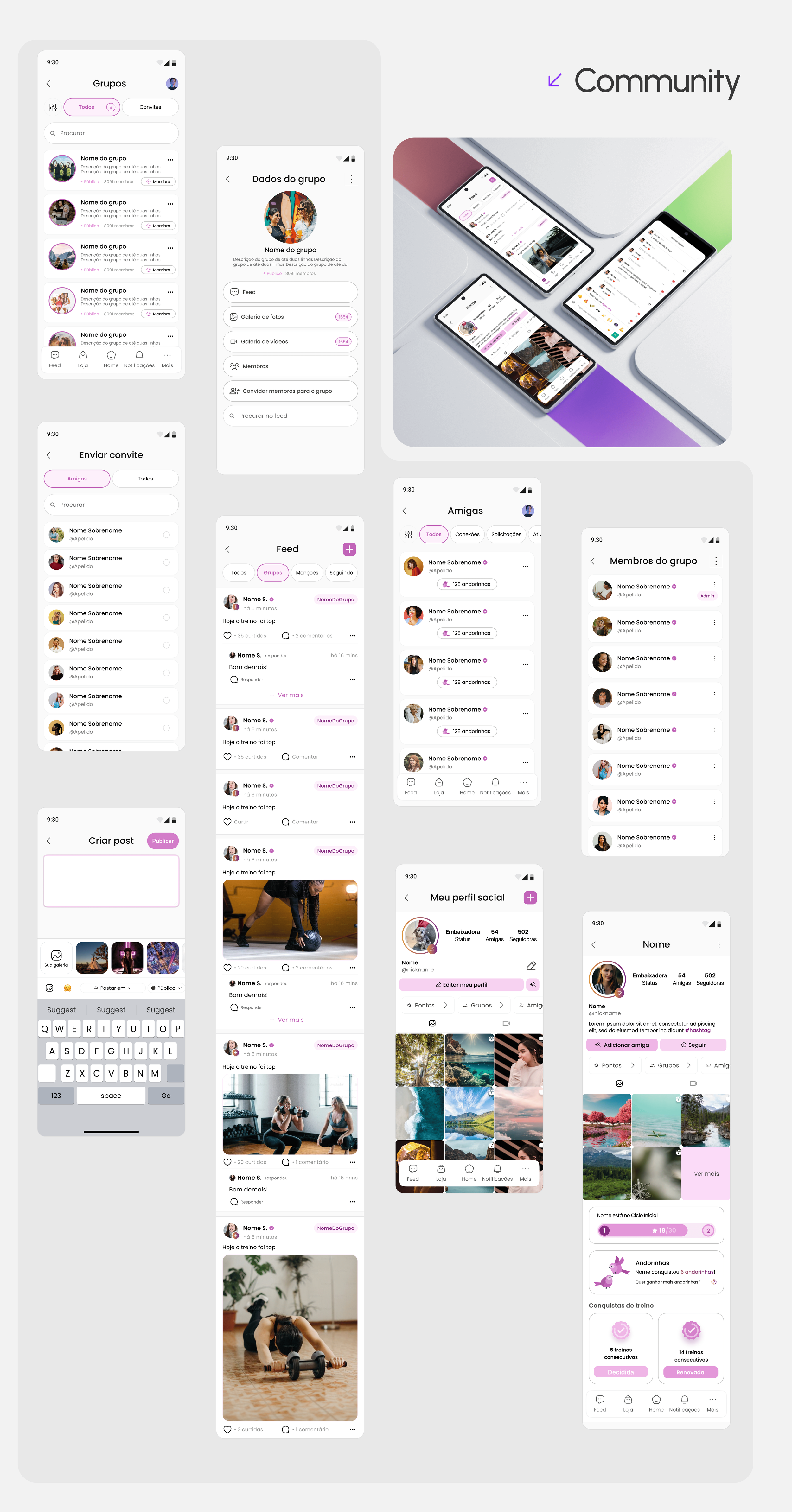
Community groups
Group spaces where users share progress, exchange tips, and hold each other accountable.
Limited access to performance metrics and health insights
Trainers and users find it hard to access comprehensive performance data and insights to adjust their training strategies effectively.
Analytics hub with health performance insights
Detailed performance metrics and health data, for the trainer as much as for the user, so training and wellness strategies can actually be adjusted.
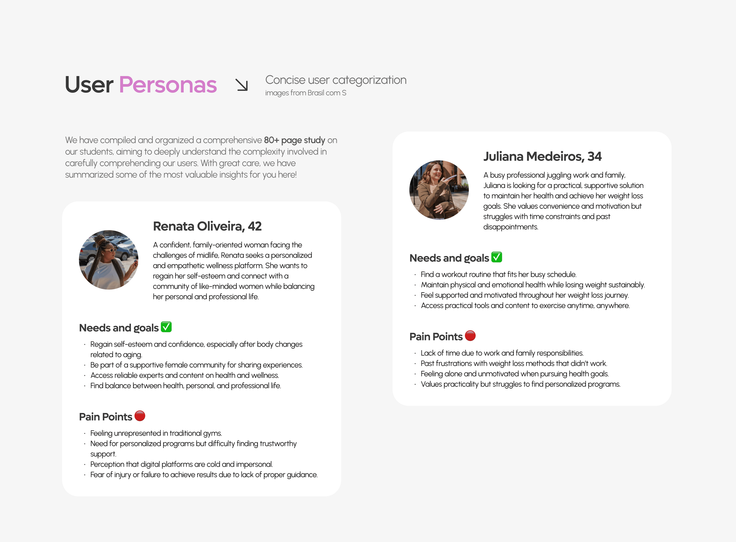
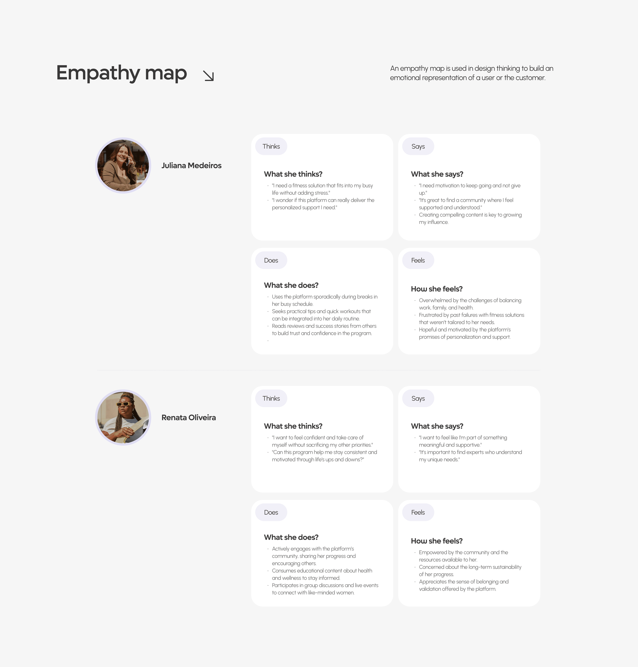
Our surveys focused exclusively on women, exploring their health, fitness and wellness journeys.
What came back was consistent enough to design against. Users prefer personalised and empathetic support tailored to their own routines and challenges, a community driven environment that creates belonging and shared experience, and solutions that are practical, accessible and motivating for a busy life.
An 80 page brand and audience study, run with Calebe and vb, and the reason this case has a point of view at all.
- Electronic survey with voluntary participation, questionnaire tested and validated with the team
- Exclusive link and QR code per product, sent directly to clients, fielded 1 to 3 December 2022
- In a probabilistic sample the margin of error would be 4.36 p.p., at a 95% confidence interval
- Factor analysis and cluster analysis applied to the respondent base
- Brand health read across four dimensions: cognition, emotion, language and action
Spread across 212 cities, and 21 of them hold 52% of the base. Mostly state capitals.
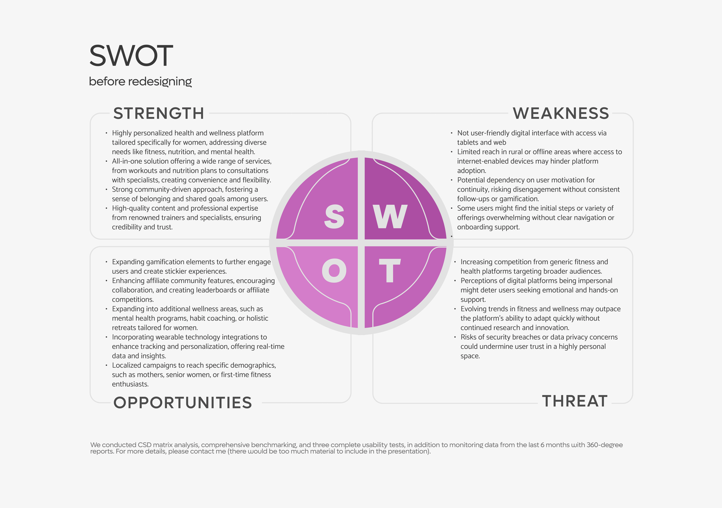
- Highly personalised health and wellness platform built specifically for women, covering fitness, nutrition and mental health
- An all in one offer, from workouts and nutrition plans to consultations with specialists
- A strong community driven approach, creating belonging and shared goals
- High quality content and professional expertise from recognised trainers and specialists
- A digital interface that is not user friendly, with access through tablet and web
- Limited reach in rural or offline areas where devices and connection are a barrier
- Dependence on the user's own motivation, with disengagement likely without follow up or gamification
- Initial steps and variety of offerings that can overwhelm without clear navigation or onboarding support
- Expand gamification to make the experience stickier
- Grow the community with collaboration, leaderboards and competitions
- Expand into adjacent wellness areas: mental health programmes, habit coaching, holistic retreats for women
- Integrate wearable technology for real time tracking and personalisation
- Run localised campaigns for specific groups such as mothers, older women, or first time fitness users
- Growing competition from generic fitness and health platforms targeting broader audiences
- The perception that digital platforms are impersonal, which deters users who want emotional and hands on support
- Fitness and wellness trends moving faster than the platform can adapt without continued research
- Security and data privacy risks that would undermine trust in a highly personal space
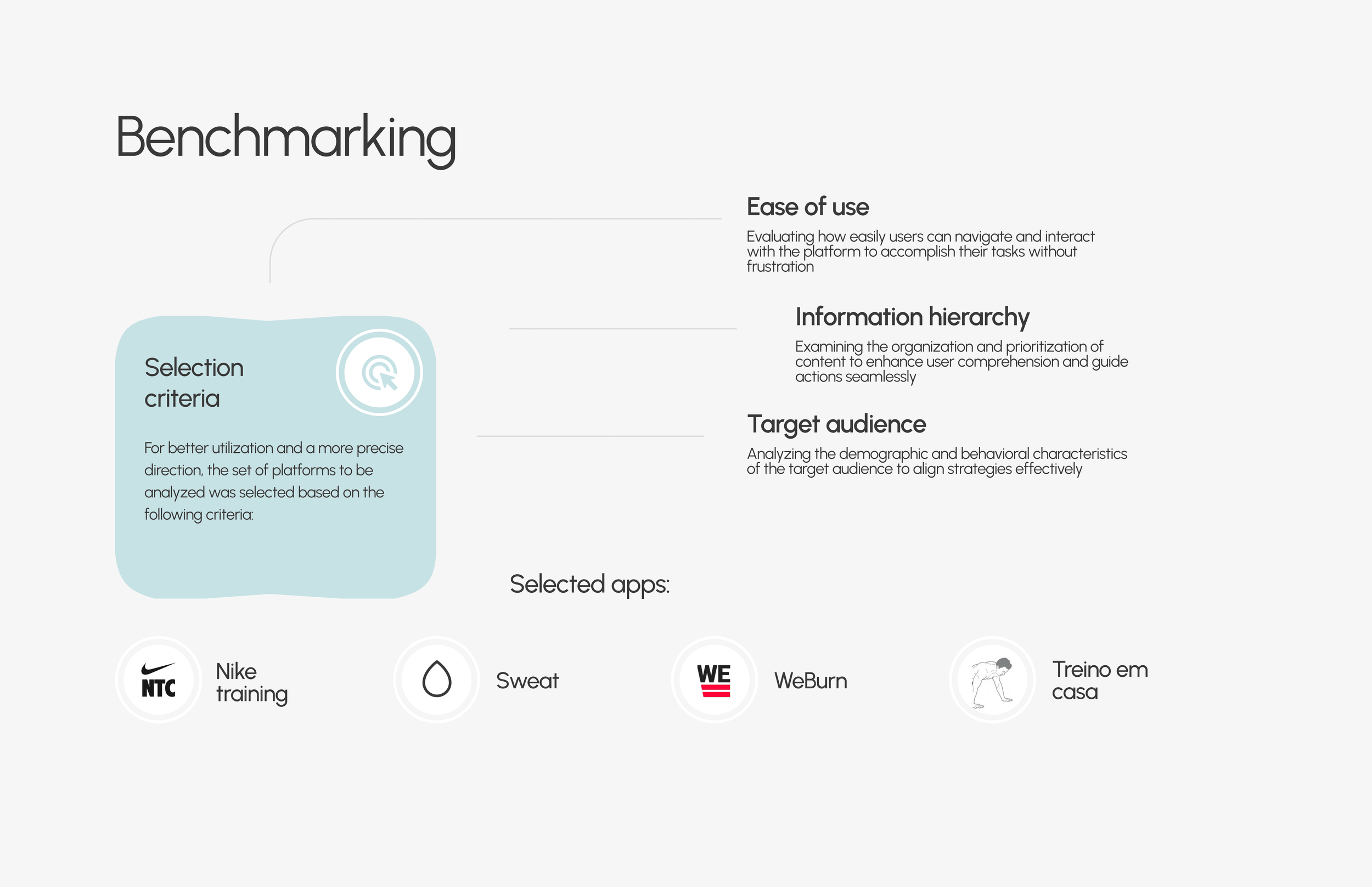
Alongside it ran a CSD matrix, comprehensive benchmarking, three complete usability tests, and six months of monitored data with 360 degree reports.
Eight jobs, and the last one is the reason the other seven get done more than once.
- Monitor progress in training performance
- Monitor improvement in health metrics
- Access training sessions easily
- Perform a daily workout
- Check the meal plan
- Communicate with other users in the community
- Rely on professional support and assistance
- Use gamification mechanics to stay motivated
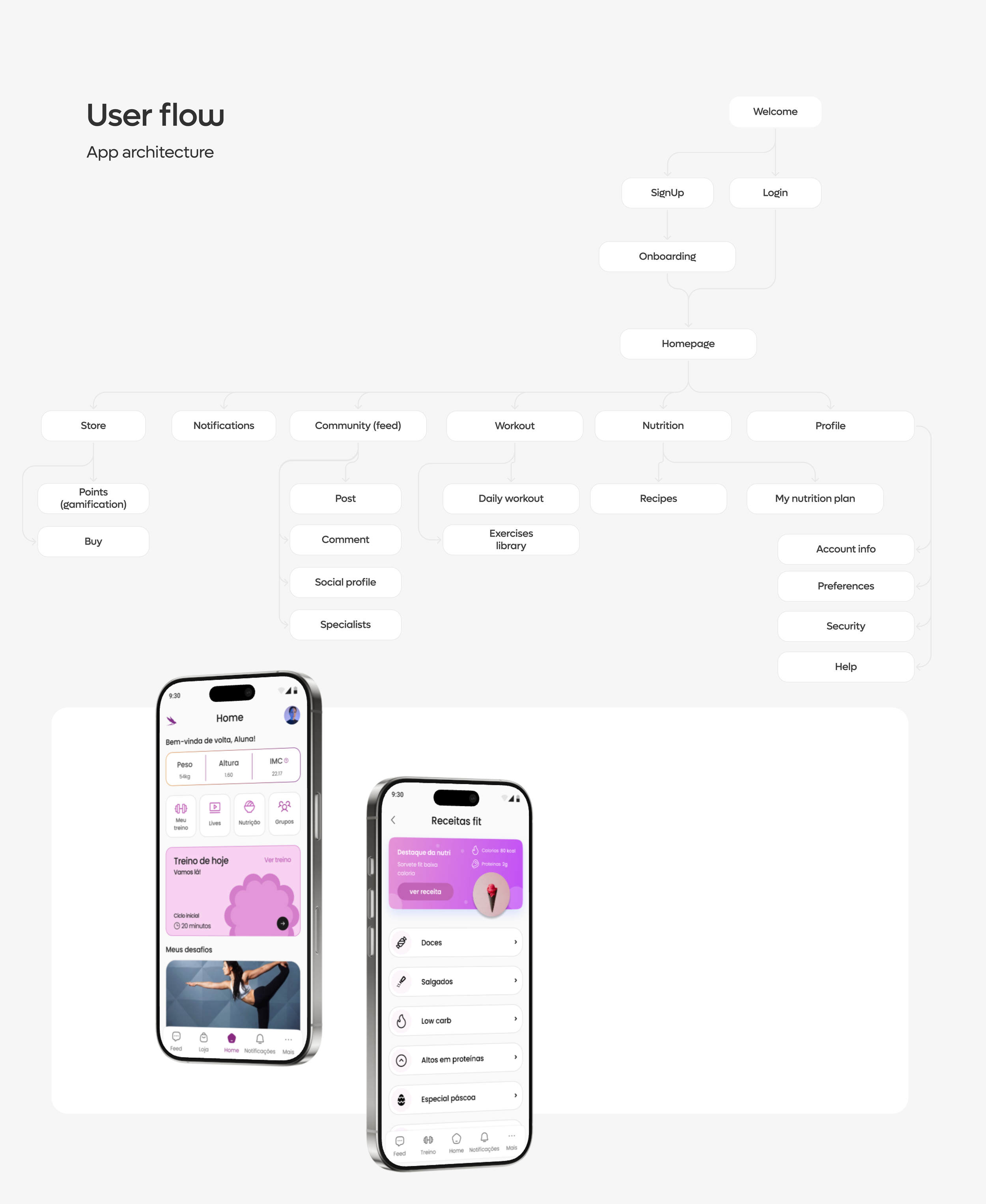
Six destinations off the homepage, and nothing more than two levels deep.
Welcome, signup or login, onboarding
Three screens of positioning before the form, then the account, then the personalisation questions.
Daily workout, exercises library
The thing the user opens the app to do, one tap from the homepage.
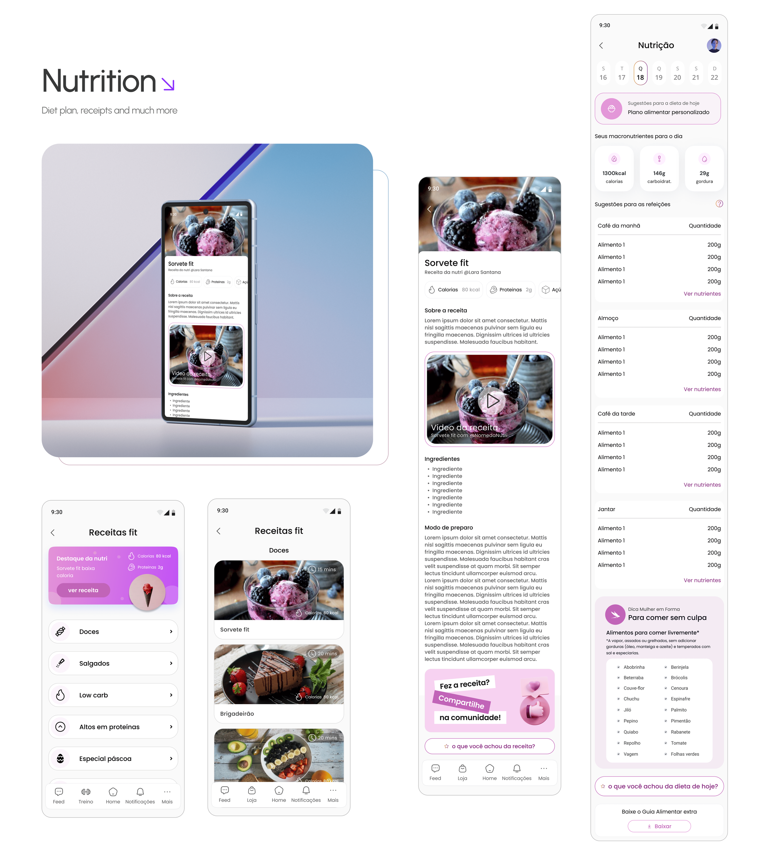
Recipes, my nutrition plan
Meal plan and recipes as two separate jobs rather than one menu.
Feed, post, comment, social profile, specialists
Points and purchases
Where the gamification currency becomes something real.
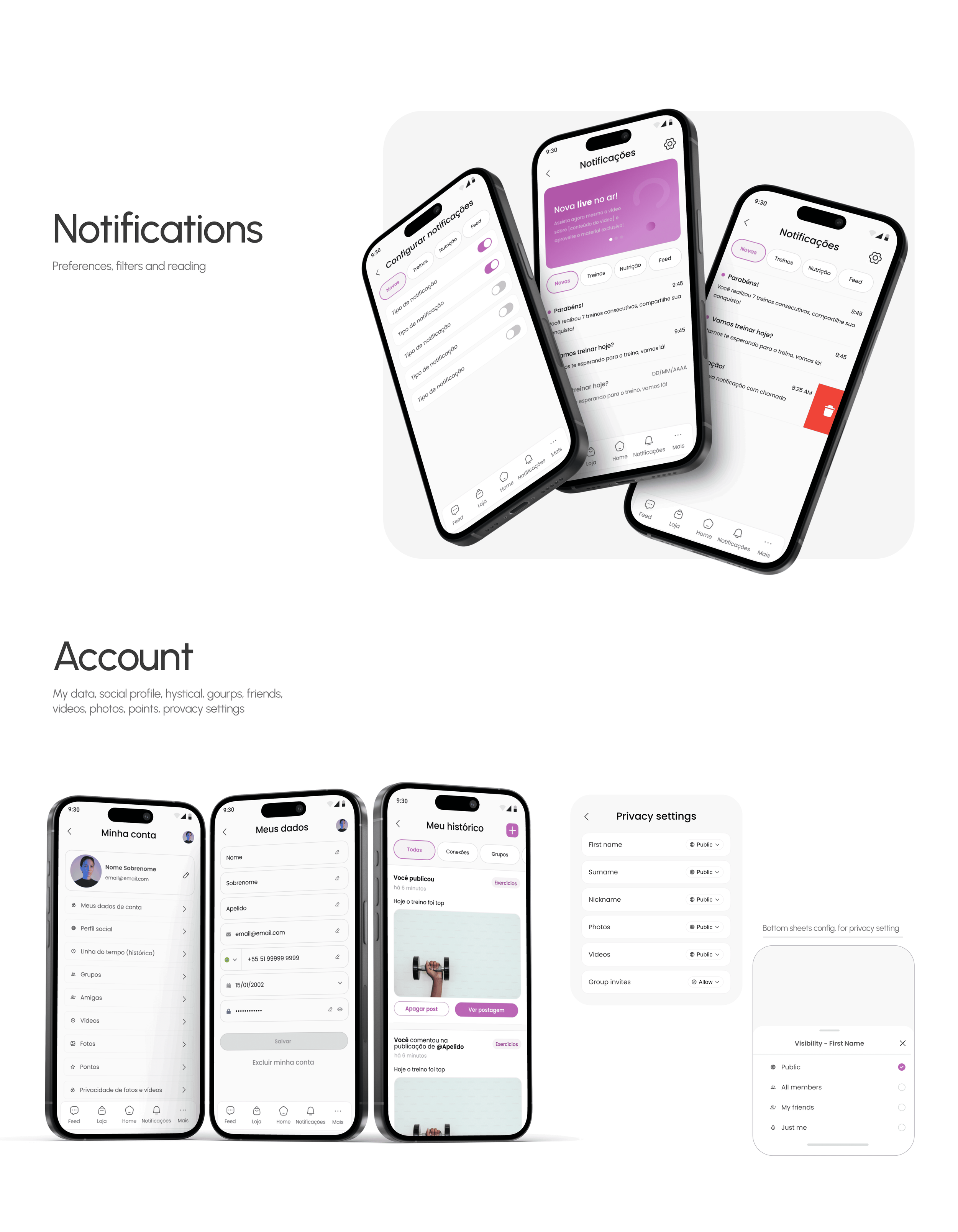
Preferences, filters, reading
Account info, preferences, security, help
An onboarding that sells before it asks
Three screens carry the positioning before the form appears: saúde e emagrecimento, motivação e carinho, liberdade e comunidade. Health tailored to unique women, workouts that motivate and make you smile, and a promise that the people behind it thought about every detail of her journey. Only then does the product ask for a name.
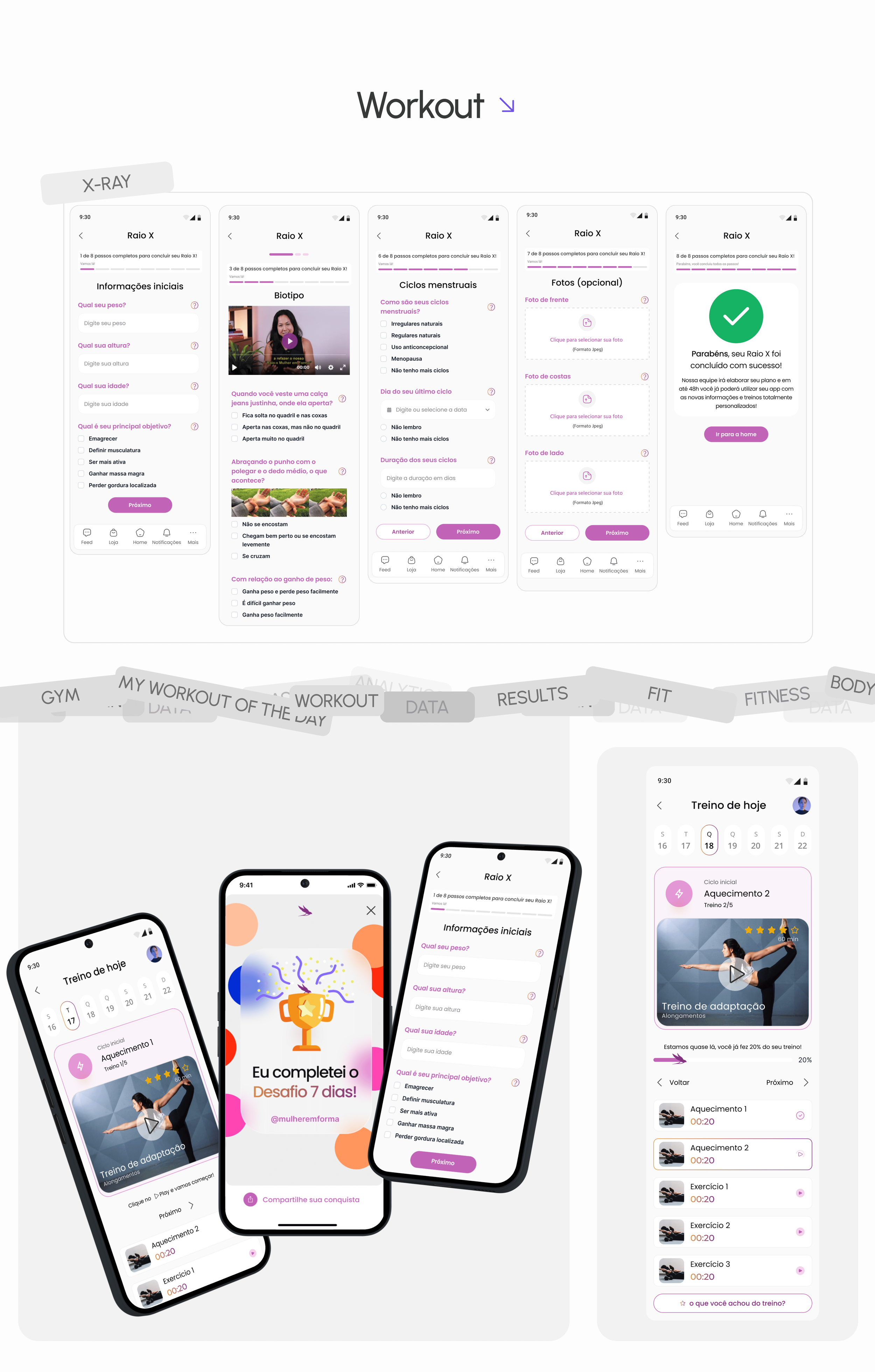
Raio X, the eight step assessment that makes personalisation real
Weight, height, age and goal; a video explaining biotype and a set of physical self assessments; menstrual cycles, their regularity and duration; and optional photos from front, back and side. It ends with a confirmation that the team will build the plan within 48 hours. Personalisation on this product is not an algorithm, it is a questionnaire a human reads, and the interface had to be honest about that.
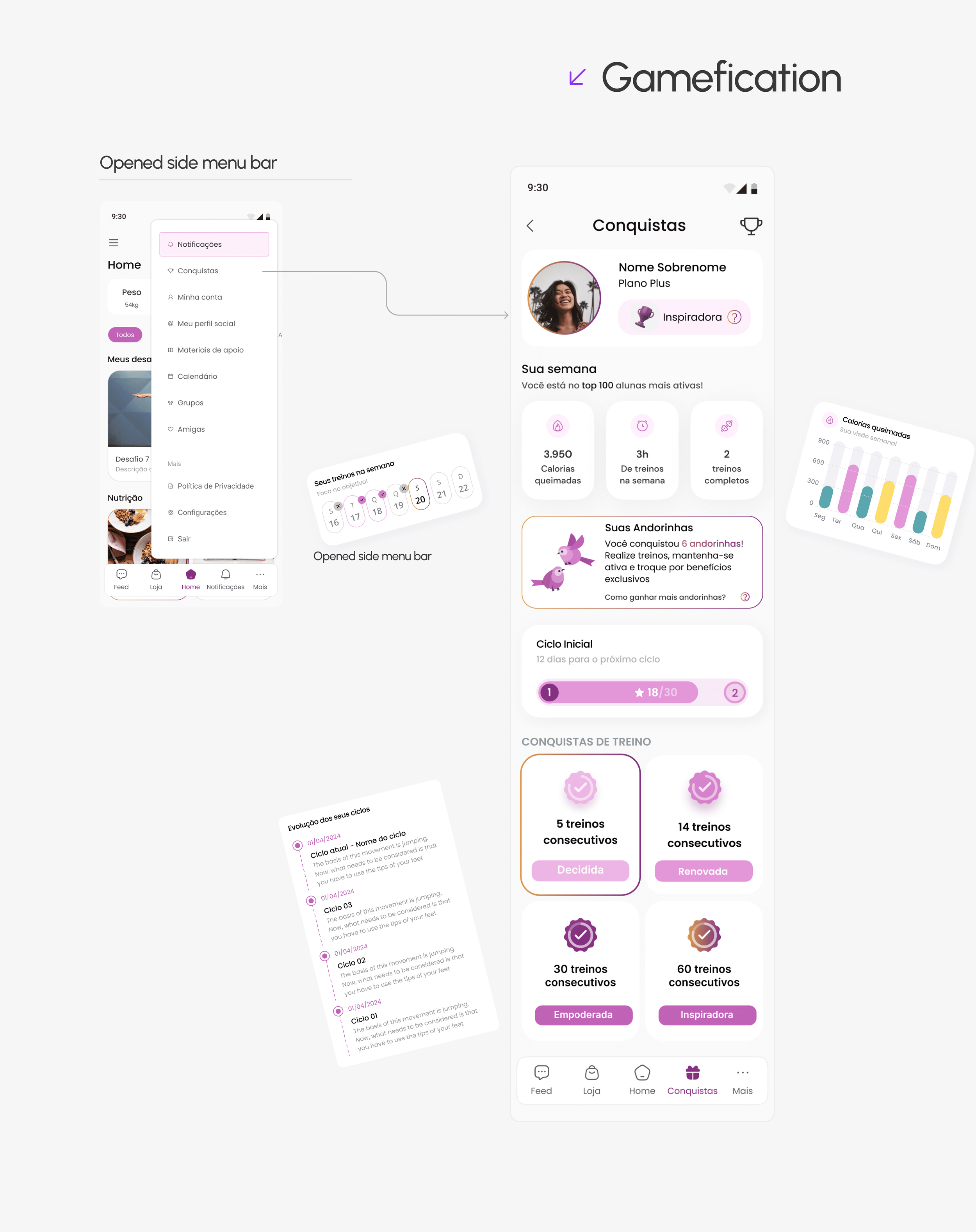
More than five gamification tactics, all of them in her own language
Cycles with a star target, consecutive workout badges named Decidida, Renovada, Empoderada and Inspiradora, andorinhas as a collectible currency, a weekly top 100, calories and workout counts, and challenge cards that change their message as the streak grows. Every message is written as encouragement rather than as a score.
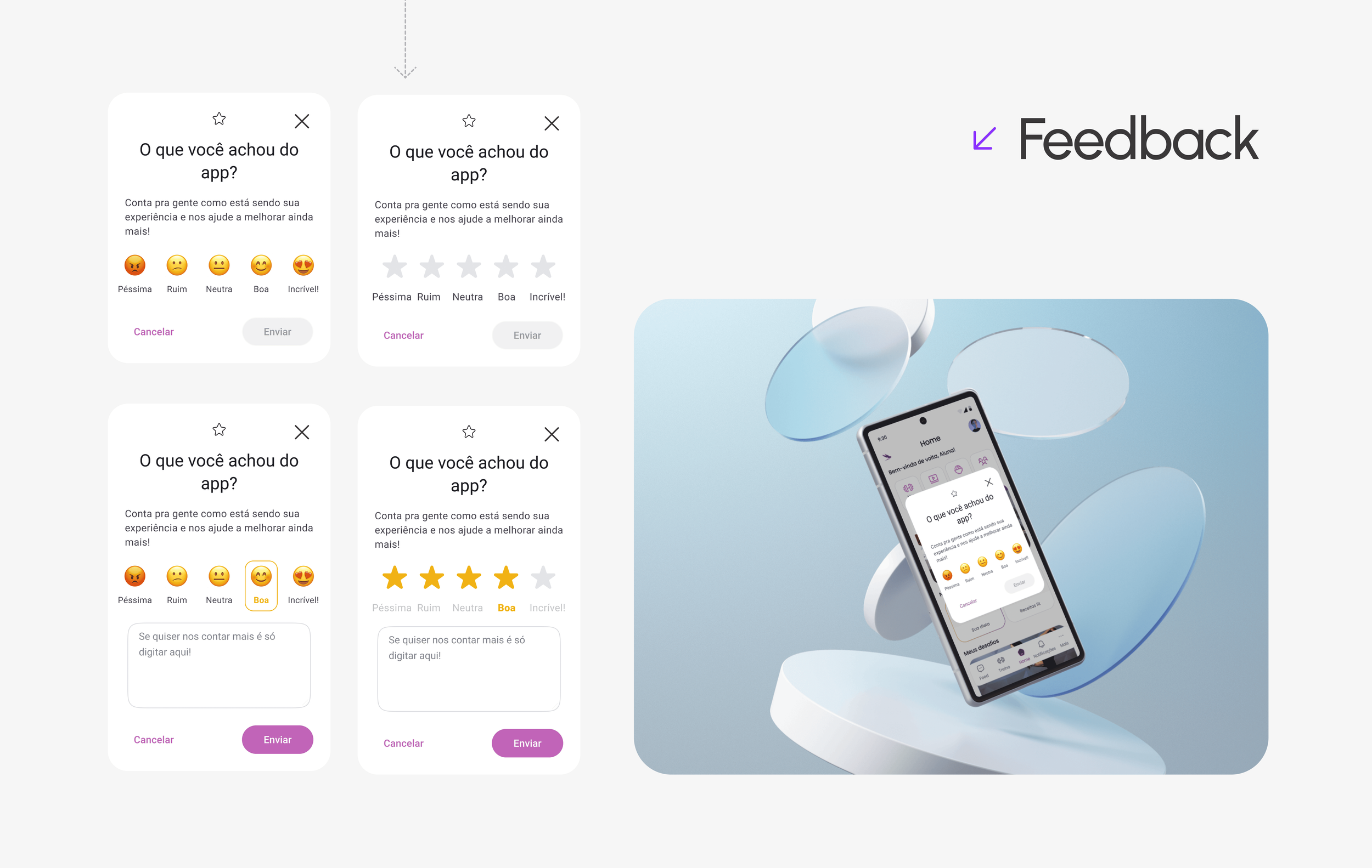
Feedback asked for at the moment it is cheapest to answer
A rating prompt at the foot of the home, after a workout, after a recipe, after the day's diet. Five faces, an optional comment, and two taps to be done with it. Collecting satisfaction in context is how a product this personal finds out it is drifting before the churn shows up.
Privacy as a first class screen, not a settings footnote
First name, surname, nickname, photos, videos and group invites each carry their own visibility setting, from public down to just me. On a product where women upload progress photos of their own bodies, control over who sees what is not a preference, it is the condition for using it at all.
A brand built on new begginings
Poppins
Regular, medium and bold, on a scale of 12, 16, 24 and 32. A geometric sans that stays friendly at small sizes on a phone.
A purple that carries the brand, and three supports
Principal purple #872A80 for buttons, backgrounds and highlighted text. Brand yellow #FFDD69 and a teal #AF5920 as optional grounds. A gradient from #EF7929 into the purple for hero moments. Then the working greys: #464646 for text, #6B6B6B and #EEEEEE for support, white for surface.
The swallow, and the andorinhas it becomes
The mark is a swallow built on a construction grid, working in purple, in white on the gradient, and reversed on each of the brand grounds. Inside the product the same bird becomes the reward currency, which is the rare case of a logo doing a job beyond the header.
Google Material Icons
Over 3,169 glyphs in one font file, in filled, outlined, rounded and two tone. Chosen for coverage: a product with workouts, nutrition, community, store and account needs more icons than anyone wants to draw.
The cgraphic version of this case lives on Behance.
You can also check the screens that are published in the Behance gallery.
View this project on Behance ›Three quarters live. Let's look at the projections.
The figures below are the design team's projections against the targets we set, built from the first three quarters of the product in production. They are estimates, and they are the clearest read we have of where the redesign is taking the platform.
Tracked alongside them, and held by the business: downloads across both stores, cost of acquisition, profit, daily platform usage, and users acquired through referral links.
- Engagement 20% increase in average platform usage time per user
- Retention 15% improvement, attributed to gamification and personalisation
- Progress 50% of users achieved their health goals in the period
- Impact 25% growth in mobile app usage
- Community 30% increase in participation in collaborative groups
- Personalisation 40% rise in adoption of personalised plans
- Satisfaction 90% reported high satisfaction with the progress dashboard
- Daily usage up 35%
- Health outcomes 75% reported improvements in weight, energy and well-being
- Retention weekly return rates above 60%
- Trainer efficiency positive feedback on the organisational tools built for trainers
- Goal achievement 80% of personal goals met within the quarter
Track engagement, retention and platform performance. Hold weekly review meetings to assess progress and raise issues. Keep communicating with users, both to build the community and to keep the insights coming.
Increase user engagement and retention
Key result: a 20% increase in monthly active users over the next quarter.
Strategy: gamified challenges and rewards together with personalised workout and nutrition plans, so users stay engaged for longer and are more likely to return.
Measured by: user retention rate · time spent on platform.
Improve trainer effectiveness and satisfaction
Key result: a 90% satisfaction score from trainers on platform usability and features by the next quarter.
Strategy: the real time progress dashboard and the analytics hub, so trainers can monitor and guide users properly.
Measured by: trainer satisfaction score · training completion rate.
Optimise health and fitness outcomes
Key result: help 75% of users reach at least one of their fitness goals within three months.
Strategy: personalised workout plans and real time progress tracking, so users can stay on track and adjust when they need to.
Measured by: goal achievement rate · user health metrics such as weight, strength and endurance.
What we learnt
Agree the measurement plan at kickoff. This product now has a real time dashboard at its centre, and the lesson is to give the project itself the same treatment: decide on day one which numbers get measured, by whom, and which of them can be published later. That turns a set of projections into a set of results.
Design the human version and the automated version of a flow together. Raio X is the strongest thing in the product precisely because a person reads it and builds the plan within 48 hours. Sketching the automated path alongside it from the start is what lets that quality survive growth instead of being rebuilt under pressure.
Let the community grow from behaviour. The research was clear that women wanted belonging, which is a different appetite from wanting to publish. Starting with the smallest version of the social layer and expanding it around what people actually do is the faster route to a community that stays full.